I don’t usually use the word transformational when discussing content blocks for an email, but this one deserves it. Recently, our team at Sercante had the opportunity to partner with one of our long-term automotive clients to find a solution to a big problem—overstocked inventory.
This project began like many others. An innovative, creative brand trying to bridge the gap between what customers want and what they can have. Buyers were spending time configuring their perfect vehicles, carefully choosing every option and detail, and then either abandoning their cart or waiting months for the car to be built.
What they didn’t realize was that their dream car, or something close to it, was already built. Already available for them. Already on the lot. It just wasn’t being shown to them.
The Problem: They Had the Cars, But No One Knew
The brand had a recommendation engine on their website, which enabled customers to browse their available inventory. However, this only happened if a customer actively sought it out. Meanwhile, their emails weren’t showing in-stock options, but rather driving them to the configurator to design their vehicle. The inbox experience focused on brand, features, and specs, but not on availability.
There was a disconnect between digital engagement and physical inventory. And it was costing time, resources, and ultimately, conversions. Through several brainstorming sessions and collaborative work, we had to ask ourselves what would happen if we started surfacing what customers could get today?
The Approach: Make the Data Work in Email and Web
Working with the brand’s Salesforce team, we built a dynamic content block that connects their existing vehicle recommendation API with Salesforce Marketing Cloud. At send time, the block pulls in the top two vehicles available near each subscriber’s zip code.
That means:
Real-time pricing and availability
Personalized images and trim-level specs
A “View Details” CTA that drives them to the inventory page
And dynamic scripting to auto-generate it all without a manual lift
The block works anywhere—in journeys, newsletters, promotions, event invitations, and more. We added fallback logic, Einstein Send Time Optimization, and throttling to ensure performance even for high-volume sends. We evaluated alternative approaches, such as daily lookup tables, but for this use case, true real-time was worth it. It wasn’t just about showing inventory, it was about giving the customer a path forward.
What Happened Next
This shift didn’t just make the email more useful. It changed how the brand saw its role in the customer journey and the results showed the impact:
Click-through rates on the monthly newsletter more than doubled from 1.02% to 2.26%.
Journey emails with the content block saw a 119% higher click-through rate in A/B testing.
Build time dropped from over 40 hours for their monthly newsletter campaign to 10 hours.
The time to purchase fell from 107 days to 5 days, and their inventory began to decline.
And, perhaps most importantly, the marketing team began thinking differently. The inbox became a place of momentum. Of relevance. Of action. As their marketing director put it, “This helped us rethink how we use email. Not just to inform, but to move customers forward in their journey.”
Check out the full case study related to this customer story here.
Going Beyond Automotive
This isn’t just a car story. If you’re in an industry with inventory, long buying cycles, or complex consideration paths, this kind of approach has ripple effects:
Are you surfacing what’s ready now or just what’s aspirational?
Are your marketing channels connected to real-time availability?
Are your emails helping customers act, not just learn?
We’re all sitting on data that can do more. It’s not about overwhelming customers. It’s about removing friction, aligning on timing, and making it easier to say yes.
This project reminded me that sometimes the most effective marketing move isn’t adding more. It’s making what you already have more visible. Your customers don’t need a better configurator. They need a clearly defined next step. Let’s give them one. If you’d like an expert’s insights on how to maximize the data you have to build more personalized experiences for your audience, that result in clear next steps and impact on the funnel, reach out to Sercante. The team is all about helping you create seamless experiences for your team and your customers.
Product Note:Marketing Cloud Growth and Advanced are editions of Marketing Cloud Next and have also been referred to as Agentforce Marketing.
Marketing Cloud Growth and Advanced Edition (aka Marketing Cloud on Core or just Marketing Cloud) offers incredible capabilities to marketers in so many areas. From AI powered segmentation, scheduling and sending SMS in a nurture campaign, and unprecedented abilities to tailor your marketing content to the audience viewing it, Marketing Cloud Growth and Advanced Edition can help marketing teams large and small automate their marketing efforts. All of these amazing capabilities rely on the power of one key feature of Data Cloud – the Data Graph.
Data Graphs allow you to combine and transform data from multiple Data Cloud Data Model Objects (DMOs) into a single view. This read-only Data Graph can then be used in a variety of ways through API, automations, and Salesforce applications, like Marketing Cloud. In fact, a Data Graph is a requirement for using personalization (and some automations) within Marketing Cloud – the objects and fields you select when creating this graph are the same objects and fields that you’ll have access to when adding personalization to your marketing content or powering your automations.
Your Data Graph needs to have a specific shape to successfully send your emails. If you have Marketing Cloud Advanced Edition, you’ll also need to ensure that Einstein Engagement Scoring and Einstein Engagement Frequency features have been enabled before building. This blog will help you understand the steps needed to take to create and edit your Data Graph for Marketing Cloud.
Things to Consider Before Building a Data Graph
Once upon a time editing a data graph wasn’t possible, which meant gathering all of the information you’d need to reference in your marketing efforts before building your first graph. Now it’s entirely possible to edit your data graph, but I’d still highly recommend you gather your requirements ahead of time, so let’s think about what you’ll need.
What fields do you need for personalization?
Personalized marketing content is the name of the game, so the first thing to consider is what fields you’ll want to reference in any personalized marketing content. This should include things like First Name, Last Name, Title, and Account but you should also consider what custom fields you may want to reference, like the name of a product or webinar they’ve attended.
Are there any fields you’ll need for segmentation?
The segmentation capabilities in Marketing Cloud rely on the fields that are included in your data graph, so next up it’s time to think about how you’re planning on segmenting your prospects for email, SMS, and/or WhatsApp sends and automations. Common things to include could be industry, region, and address data. Make note of the fields and the object that those fields are on. For example, if you want to pull in industry, that field is likely on the Account Object. Keep in mind that anything you include here must have some relationship to the individual included in the segment.
What will you need for your automations?
The last thing you’ll need to consider is any information you might need for your flows. What information will you be basing your automation decisions on? Things to consider include campaign membership or status, email engagement, and geographical information.
Have Advanced edition? Turn on Einstein Features (if applicable)
Marketing Cloud Advanced Edition includes Einstein Engagement Scoring and Einstein Engagement Frequency. Be sure to enable these features before building your data graph!
Confirm the fields are in Data Cloud
Now that you have your field requirements determined, the next step is to make sure all these fields are mapped to your Data Streams. These field mappings take the new information ingested in the data stream and map it to the appropriate fields and objects in the Data Model Object (DMO) to create or update the appropriate records. Head to the Data Streams tab in Data Cloud and confirm all the fields you listed earlier are mapped to the appropriate DMOs. Check out this help article for some data mapping best practices.
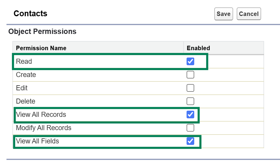
Be sure the Data Cloud Connector can View All fields
One of Salesforce’s core tenets is trust, and that extends across all layers of the Salesforce ecosystem. This means that the connector between Data Cloud and Sales Cloud has minimum access to information in your Salesforce system. Make sure all the fields you’re including in your data graph are visible to Data Cloud by going to the Data Cloud Salesforce Connector Permission Set and updating the object settings to include the View All and Read permissions for every object you’ve listed. This ensures that all objects and fields are able to be ingested into Data Cloud.
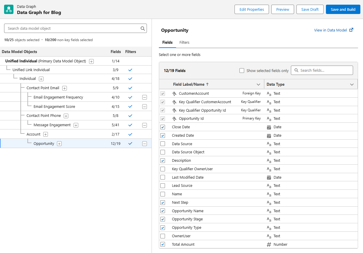
Building the Standard Data Graph for Marketing Cloud
We have a step by step blog on building a data graph for personalization, but as a quick refresher, here are the steps you’ll need to take and things to keep in mind.
Go to Salesforce Setup > Marketing Cloud > Assisted Setup > Reporting and Optimization > Customer Engagement
Click on “Go to Data Graphs”
Create a new data graph from scratch
Use the default data space
Select the Unified Individual as your Primary Data Model Object
Ensure your data graph has the following shape:
Unified Individual (Primary Data Model Object)
Unified Link Individual
Individual
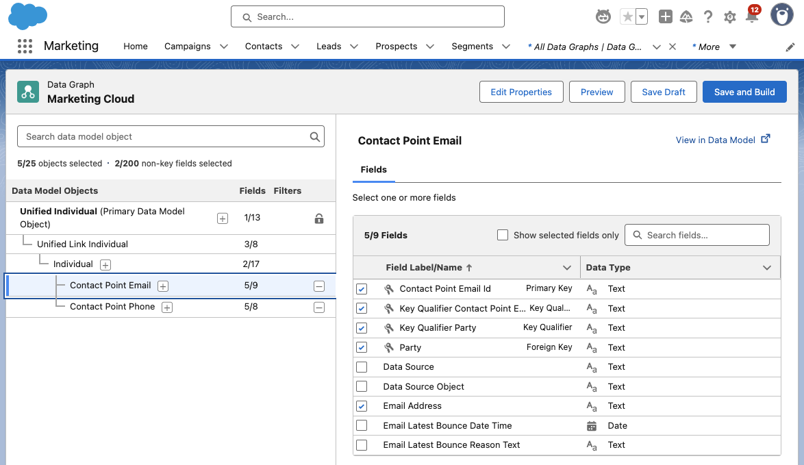
Contact Point Email
Contact Point Phone
Make sure all the objects and fields on your lists are included in the data graph
The following fields must be selected during the Data Graph setup:
Individual ID from ‘Individual’
Email Address from ‘Contact Point Email’
Telephone Number from ‘Contact Point Phone’
But what if you have Advanced?
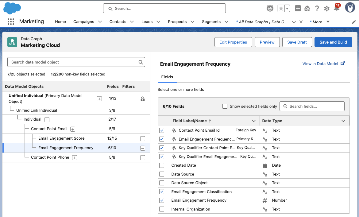
If you’re using Marketing Cloud Advanced Edition, be sure to include the Email Engagement Score (Unified Individual > Unified Link Individual > Contact Point Email) and Email Engagement Frequency (Contact Point Email & Contact Point Phone).
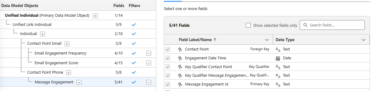
Add in SMS
By now, your data graph should look something like this, give or take the Email Engagement Score, Email Engagement Frequency, and SMS options. To include SMS in your Data Graph, be sure to include the Contact Point Phone and the Message Engagement options, as shown below.
Message Engagement gives you lots of options for monitoring how your SMS marketing is doing. Use this to monitor engagement with your SMS messages, the messages you’re sending, links, subscription information and more!
Bringing in Custom Fields and Objects
Okay, so we’ve covered adding in all the standard objects and fields you’ll need for your standard personalization and automation needs, but what about the custom objects that you may have in your organization? These may be objects from integrations, or ones you’ve created to help manage campaigns or customer orders.
To bring this information into your Data Graph for use in your marketing, you’ll need to ensure that there’s a connection to the Individual in some manner. What does that mean? An easy example is an Opportunity – Opportunities are connected to the Individual via their Account in Salesforce. Select the top level item in your Data Graph, then use the + option to drill down to the object you’re looking for. Once you’ve gotten your object added on the graph, use the right side of the screen to select the fields you want to include in the graph.
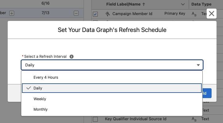
Deploy Your Data Graph
Now that you’ve built your graph, the next step is to save and build, then deploy your graph. Click on Save and Build then choose your refresh interval. Keep in mind that every refresh will consume credits! The right refresh interval will depend on how you’re planning on using the Data Graph, but typically the daily refresh rate works well for marketing needs.
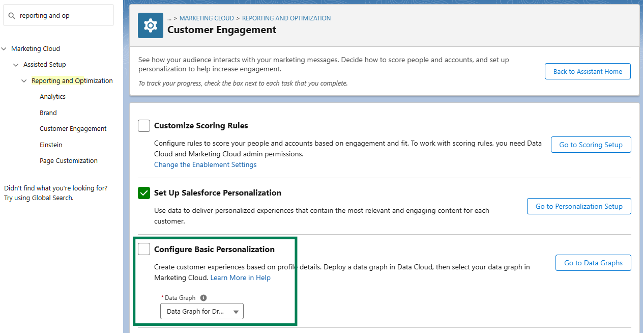
Head Back to Setup to Deploy Your Graph
From Salesforce Setup, type Reporting and Optimization in the Quick Find box and navigate to the Customer Engagement option. In the Configure Basic Personalization section, use the drop down menu to select the Data Graph you just created.
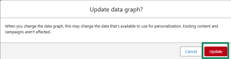
If prompted, confirm that you want to update your data graph by clicking the Update button.
Get Personalizing with Your Data Graph!
Now that you’ve built and deployed your Data Graph, you’re able to use the information in your personalization and automation efforts across Marketing Cloud. This powerful tool combines information from across your Salesforce organization into a single place of reference for Marketing Cloud to use that will update automatically on a planned schedule.
Product Note:Marketing Cloud on Core is now known as Marketing Cloud Next. Marketing Cloud Growth and Advanced are editions of Marketing Cloud Next and have also been referred to as Agentforce Marketing.
Your messages are doing their job, but are they working it?
If your campaigns are feeling a little too copy-paste, a little too “blah,” it might be time for a serious glow-up. You’ve got the data. You’ve got the content. Now it’s time to use the tools inside Marketing Cloud on Core (aka Growth and Advanced Edition) to turn that good-enough messaging into something that shines!
This blog will teach you how Dynamic Content and Expressions can transform your messages from basic to brilliant. You’ll learn what these new features are, how they work, and how to use them to make every send feel personal, polished, and powerful!
Let’s Start with the Basics
Before we dig into the tools, let’s talk about transformation. A glow-up for your marketing means:
Less copy-paste, more customization
Making use of the data you already have
Messages that speak directly to the recipient, not the crowd
Marketing Cloud on Core gives you two powerful tools to make it happen. Ready to transform your messages? Let’s learn how to master Dynamic Content and Expressions.
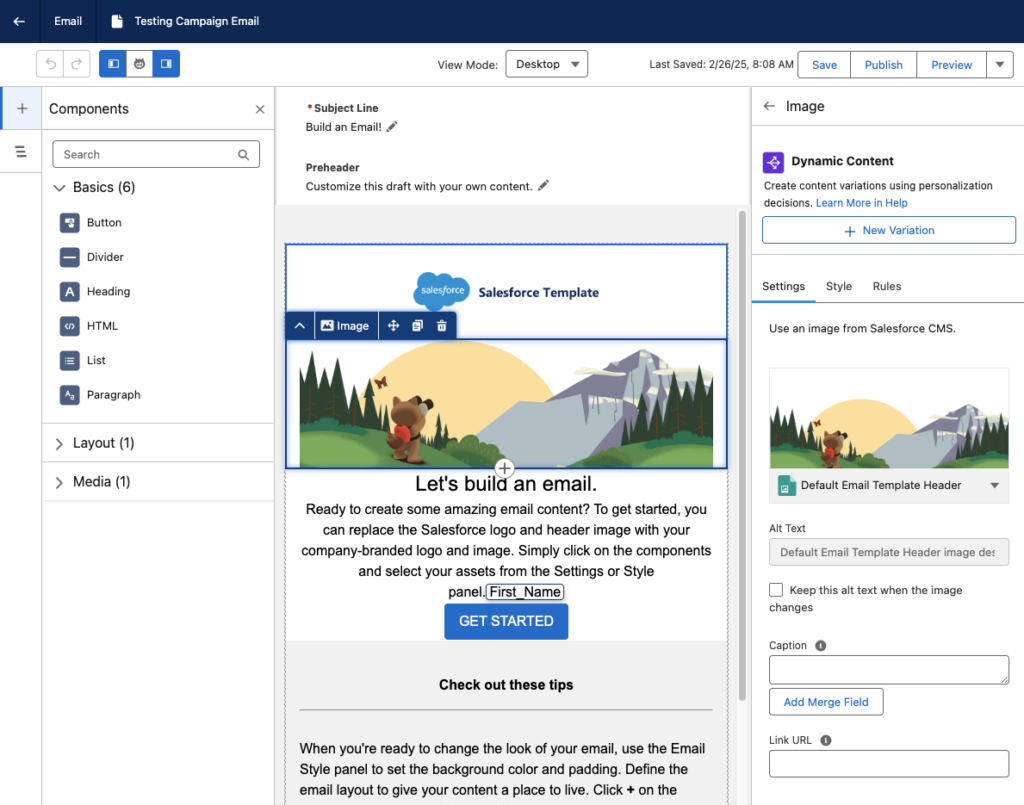
Introducing Your Email’s Style Squad
Give your emails a fresh look without starting from scratch. Think of Dynamic Content like your email’s glam squad; each part makes your email stand out. Consider giving your email different “outfits” based on who’s opening it.
Personalization Point: This is the part of your email where you give a mini makeover. It could be a subject line, preheat, hero image, or CTA – any element that could use extra sparkle.
Personalization Decision: This is the brains behind the beauty. It figures out who should see what based on the rules you set.
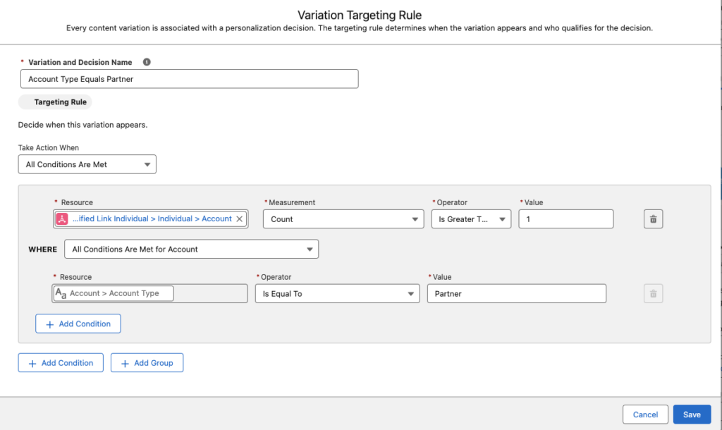
Targeting Rule: Your custom-fit formula. It defines “if this, then show that” logic. For example, “if account type = VIP, show gold banner.”
Pro Tip: Already built a variation you love? You can reuse it in other emails using recent Personalization Points.
How to Apply the Glow-Up: Creating Dynamic Content
Let’s walk through giving your content a dynamic makeover:
Open your email in the editor and select the content block you want to glam up.
Head to the Dynamic Content section and click Add Variation.
You can use the Variation dropdown to access NewVariations if you’ve already got some variations.
When the Create or Reuse Personalization Settings window pops up, select New Variation. Heads up: Your message has to save first, so give it 10-20 seconds.
Name your variation and create your Targeting Rule.
Click Save, then customize your content within that variation, like updating a header image or swapping out messaging for a specific audience.
Use the Variation dropdown to preview how your message looks for each version.
Pro Tip: Use dynamic blocks sparingly at first. Target high-impact spots like hero images or CTAs, and test frequently to ensure each variation shines.
The Finishing Touch for Personalized Flair
Once your content’s dressed to impress, it’s time to fine-tune the details, and that’s where Expressions come in. They’re like your behind-the-scenes styling tool that ensures every message feels personal, even when the data isn’t perfect. Here’s how Expressions keeps your messages looking polished:
Saved Expression: Think of this as your go-to styling shortcut. It’s a reusable logic block you create once and drop into multiple campaigns; it’s less work with the same wow factor.
Attribute Selection: This is where you tell the Expression what data to look at, such as PreferredName, LoyaltyStatus, or FavoriteProduct.
Fallback Value: No data? No problem. Expressions let you set a backup so your message stays smooth. Instead of “Hi,” you get “Hi there!”
Expressions ensure every message feels intentional and on-brand like you planned that way (because you did).
Adding the Ultimate Accessory: Creating Expressions
Here’s how to build your first Expression and set your messages up for consistent, reusable personalization:
Head to Content > Content Workspace in Marketing Cloud.
Click Add, then choose Content.
Select Expression, then click Create. (Yes, you’re about to create something fabulous.)
Give your Expression a name that clearly describes what it does (like “PreferredName Fallback” or “GoldMemberStatus”).
Use the Attribute field to choose the customer data you want to reference.
(Optional) Add a filter if you need to narrow down conditions, like only using this Expression when someone’s location is “US.”
Click Save.
Don’t forget to hit Publish to start using your Expression in your messages.
Pro tip: Once created, Expressions can be used repeatedly across campaigns, saving you time while keeping your personalization game strong.
Using Your Expression in a Message
Now that you’ve created your personalized shortcut, it’s time to drop it into your message for that final glow-up touch.
Open the email, SMS, or WhatsApp message where you want to use your Expression.
Select the content block where you want your personalization to appear.
Click the [] Add amerge field symbol.
Choose Saved Expressions from the dropdown menu.
Pick the Expression you created earlier.
Add a default value (like “there” or “friend”) in case your data field is empty.
Click Done and admire your work.
Pro Tip: This ensures your message always reads naturally, even if a customer’s name or info is missing the data.
Use Them Together for a Full-On Email Glow-Up
You’ve got the tools! Now it’s time to layer them like a pro stylist would. Dynamic Content and Expressions are great on their own, but when used together? That’s when the real transformation happens!
Think of Dynamic Content as your email’s wardrobe, changing outfits based on who’s reading. Then think of Expressions as the accessories, adding that personalized sparkle like someone’s name, product interest, or membership level.
Real-World Example
Let’s say you’re sending a promotional email:
You use Dynamic Content to show one banner for loyalty members and another for new subscribers.
Inside each banner block, you drop in an Expression to greet the user by name (with a fallback like “their” in case their name isn’t available).
You also use Expression to highlight their preferred product category, so the CTA feels totally tailored.
The result? An email that looks like you custom-designed it for every person without cloning templates or managing a million logic paths.
Why This Combo Works
You reduce manual work by creating fewer, smarter assets.
You create hyper-relevant emails without sacrificing time or scalability.
You build a customer experience that feels seamless, polished, and personal, even if you’re sending to thousands at once.
Using Dynamic Content and Expressions is the email marketing equivalent of putting on a fresh outfit, doing your hair, and finishing with the perfect accessory.
Ready to Give Your Emails a Glow-Up?
You don’t need a whole new wardrobe of emails, just the right tools to style them smarter. With Dynamic Content and Expressions in Marketing Cloud on Core, you can transform basic batch-and-blast messages into personalized, polished experiences that connect with your audience.
From targeting rules to fallback names, you have everything you need to bring out the best in your campaigns without doubling your workload. Whether you’re just dipping your toes into personalization or looking to scale with style, this glow-up is just the beginning.
Want help applying what you learned?
Book a consultation with Sercante’s Marketing Cloud experts to review your personalization strategy or sign up for one of our hands-on workshops. Let’s glow up your next campaign together!
For the last seven years, I’ve been enamored by a marketing analytics tool (who among us hasn’t, I’m sure), Datorama, or Salesforce Marketing Cloud Intelligence. MCI, as we’ve come to call it, is the most seamless way my customers have found to join their data across multiple sources, built by marketers and for marketers. MCI allows users to join data together and easily create reports and dashboards using plain language from the pre-built data models. This allows for easy-to-populate smart lens dashboards, or deeply complex automated reporting triggered by specific events.
To my delight, and to the happiness of marketers, Salesforce just announced on March 18, 2025, a new version of the tool, Marketing Intelligence (MI), built on the Salesforce Platform. This new version takes the best features of existing MCI and layers them into the functionality of Data Cloud’s unified platform, while taking users to the future with agentic features that will provide down-to-earth insights with conversational agents. So without any further ado, let’s dive into this new tool, Marketing Intelligence!
What is Marketing Intelligence?
Marketing Intelligence (or MI) is a new application on the Salesforce platform designed to simplify marketing data management, deliver trustworthy, out-of-the-box insights that marketers can instantly act on, and deliver better return on investment for marketing spend. Being built on Data Cloud and connected to the Salesforce platform allows it to be fully extensible, with a toolbox for marketers at the ready- it’s everything you need to build robust, effective, and meaningful dashboards with minimal lift.
Data Cloud for Marketers Made Easy
One of the processes I have been spoiled by in Marketing Cloud Intelligence is data mapping that auto-populates based on past usage and logical guesses by the platform’s artificial intelligence. Additionally, certain APIs come with prebuilt models and mapping to build off of rather than user-defined settings. These features have helped get marketers streamlined into the world of data models and dashboarding with less lift than throwing them into a database or asking them to join various tables.
All of that, to my delight, is back in full form with Marketing Intelligence. You have the option to upload a TotalConnect file (a non-standard API, flat file of your choosing), or to use an existing API connection, with some rolled out at launch and more coming in the year ahead. Choosing a connection like Google Ads allows you to seamlessly grab that data, formatted and ready for quick mapping, and load the data you need into a dashboard in just 3 clicks.
Clean and Easy Dashboards
The dashboards look sharp and load with ease. These dashboards come prebuilt, with options to customize, and also have a key new feature compared to the existing Marketing Cloud Intelligence: generative AI summaries of your campaigns, including what’s working and what might not be. This elevates, to me, the future of dashboarding—being able not only to look at quick and easy data points and trends but also being told in plain language for what to take away or dig into. This can help marketers ask questions and dive in further, and even ask their agent to take action on what recommendations surface.
The idea of clear and plain insights especially comes up in implementations of the current dashboard tools I work in. Users looking at a dashboard want to know different information, and for dozens of users looking at a single page, the questions they’re asking are going to be different depending on needs. The option to ask your agent to recommend optimizations, and then act on it will save marketers a lot of time and headache. With Marketing Intelligence, you just need the data ready for an agent to help your end users get what they need from the data you’ve put in place.
Tidied Data Across Channels
Of course, the core goal of any marketer looking for a tool like Data Cloud, Marketing Cloud Intelligence, or this new version of Marketing Intelligence, is to tie data together across channels to tell meaningful stories they can act on. In addition to the standardized API mapping, MI creates value by uniformly harmonizing these fields across datasets and allows for a semantic model to be used on the backend to tie data together in ways that are common sense (campaign name ties across all of your channels, for instance), such as tying your campaign from paid media to your campaigns from your CRM or other tools, even when names are not exactly aligned (more on this in a moment).
I’m an existing Datorama/MCI User: What’s Worthwhile Here?
If you have been reading up to this point, you know what was probably on my mind when I first saw this tool: can I love a changed version of my favorite software of all time? (And yes, I have a favorite software of all time.) Put simply, I’m ready to love. Let’s dissect the butterflies in my stomach. (And if your heart skips a beat when you hear about normalization, semantic modeling, and ROI, there’s enough of this platform for us to share).
One Word: Normalization
When I lead implementations with clients on MCI, we talk about the ways in which their data joins. Sometimes it’s super straightforward, sometimes it’s messy. More often than not, we can devise ways to join the messy and the clean together, such as by breaking out parts of campaigns to equal full campaign names in other channels, or by using the numerous formulas Marketing Cloud Intelligence offers out of the box.
In MI, this is no longer necessary. One of my favorite surprises is seen below: you can classify and normalize data with Einstein AI, so instead of working to modify and standardize all of your data either in the platform of origin or in Intelligence, you can instead have Einstein help you set standardization of your data. This is a fantastic path forward in joining datasets together for synchronized cross-channel reporting.
Two Words: Semantic Modeling
Though users will have an out-of-the-box paid media data model ready to go, users will have free range beyond the world of pre-defined data models in MCI. In MI, you can set up a semantic model that joins datasets together across multiple objects. While you may miss some of the standardization of having ads, conversion, and web analytics data models, among countless others in MCI, you will get seamless back-end loading of data together, along with seamless joins to standard Salesforce object data. This also means that you can add fields and relationships with full customization as your datasets evolve, or as you update back-end nomenclature to more cleanly join fields from one connection to another.
Three Words: Return on Investment
Speaking of Salesforce data, what elevates a good MCI implementation to a great one, in my books, is the joining of cost/engagement data to tangible ROI and meaningful dollar results. With the new integration to the semantic model and the ease of connecting standard objects from Sales Cloud, users can handily create and easily visualize ROI metrics in MI wherever data cleanly intersects, which is now made much easier with Einstein normalization and semantic modeling.
Additionally, attribution is a more straightforward possibility with MI than in current MCI, with the framework to capture website events within Data Cloud data model objects, providing marketers end-to-end visibility into touchpoints where ads have been seen by end users. This will include attribution models for first and last touch for users, and can further be a method to validate ROI and pinpoint specific interactions with customers.
I’ve Never Used MCI or Datorama-Why Should I Explore Marketing Intelligence?
The Tool for Data Harmonization
MCI has long been the gold standard for harmonizing marketing data. When clients come to me looking for data solutions, if the core users (front and back-end) are marketers, MCI is always what I recommend. Now with MI, you have the power of what current MCI can do to enable marketers to aggregate and act on data in the same platform as your CRM and marketing data, with the added benefits of generative and agentic AI, 3 click data setup, Data Cloud, and embedded Tableau Next visualizations.
The Tool for Visualization
Current Marketing Cloud Intelligence has some great visualization options, but the two big enhancements I’ve always wanted and have tried to build guardrails for on my own are:
1. Faster load optimization for dashboards
2. Plain language recommendations for end users
With MI, you get both of those with minimal lifting. Data is smoothly joined together using Data Cloud and back-end semantic modeling, with minimal loading for calculated fields and other computing intensive processes in current MCI. Additionally, with generative AI suggestions and an agent to help you pause underperforming ads, end-users are no longer limited to looking at charts and figuring out what it means,—because actions are ready and available to springboard from on the page.
The Tool for Marketing Customization
Have you ever wanted to redefine your campaign names in reporting by extracting certain parts of your campaign names from across systems? Have you wanted to group different Google Analytics traffic sources and merge them against ad spending from the respective paid media platforms on an automated basis? What about renaming and grouping a set of campaigns based on criteria only you and your team know and then dynamically filtering for a handful of those campaigns?
That’s the sort of fun I love to explore with clients, and it’s back in full force in MI with processes like patterns to extract data points from various fields, calculated fields in the semantic layer, and the normalization processes Einstein brings to the table.
A New Era
Marketing Intelligence launched on March 18th (with Data Cloud and MI licenses required). Talk to your account executive to explore this new product. Marketing Intelligence is going to be the gateway into a new world of dashboarding intelligently (no pun intended) and is sure to streamline data for marketers in ways that have only been hinted at by Marketing Cloud Intelligence previously. I know I’m excited to take this ride, and I hope you’ll join me!
Product Note:Marketing Cloud Growth and Advanced are editions of Marketing Cloud Next and have also been referred to as Agentforce Marketing.
Marketing Cloud on Core (also known as Marketing Cloud Growth or Advanced Edition) can now track how marketing efforts contribute to revenue! With the Spring ‘25 release, Salesforce introduced Opportunity Influence, helping businesses connect marketing engagement to pipeline and revenue. But how does it work, and what’s the difference between Opportunity Influence and Campaign Influence? Let’s dive in!
Opportunity Influence vs. Campaign Influence: What’s the Real Deal?
Before we break down how to customize and report on Opportunity Influence, let’s clarify how it differs from Marketing Cloud Account Engagement’s Customizable Campaign Influence. While both models aim to connect marketing efforts to revenue, they function in distinct ways and serve different use cases.
Tracks Leads/Contacts who are Salesforce Campaign Members
Integration
Syncs Marketing Cloud engagement data to Salesforce Opportunities
Works within Salesforce CRM using Campaigns and Opportunities
Attribution Models
Multi-touch attribution (first-touch, last-touch)
Campaign Influence and Customized Models
Reporting & Insights
Measures marketing-driven revenue impact
Measure campaign-driven revenue impact
🚨 Important Note for Account Engagement Users 🚨
You cannot use Opportunity Influence alongside Customizable Campaign Influence. If your team already relies on Account Engagement’s Campaign Influence Models, keep this in mind when deciding which model to use.
Additionally, Account Engagement users cannot activate Opportunity Influence as it does not currently integrate with Account Engagement’s Campaign Influence model. If your organization currently tracks marketing-driven revenue using Campaign Influence reports, you’ll need to continue using that model. However, if you’re considering a shift to Marketing Cloud on Core, Opportunity Influence could offer enhanced multi-touch attribution and engagement tracking.
Battle of Influences: Campaign vs. Opportunity – Which One Wins?
Let’s say you’re running a B2B software company and you’ve executed multiple marketing campaigns using a variety of platforms, including ads, email, an e-book, and a webinar, to engage your prospects.
Campaign Influence: A prospect attends the webinar, clicks on an email, and downloads the e-book before being transitioned to sales as a marketing-qualified lead. These interactions are recorded under a Salesforce Campaign and can be manually associated with the Opportunity when created based on the Opportunity Contact Role and Campaign Member. You can assign influence weight based on your customized rules.
Opportunity Influence: Marketing Cloud on Core automatically tracks all marketing engagement, including the ad view and click, webinar attendance, and e-book download. These touchpoints are automatically associated to attribute influence based on the predefined model and associated to the Opportunity upon creation.
If Campaign Influence were a fine-dining experience, it would be a chef-curated meal—meticulously crafted with manual customization to fit your exact taste. You decide which interactions get the most credit, but it requires hands-on effort. On the other hand, Opportunity Influence is like an all-you-can-eat buffet with an expert chef behind the scenes. It automatically dishes out credit across touchpoints, giving you a full spread of marketing influence with minimal effort. If you love precision and control, Campaign Influence is for you. But if you want a seamless, automated view of your entire marketing impact, Opportunity Influence takes the crown.
How to Set Up Opportunity Influence
Setting up Opportunity Influence requires configuration in Sales Cloud to ensure marketing engagement is properly attributed to revenue-generating activities. To fully connect marketing efforts with sales outcomes, ensure that contacts engaging with marketing campaigns are linked to Opportunities. This allows for accurate tracking of marketing interactions that influence deals.
Enabling Opportunity Influence
Navigate to Salesforce Setup > Opportunity Influence
Enable Opportunity Influence
Select an Attribution Model
First-Touch: Gives full credit to the first marketing engagement that led to the opportunity. It’s ideal for understanding which top-of-funnel efforts drive initial interest.
Last-Touch: Assigns full credit to the last marketing interaction before the opportunity was created. It helps measure the final push that converted a lead into an opportunity.
Going Beyond Activation
Customization is key to maximizing Opportunity Influence. Marketers should align influence models with their sales cycle, ensuring critical marketing touchpoints, such as email engagements, paid ads, and automation journeys, are correctly captured. Because Opportunity Influence consumes Data Credits, it’s essential to be strategic when enabling multiple models to avoid unnecessary credit usage.
Making Sense of Your Data: Reporting on Opportunity Influence
Once Opportunity Influence is enabled and tracking data, you can start reporting on marketing’s impact. The key to unlocking valuable insights is leveraging Salesforce’s Reports & Dashboards to tell a clear story about how marketing drives revenue.
Your Treasure Map to Salesforce Reports & Dashboards
Head over to Salesforce Reports and search for Opportunity Influence Reports. This is your go-to hub for seeing which marketing touchpoints are helping close deals.
Get specific with your insights! Use filters to refine reports by timeframe, campaign, or opportunity. Want to know which emails led to the most revenue? Adjust your filters to see the impact.
Create Salesforce Dashboards to visualize Opportunity Influence. Need a quick snapshot for your leadership team? Build an easy-to-read chart that shows exactly how marketing is fueling revenue.
The Ultimate Guide to Opportunity Influence Report Types
Salesforce provides several built-in report types to help you analyze how marketing efforts contribute to revenue. Here are the key report types you can use:
Opportunity Influence Summary Report – This high-level report shows how marketing engagements are influencing revenue across all opportunities. Use it to track overall marketing impact.
Opportunity Influence Detail Report – A more granular report that breaks down individual touchpoints per opportunity, allowing you to analyze which specific marketing interactions played a role in closing deals.
Influence Attribution Model Comparison Chart – Compare first-touch and last-touch models side by side to see which one provides the best insights for your marketing strategy.
Marketing Touchpoint Analysis Report – Identifies which marketing channels (email, ads, website visits, etc.) are contributing the most to opportunity creation and pipeline growth.
By setting up and analyzing Opportunity Influence reports, marketing teams can gain deeper insights into which touchpoints matter most, optimize their strategies accordingly, and confidently demonstrate their return on investment.
Why Opportunity Influence is a Game-Changer
Opportunity Influence is a must-have tool for any marketing team looking to measure true revenue impact. No more guessing which emails, ads, or landing pages are driving pipeline – Opportunity Influence connects the dots, giving you a clear picture of how marketing fuels business growth. With built-in attribution models, you can customize insights based on what matters most to your strategy.
Whether you’re aiming to prove marketing ROI, optimize your campaigns, or align better with sales, Opportunity Influence provides automated, data-driven attribution that simplifies reporting and enhances decision-making. If you want better visibility into marketing’s role in revenue generation, this feature is your new best friend!
💡Next Steps:
Check your org to see if the new update is available.
Test Opportunity Influence tracking before rolling it out company-wide.
Monitor data service credit usage if you’re using multiple attribution models.
📣 Want to learn more? Check out the full Spring ‘25 release highlights or dive into the official release notes.
🚀 What are your thoughts on Opportunity Influence? Drop a comment below, and let’s discuss!
I must confess that I have built my fair share of boring unremarkable dashboards. It haunts me to think of all those past reports that are now collecting dust like a Betamax tape in a world of streaming services. If you are reading this, I bet I am not alone. We can put so much effort into a dashboard and have the reports hold so much potential but they so often get left on the cutting room floor. But why? Why do our dashboards seem to fall flat when there is clearly a need?
Because effective dashboards require more than just data. They need a clear purpose, a targeted audience, and a design that compels engagement. There are four key questions you can ask yourself to align and truly transform your next dashboard from a snoozefest to a success story.
Target Audience | “Who is this dashboard for”
Imagine building a cockpit for a pilot instead of a dashboard for a car. A pilot wouldn’t be helped by a speedometer and radio – they need critical flight information displayed clearly and concisely. The same goes for dashboards. The first question to ask is: who’s the key decision-maker this is designed for? Are they executives seeking a high-level financial health pulse, or analysts needing to dive deep into specific metrics? Understanding your audience gives you the lens to curate the right information. Too often we want to cram all the information into one dashboard and end up overwhelming viewers with a data buffet, thus a dashboard becomes unused. By pinpointing who will use the dashboard, you can tailor the data to speak directly to their needs and drive actionable insights.
Goal Setting | “What are the top 3 goals of this dashboard”
Okay, we’ve identified the audience, but what exactly do we want them to achieve with this dashboard? Just throwing data at viewers isn’t enough. We need to set clear goals for what this dashboard should help them accomplish. Is it to monitor key performance indicators (KPIs) for a quick health check for the marketing manager? Or maybe it’s a unified dashboard for sales and marketing on lead generation ? Defining the top goals keeps the focus tight and ensures the data presented directly addresses those objectives. This also doesn’t have to be overly complicated either. Start with 3 main goals and then you can build upon them!
Actioning | “Where will this dashboard be used”
Here’s the thing: dashboards need a clear path to “aha moments” and real-world application or they are going to be forgotten like the bagged salad in the back of your fridge. We can break down the lack of action into two key areas.
First, is the information on the dashboard actually driving insights? Are users gleaning valuable trends, identifying potential issues, or getting the data they need to make informed decisions? The second area is the “where” question. Will this dashboard be a daily touchpoint for a specific team, a strategic tool for presentations, or something else entirely? Building a dashboard “just because” is a recipe for neglect. By understanding how the dashboard will be used and what kind of action it should inspire, you can transform it from a static report into a dynamic driver of results. This is your sign to build in a retrospective process with reporting if you haven’t done so already!
Goal Setting | “What do you love and hate abour your current process”
Before diving headfirst into building your new masterpiece, take a moment to reflect on your organization’s current dashboards or reporting tools. What reports are being used religiously? Conduct a post-mortem on these existing dashboards – both the good, the bad, and the downright ugly.
By understanding what resonates with your audience and what falls flat, you can identify successful elements to carry over and steer clear of pitfalls that led to neglected reports. We don’t always have to reinvent the wheel! Is a specific visualization particularly clear and engaging? Note that down! Conversely, are there any charts or metrics that consistently go unnoticed? Those might be prime candidates for removal.
Remember, your current dashboards are a treasure trove of insights waiting to be unearthed. Utilize this intel to make informed decisions about the data, design, and functionality of your new dashboard, ensuring it becomes a go-to resource.
Honorable Mentions
Truthfully I can go on and on about questions you should ask before preparing your dashboard, but I did want to also throw a few honorable mention questions that help focus the data quality. Which let’s behonest, is always a hurdle!
“Is the data reliable and up-to-date? “ Ensure the data feeding your dashboard is accurate and reflects the current state of affairs. Inaccurate data will lead to misleading conclusions. How often will the data be updated to ensure it reflects the current state of affairs? Stale data is like watching yesterday’s news – interesting, perhaps, but ultimately not very actionable.”
“How can I use the data to tell a compelling story?” Effective dashboards don’t just present facts and figures; they weave a narrative that resonates with the audience. This question encourages the creator to consider the flow of information, highlight trends and patterns, and use visuals to make the data come alive. By crafting a data story, the dashboard becomes more engaging and memorable, ultimately driving a deeper understanding and fostering action.
Design with Purpose, Deliver with Impact
By asking the right questions upfront, you can design dashboards that are anything but boring. Remember to target the right audience, set clear goals, and prioritize actionable insights. By following these steps, you can create dashboards that become central hubs for informed decision-making and drive real results. So, what are you waiting for? Grab your data and get started crafting your next dashboard masterpiece!