Category

Emails & Templates

GIFs are a staple of Twitter and Slack, and sometimes they convey your message JUST RIGHT in a way that no words or static image can. (more…)

I’m going to let you in on a little secret. It’s taken me my entire career to learn this.

The silver bullet to success with marketing automation is…

THERE ISN’T ONE, DAMMIT. STOP LOOKING FOR IT.

The temptation of the shiny object

Our industry is obsessed with hyperbole and the next big thing.  If I had a dollar for every time I heard:

“The playbook is broken…”

“Everything has changed…”

“Modern marketers are doing [fill in the latest buzzword].”

…then we could all be spending our days doing something a little like this:

Don’t get me wrong — thinking about the future is vital.

But if you’re looking for the martech equivalent of that “one weird trick to lose your belly fat in 30 days,” you will be disappointed.

There’s no substitute for strategy and disciplined execution

When things aren’t quite working the way you hoped, it’s tempting to succumb to the lure of this “playbook is broken” messaging.

But the companies that are killing at aren’t fluttering from shiny object to shiny object.  They’re crafting a thoughtful strategy.  And then they’re executing.  And then revising the plan.  And then executing some more.

The fundamentals are as relevant as ever

Sure, a lot of things have changed.  We need to grow and evolve.  We need to be ahead of market shifts and the competition.  And that’s on top of (not in place of) rolling up our sleeves and doing the hard work involved in the foundational tasks of digital marketing.

There is still so much bad marketing out there — and this is actually a good thing.  In many market spaces, you will leapfrog the competition just by executing the basics well.

I can’t tell you how many companies I hear ranting and raving about the “next big thing” – AI, machine learning, bots, augmented reality – and then you turn around and look at their website and it’s some amateur shit. Or they don’t even have a content calendar or a written marketing plan.

There’s an abundance of room at the top — so claim your spot!

Okay, okay </rant>.

The main point I’m getting at is that there’s so much opportunity for companies who understand digital marketing and customer experience to get ahead and win.  And the beauty of digital marketing is that it rewards people more for the width of their brains than the width of their wallets.

So here’s to the marketers out there fighting the good fight and showing up every day to ship amazing work. I’m rooting for you, dudes!

I get excited when working with a new client and seeing that they have BEAUTIFUL emails.  But that excitement quickly withers when upon further inspection, these emails are a collection of image snippets.

Ick.

Marketers with a more traditional background often design or gravitate toward emails that look like flyers and print advertisements.

This can be problematic for a number of reasons I’ll dive into here. If you are going to deploy image heavy emails using Pardot, keep in mind that:

1. Outlook is going to hide your images

A picture’s worth a thousand words… unless it doesn’t load in Outlook.

If your emails are opened in Outlook (which is utilized by a large share of B2B prospects) images are blocked by default.  So instead of the snazzy design you slaved over, your prospects will see something like:

blocked image.png

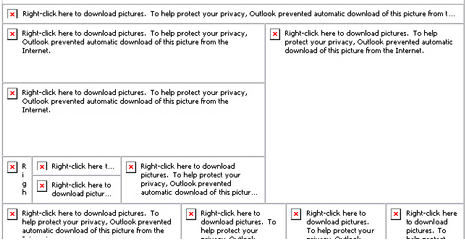
No bueno.  You need more than imagery alone to catch people’s attention in Outlook.

2. Load times will suffer for image-heavy emails

Patience is a virtue that most of us are suddenly lacking when you put an iPhone in our hands.  According to KissMetrics, 40% of people will bail if a page takes more than 3 seconds to load.

Know that load time with image based emails – especially high resolution ones – is going to take a hit.  This will be even more of an issue if you’re targeting buyers in rural or developing areas.

Consider this beauty vs. speed trade off in your approach.

3. You don’t need images for simple text on a background or for your CTAs

If you have simple text with a background (even an image background) this doesn’t need to be an image.  It can just be text, with some HTML to style it according to how you want it to appear on the page.

This is most important – and fortunately, easiest to fix – for call to action buttons.  Instead of designing your button in Photoshop or another graphics tool, use a bulletproof button generator to design a more email-friendly version.

pixilated CTA

By creating these buttons in HTML, these will load from the get-go (no Outlook image blocking) and will be clear and crisp on any device without impacting load times.

4. Fewer images means fewer of your messages trapped in spam filters

If your email is all or mostly images, email clients aren’t able to “see” what the content is.  As a result, your messages may be marked as spam.

There’s no magic number or hard-and-fast ratio here, but a good rule of thumb is to target 80% text and 20% images.

5. Choose the right image format for high quality and speed

The three most common image formats in digital are PNG, JPEG, and GIF.  If you want to get into the weeds, Litmus breaks down the pros and cons of these options.

In most cases, PNGs are best for email. They can be compressed without losing quality, they support transparency, and they’re supported by virtually all browsers and email clients.

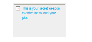
6. You can leverage alt text to add context

When an image is blocked or can’t load for some reason, most email clients will show a blank frame with the alt text displayed.

It takes a little extra time, but you can use this to your advantage.  Populate the alt text to provide context to what the viewer should expect to see.

Alt Text.png

7. Text lends itself better to inbox searches

If your users open your email and think “I’ll get back to this later,” using text for key info helps them search and find your message down the road.

If the majority of your email’s copy is embedded in images, you’re providing users with a lot less “real text” to parse.  Things like your company’s name, event titles, dates, headlines, etc. should ideally be in text for maximum searchability.

8. It takes more time to update graphics based emails

It’s hard to generate a text version from an all image email.  Pardot requires you create both an HTML and a text version of your message to maximize deliverability.  But when you hit the “Import text from HTML” button… you’ll get the pre-header text and not much else. You will need to re-type any embedded copy so that it will show up in the text version of the message.

If you catch a typo in an HTML based email, you can make that edit quickly in Pardot.  Not so for a franken-email of Photoshop snippets – you have to get back in the image editor, make your copy change, save, re-upload to Pardot, and replace the image in the email.

A sliced image email also creates all kinds of challenges for perfecting alignment.  Try zooming in and out on your browser, and looking at the template on your phone, and you’ll notice that devices don’t always get the alignment quite right or even the same.  You can spend hours trying to determine how to get rid of that one bit of wonky white space for one random person.

9. Ultimately, good performance is good design

If you can’t tell, I lean heavily toward erring on the side of text over heavy graphics when designing an email template.

But this is an opinion based on my experience, and your mileage may vary based on your content and audience preferences.  Be sure to A/B test, check out how your templates render on different devices, measure your results, and adjust based on the metrics you’re seeing.

Where do you fall on this debate?

Image-heavy emails – like ‘em or loathe ‘em?  Are there pros and cons I missed?  Or pet peeves you’re itching to share?

Let us know in the comments! 

Left to my own devices, I’m the kind of person who saves everything to her Desktop and has at least 5 Word docs titled “Notes Latest V2a” at any given point in time.

I’ve learned the hard way that this is NOT a good plan if you’re managing assets in a Pardot org.  (Kicking this can down the road means lots and lots of technical debt in your future! No bueno.)

It is SO worth it to take the time to build a coherent folder structure and standard file names.  Even if it’s boring and adds a few seconds to your process.  Your future self and team members will thank you for it.

General foldering best practices in Pardot

Pardot folders operate the same basic way they do on the hard drive of your computer.  A definition from Pardot:

Folders are a top-down organizational feature that house campaigns, emails, and other marketing modules together. Folders let you segment and nest marketing elements in a way that makes sense for your team.

Every piece of marketing content created must be placed in a folder.  And there’s a big catchall one called “Uncategorized” that is basically the Pardot equivalent of my messy desktop.

Side note: most people will find this to be fairly self-explanatory and intuitive, but it’s a little bit of a re-frame from what former Marketo users are used to. Marketo is very folder-centric and uses these to create programs and relate assets to each other.  That’s not really what Pardot’s trying to do – their version of folders are mostly just an organizational tool.

Options for Pardot folder structures

Folders are basically a blank canvas for organizing to your heart’s desire.  The only real limits are that you can have max 10,000 items in a folder, and up to 16 levels of subfolders.

But come on – do you really need deeper nesting than:

 Folder A >  Folder B >  Folder C >  Folder D >  Folder E >  Folder F >  Folder G >  Folder H >  Folder I >  Folder J >  Folder K >  Folder L >  Folder M >  Folder N >  Folder O >  Folder P

Common organizational structures I’ve seen include:

Heads Up: folders & scoring categories

A critically important thing to note is that folders are the basis for Scoring Categories.  Quick refresher: Scoring Categories allow you to break down the overall prospects scoring into subcategories – so that you could have separate scores for each of your product lines, or different business units, etc.

If you’re planning on using Scoring Categories at some point down the road, build your folders around the categories you will likely use (like product or business unit).  Worry about the points system later – and this will save you from a massive reshuffle when you’re ready to revisit that.

Naming conventions in Pardot

If you’ve already been using Pardot for a while, a great place to start with this is looking at how your team is naming files on their own.  If it’s good/useful – boom, document it.  If it’s a mess, then work the team to come up with a naming protocol.

Detailed file names are vital for searchability.  You will have some users that navigate to assets using the folder structure every time, and others that will type a few keywords in the search bar to filter down to what they’re looking for.  Standardized naming sets both groups up for success.

Data points you may want to work into your names could be:

  • Name/title
  • Campaign type (i.e. tradeshow, webinar, advertising)
  • Company division / business unit
  • Industry / vertical
  • Date
  • Region
  • Language
  • Audience (i.e. Client, Late Stage Prospects, etc.)

So for example, if you decided you wanted to set your naming convention to be:

Company Division – Name/Title Campaign Type – Audience – Date

This would translate into something like:

Employee Benefits – Complying with the ACA Webinar – Clients – July 2016

General tips & gotchas

Use dividers

Use some kind of dividing character so that your name doesn’t become one big string. I’m partial to – or |. Underscores are also a common divider – but personally I think they are harder to read.

Avoid over-reliance on tags

Tags are NOT a substitute for proper foldering and naming conventions. You have very limited reporting and search capabilities with tags.  They’re useful in a pinch, but I repeat, DO NOT make them the center of your organizational structure.

Consider whether date is really relevant

If you’re creating a template (an email, for example) that is going to be used in multiple initiatives over time, I’d suggest skipping the date as part of your name – it gets confusing.  You’ll always have the system created and last modified dates to refer to.

The briefer, the better

Try to keep names as short as you can, and put the most important/descriptive parts toward the front. Asset names can go up to 255 characters, max. But you’ll only see about the first 42 characters when you’re referencing in automation rules and completion actions, and about 20 characters when referencing in Engagement Studio.

Don’t set it and forget it

You’re not done when you decide on a plan and roll it out. Oh no.

Appoint someone Keep-It-Organized Cop or Organizational Officer, or whatever you want to call it – and check at least monthly to be sure things are being classified correctly to avoid a big pile up to sort out later.

Over to you: what do you think?

How is your process working?  What tactics have you tried in an effort to stay organized?  Any horror stories?

Let us know if the comments!

True story, this is an actual text I got from my mom recently:

IMG_6427.jpg

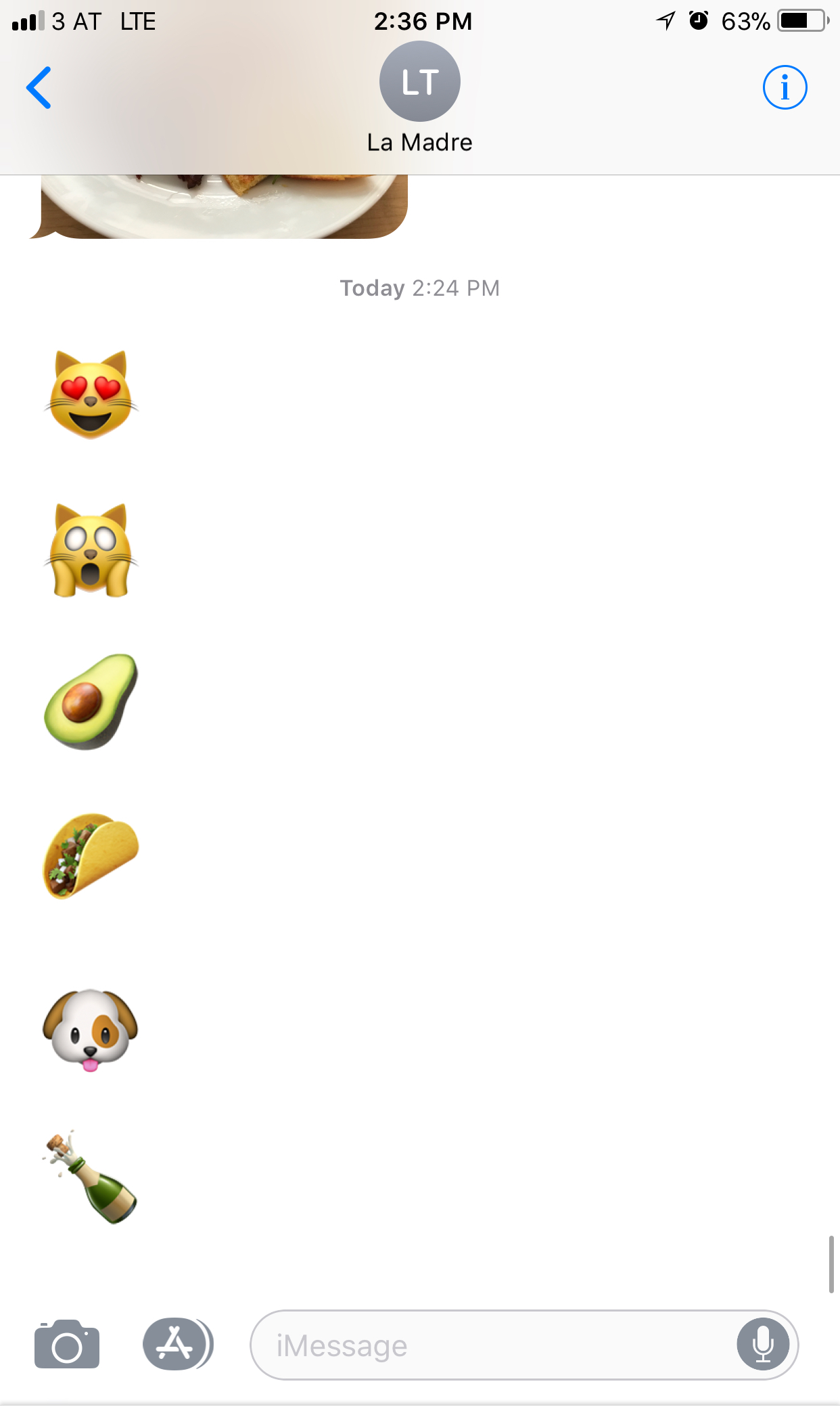
Um…yeah. I’m not sure what this means.

It might be some sort of code for “hey dude call your mother,” because I did, and the emojis didn’t actually come up.

Cryptic mom texts aside, emoji literacy is becoming something that digital marketers need to have on their radar. Emojis are one of the fastest growing “languages” in human history – and we’re seeing them make the leap from fun flair in SMS to mainstream marketing.

How emojis have crept into our vernacular

The modern emoji emerged in Japan in the late 1990s. The word “emoji” itself is actually a combo of the Japanese words for “picture” (e) and “character” (moji.)

There is truly nothing new under the sun, though — the first smiley face emoticons appeared on typewritten documents as far back as the 1648. (Yes, really. I mean it could have been a typo… read this and decide for yourself.)

The innovation of the smiley with a nose, i.e. :-), didn’t debut until 1982.

And now, here we are in 2017, scrolling through hundreds of itty bitty images our iPhone keyboards to find the emoji that perfectly captures the emotion we can’t quite explain in words.  What a time to be alive.

Should you give emojis a try in your marketing?

We’re all looking for ways to stand out in a crowded inbox. Could a colorful image catch your recipient’s eye in a long list of text only subject lines?

According to a report by Experian, 56% brands using an emoji in their email subject lines saw a lift in unique open rate.  Not too shabby.  Other data I’ve seen on emoji performance has had inconclusive results.  But it might be worth a try…

A few things to consider to help you determine whether this makes sense for your marketing:

1. Does it fit your brand voice?

What is the tone of your overall marketing and corporate comms? Is it buttoned up and formal? Light and playful? Somewhere in between? Keep your emoji-ing consistent with that, and use your brand guidelines as a filter for how and when to use a well-placed emoji.

2. Who else is doing it?

Scan your own inbox for emojis in emails. Is your competition leveraging them to stand out? If the answer is no – I actually see that as a really good thing. That means there’s an opportunity for you to differentiate.

3. How will you know if it’s working?

What’s the main metric you’re targeting? If you’re dropping emojis in subject lines, the best one would be open rate. This is an ideal use case for A/B testing, so that you can isolate the impact of the emoji.

Get your emoji on: HOW to actually do it

Ready to go?  Then here’s the how-to stuff:

1. Copy and paste into your Pardot template ????‍♀️

The easiest way to get an emoji into Pardot is with a little Ctrl + C, Ctrl + V action. Emojipedia is a great resource to select the perfect emoji.

Update: Amy has brought it to my attention that not ALL emojis available on Emojipedia will work in Pardot.  Working on testing this and coming up with a comprehensive list of “Pardot-safe” emojis, but in the meantime, here are some that have worked for me:

■ □ ▢ ▣ ▤ ▥ ▦ ▧ ▨ ▩ ▪ ▫ ▬ ▭ ▮ ▯ ▰ ▱ ▲ △ ▴ ▵ ▶ ▷ ▸ ▹ ► ▻ ▼ ▽ ▾ ▿ ◀ ◁ ◂ ◃ ◄ ◅ ◆ ◇ ◈ ◉ ◊ ○ ◌ ◍ ◎ ● ◐ ◑ ◒ ◓ ◔ ◕ ◖ ◗ ◘ ◙ ◚ ◛ ◜ ◝ ◞ ◟ ◠ ◡ ◢ ◣ ◤ ◥ ◦ ◧ ◨ ◩ ◪ ◫ ◬ ◭ ◮ ◯ ✁ ✂ ✃ ✄ ✆ ✇ ✈ ✉ ✌ ✍ ✎ ✏ ✐ ✑ ✒ ✓ ✔ ✕ ✖ ✗ ✘ ✙ ✚ ✛ ✜ ✝ ✞ ✟ ✠ ✡ ✢ ✣ ✤ ✥ ✦ ✧ ✩ ✪ ✫ ✬ ✭ ✮ ✯ ✰ ✱ ✲ ✳ ✴ ✵ ✶ ✷ ✸ ✹ ✺ ✻ ✼ ✽ ✾ ✿ ❀ ❁ ❂ ❃ ❄ ❅ ❆ ❇ ❈ ❉ ❊ ❋ ❍ ❏ ❐ ❑ ❒ ❖ ❘ ❙ ❚ ❛ ❜ ❝ ❞ ❡ ❢ ❣ ❤ ❥ ❦ ❧ ❶ ❷ ❸ ❹ ❺ ❻ ❼ ❽ ❾ ❿ ➀ ➁ ➂ ➃ ➄ ➅ ➆ ➇ ➈ ➉ ➊ ➋ ➌ ➍ ➎ ➏ ➐ ➑ ➒ ➓ ➘ ➙ ➚ ➛ ➜ ➝ ➞ ➟ ➠ ➡ ➢ ➣ ➤ ➥ ➦ ➧ ➨ ➩ ➪ ➫ ➬ ➭ ➮ ➯ ➲ ➳ ➴ ➵ ➶ ➷ ➸ ➹ ➺ ➻ ➼ ➽ ➾ ☀ ☁ ☂ ☃ ☄ ★ ☆ ☇ ☈ ☉ ☊ ☋ ☌ ☍ ☎ ☏ ☐ ☑ ☒ ☓ ☖ ☗ ☚ ☛ ☜ ☝ ☞ ☟ ☠ ☡ ☢ ☣ ☤ ☥ ☦ ☧ ☨ ☩ ☪ ☫ ☬ ☭ ☮ ☯ ☰ ☱ ☲ ☳ ☴ ☵ ☶ ☷ ☸ ☹ ☺ ☻ ☼ ☽ ☾ ☿ ♀ ♁ ♂ ♃ ♄ ♅ ♆ ♇ ♈ ♉ ♊ ♋ ♌ ♍ ♎ ♏ ♐ ♑ ♒ ♓ ♔ ♕ ♖ ♗ ♘ ♙ ♚ ♛ ♜ ♝ ♞ ♟ ♠ ♡ ♢ ♣ ♤ ♥ ♦ ♧ ♨ ♩ ♪ ♫ ♬ ♭ ♮ ♯ ♰ ♱

2. Understand how your emoji will come across (literally, not figuratively) ????

Be aware that emoji support across clients and operating systems is different. Emojis are based on Unicode characters – which is a computing industry standard that helps ensure consistent representation of text and symbols across digital devices.

For example, 8.2% of users are still on Windows XP, which is wholly e-NO-ji. If these folks get your email on a desktop client, they’ll see a big fat ☐ in place of the witty emoji you lovingly selected.  The BEST environment for emojis is Gmail, which always renders emojis (no matter what device or OS.)

You could spend days analyzing how your emojis will render, but is that the highest and best use of your time as a marketer?

My advice would be to look at the top 3 OS and mail clients your audience is using, and allow that to inform your decision. Emojipedia show you what will come across.

3. Use emojis to accent, not replace content ????

Because you can’t be 100% certain that your emojis will render, I’d recommend using them for flair/emphasis rather than actually replacing words. So instead of:

Wanna ????this?

Try…

Wanna pizza this? ????

If your content is blocked, that latter is much easier to understand.  The user will see:

Wanna pizza this? ☐

Instead of:

Wanna ☐ this?

That’s not a blank I’d want to leave to the human imagination.  Lots of ways to fill that one in.

4. Treat it like an experiment, and TEST IT!

Don’t just listen to your Beating Heart on Samsung Galaxy S8 (April 2017).

Get some data.

Use your A/B testing superpowers (available in Pardot Pro or higher) to gather data on how emojis actually move the needle on your results.  If you do run an emoji test, please share what you find in the comments!

Emoji or NOji: what are your thoughts?

If you do run an emoji test, please share what you find in the comments!

In the meantime, what do you think — are emojis a fun way to stand out in the inbox, or too cutesy for B2B marketing?  When is a well placed emoji appropriate?

Make your life easier by using these Pardot code snippets to kickstart your next Pardot landing page, email template or form project.

Catalogue

  • Landing Pages & Landing Page Templates
    • Variable Tags
      • title
      • Content
    • Content Regions
      • Link Region
      • Image Region
      • HTML Region
      • Simple Region
      • WYSIWYG Editor
  • Emails
    • View in Browser
    • Unsubscribe
  • Email Templates
    • Editable Content Regions
    • Editable Content
    • Repeatable Content
  • Forms
    • Change a form submit button to an image
    • Trigger a download after successful form submission

Landing Pages & Landing Page Templates

Landing Page Variable Tags

Title

Use this snippet to populate the name of the Pardot landing page.

%%title%% 

Content

Place this snippet where you would like the form, site search results, or landing page general content to appear within your design.

%%content%% 

Content Regions

A Link

Use this snippet to make a link in your landing page template editable.

<a href="https://jennamolby.com" pardot-region="editable-link" pardot-region-type="link">My Link</a>

An Image

Use this snippet to make an image in your landing page template editable.

<img src="image/my-image.png" pardot-region="editable-image" pardot-region-type="image" />

HTML

Use this snippet to display HTML code on you landing page.

	
&lt; your code here&gt;

Simple

Use this snippet to make HTML elements editable. You can use it on the following tags: address, b, big, blockquote, caption, cite, del, dfn, em, h1, h2, h3, h4, h5, h6, i, ins, kbd, p q, s, samp, span, small, strike, strong, sub, sup, u var

<p pardot-region="simple-text" pardot-region-type="simple">Your text here</p>

WYSIWYG Editor

Use this snippet to make HTML elements editable. You can use it on the following tags: article, aside, div, dt, dd, figure, figcaption, li, footer, header, main, section, td.

<div pardot-region="pardot"><h3>My Header</h3></div>

Emails

View in Browser

To add a view in browser link to your email add the following snippet.

%%view_online%%

Unsubscribe

To add a unsubscribe link to your email add the following snippet.

%%unsubscribe%%

Email Templates

Email Content Regions

Pardot will automatically make every table cell or paragraph editable, however, if you want to “lock down” your template so only some areas are editable, you can use these snippets.

Editable Content

Add this snippet to a table cell to make it editable.

<td pardot-region></td>

Repeatable Content

Pardot allows you to specify repeatable content blocks within an email template. This is great for scenarios where you need 3 content sections for 1 email but only 2 for another email.

<div pardot-repeatable>
	<div pardot-region>
	<h1>Title</h1>
	A paragraph of text
		<a href="#">Read More</a>
		</div>
	</div>

Forms

Change a form submit button to an image

Place this snippet in the Look and Feel step in the form wizard to change it to a image. Remember to remove all the text in the Submit Button field.

<style type="text/css">
  form.form p.submit input {
  margin: 0;
  padding: 0;
  text-align: right;
  border: none;
  background: url(https://www.site.com/submit.gif) no-repeat left top;
  width:100px;
  height:100px;
  cursor: pointer; }
</style>

Trigger a download after successful form submission

Use this snippet to automatically start an asset (like a whitepaper) to download upon successful form submission. Place this code under the Thank You Code tab in the form wizard.

<script type="text/javascript">
  var howLongToWait = 10; //number of seconds to wait
  var urlOfDownloadContent = 'http://www.example.com/whitepaper.pdf'; // URL of your piece of content
  function triggerDownload() {
  window.location = urlOfDownloadContent;
  }
  setTimeout('triggerDownload()', howLongToWait * 1000);
</script>

What are your favorite Pardot snippets?

Send me a tweet @jennamolby to tell me about your favorites, or contact the Sercante team for help.

No more posts to show