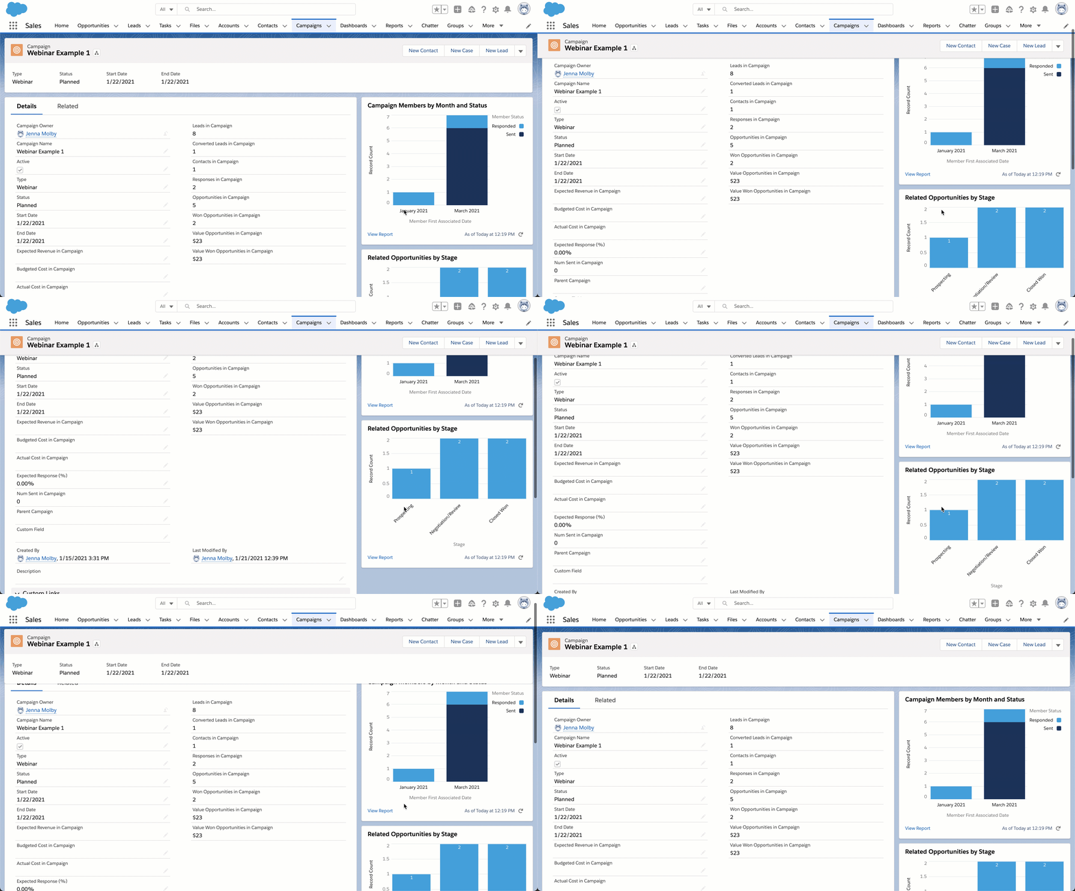
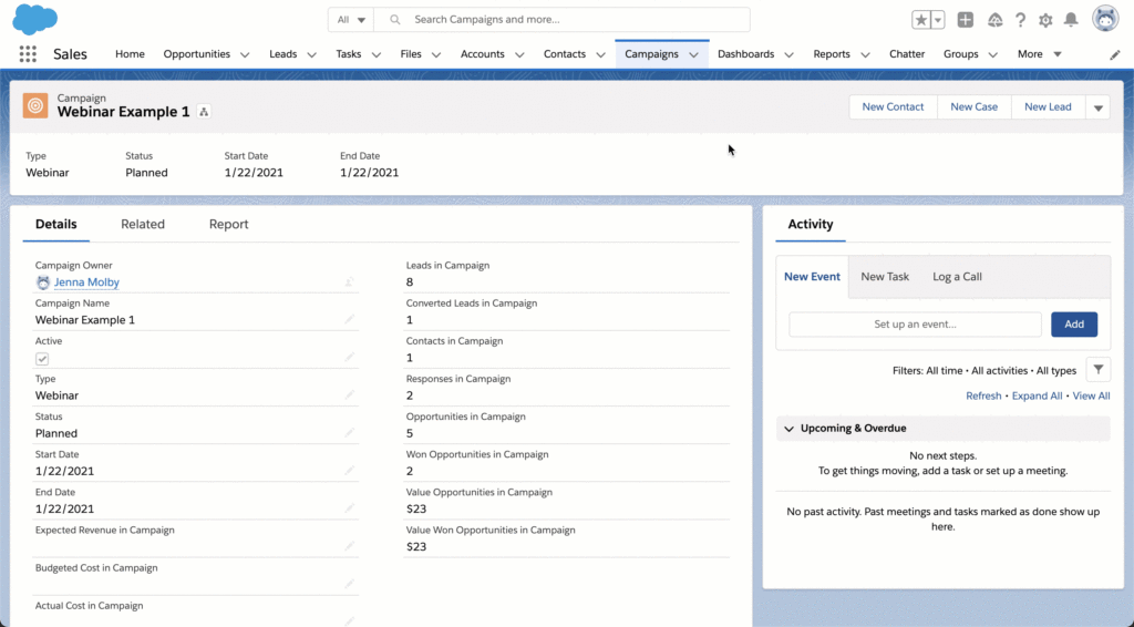
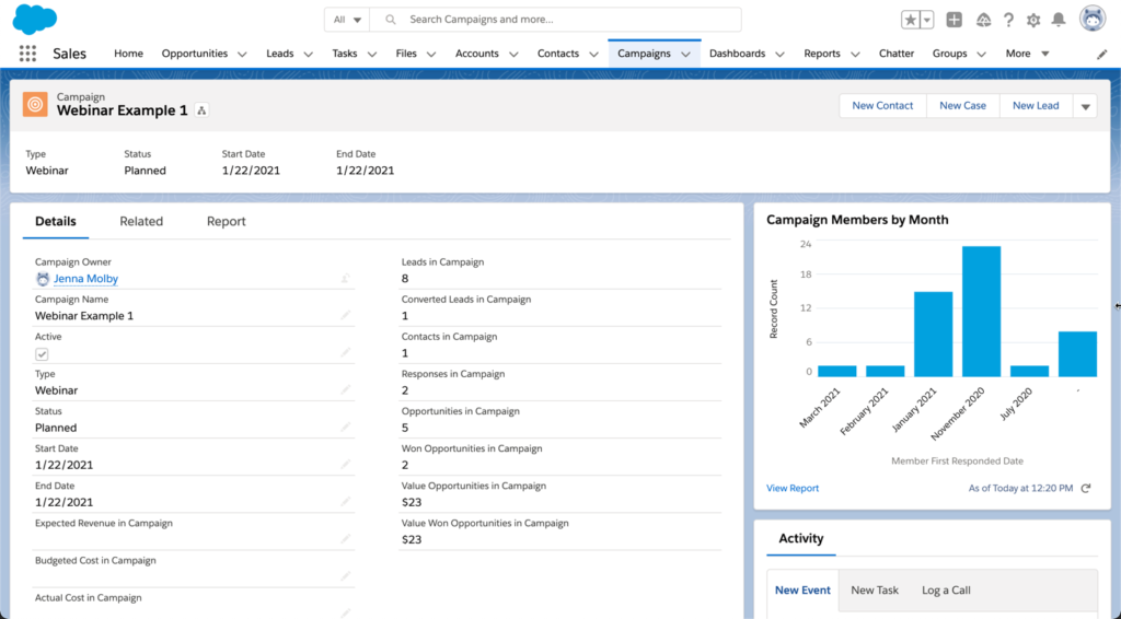
One of my favourite Lightning features is customizing the campaign page using the Lightning App Builder. The drag-and-drop App Builder allows you to add tabs, reports and instructions to your page. While there are many different ways to customize your campaign page, here are four changes that are easy to implement that will delight your marketing team.
How to customize your Salesforce campaign page
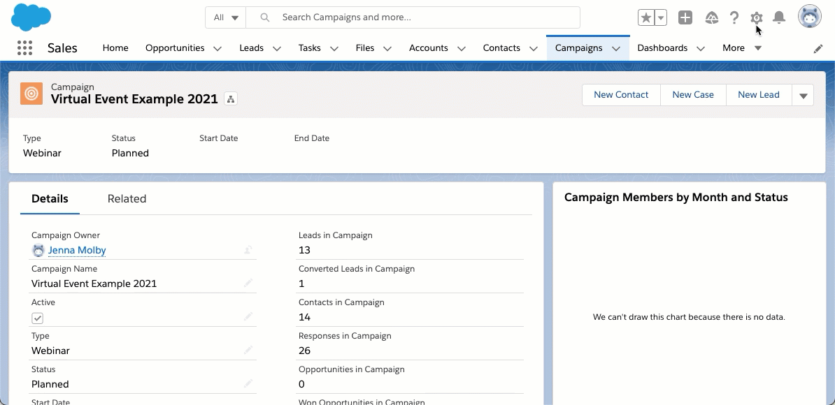
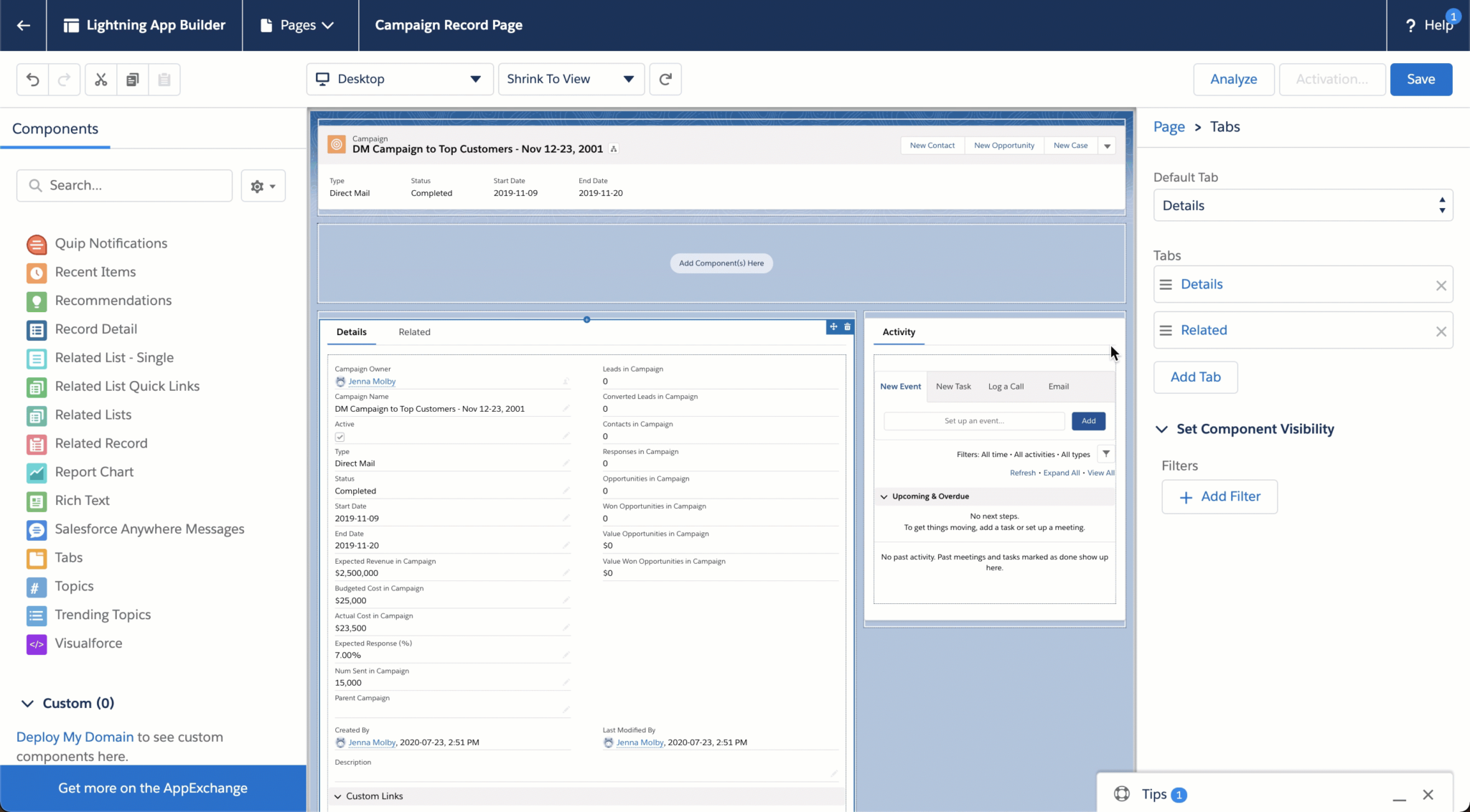
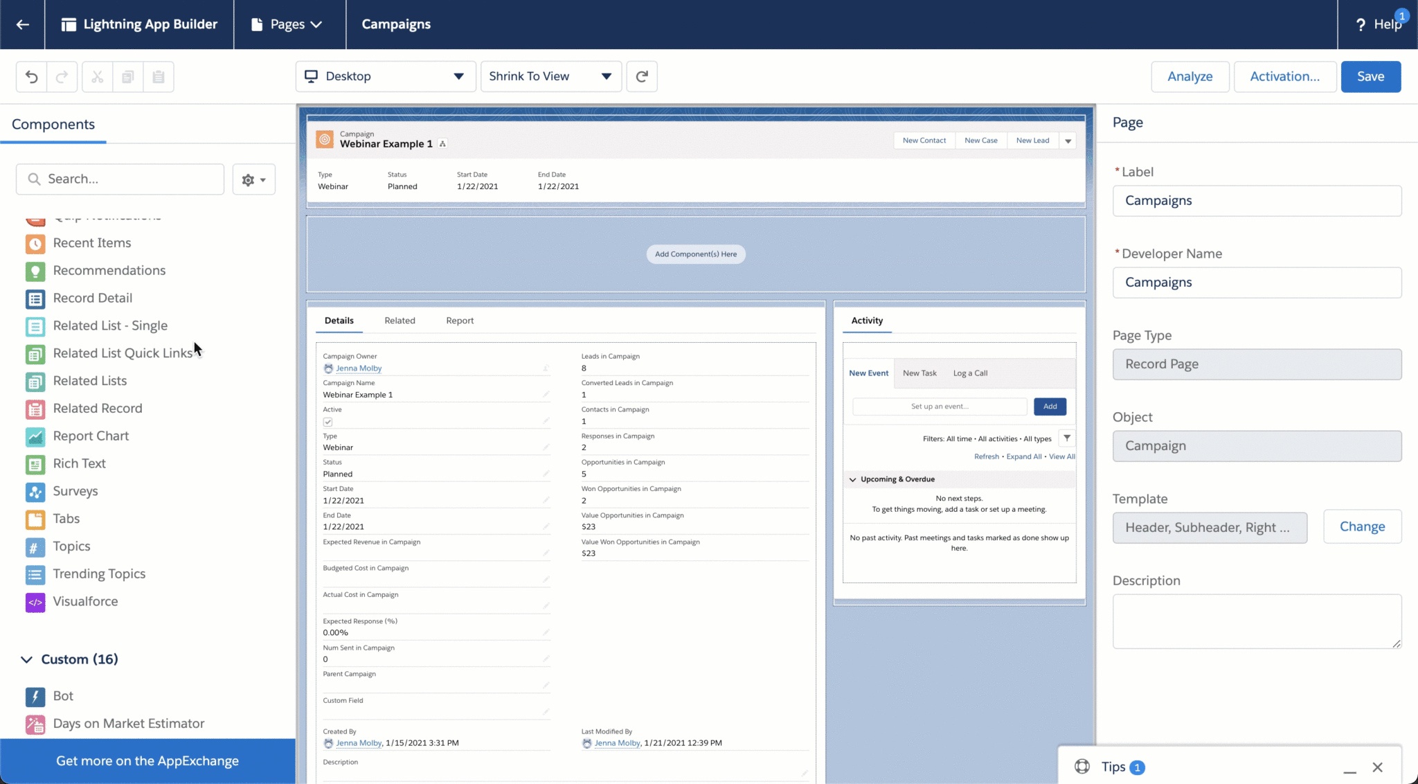
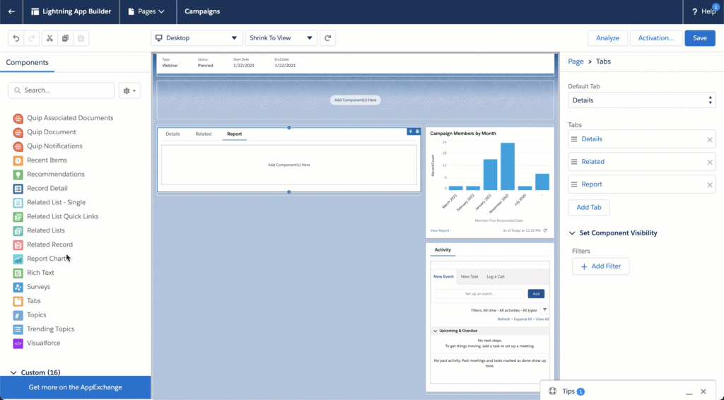
To customize your campaign page, navigate to one of your Salesforce campaigns, click on the gear icon, and click on edit page. This will take you to the Lightning Page Builder.
Note: Editing the page will overwrite the existing page. You might want to create a new custom record page instead of overwriting an existing page.
1. Change the default tab
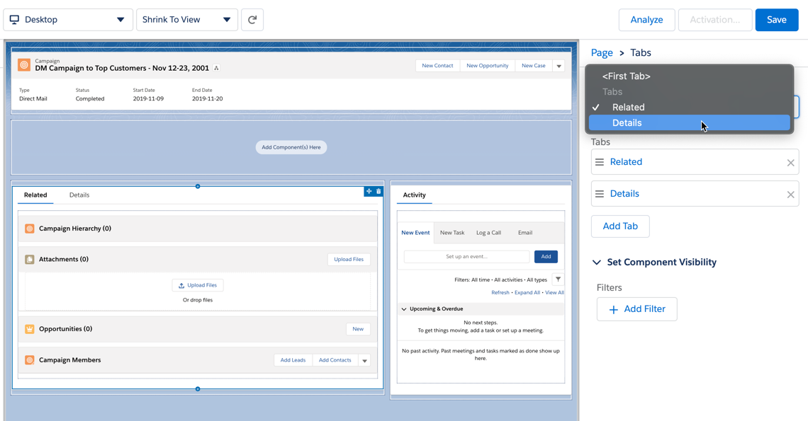
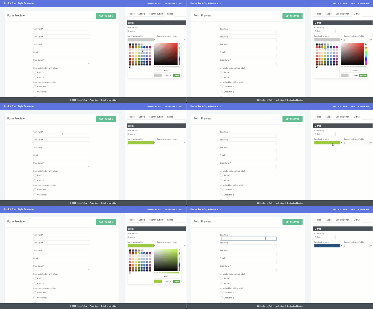
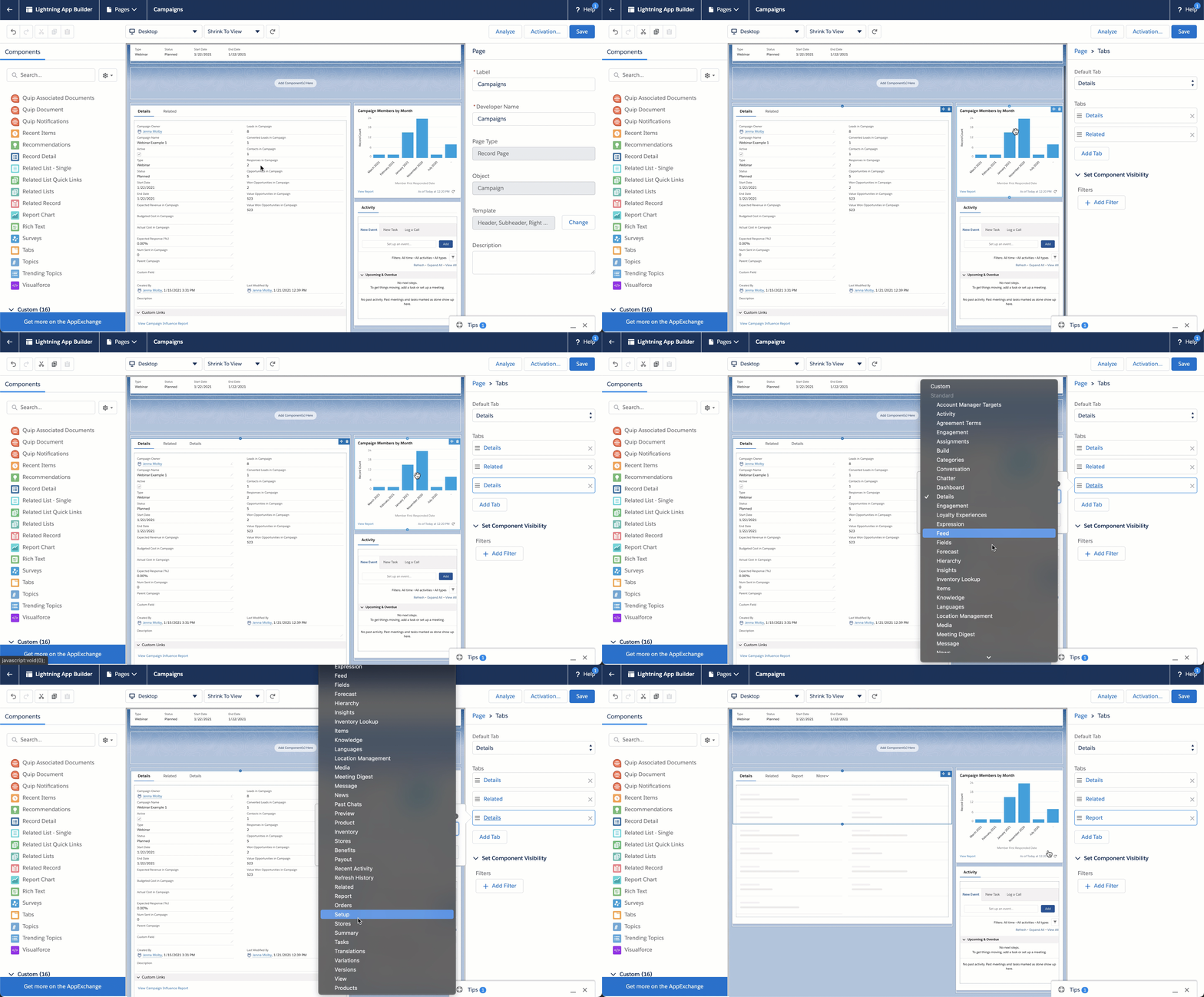
By default, when you navigate to a campaign in Salesforce, the default tab will be the Related tab. You can update the default tab to be anything you want. I recommend setting it to the Details tab. To do this, click on the tabbed section and chose the default tab from the dropdown.
2. Add custom links and instructions to your page
Add helpful links or instructions to the page that can be used by Sales or Marketing. This can include campaign checklists, best practice docs, links to report or dashboards and whatever else would be helpful when viewing or creating a campaign.
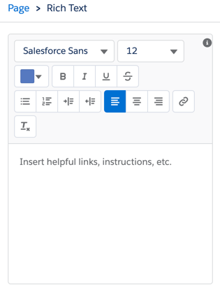
To add text sections on a page. Drag and drop the Rich Text component anywhere on your page.
Enter the text within the Rich Text editor.
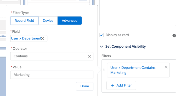
Optionally, add some visibility features to the rich text section. For example, you can show different content based on campaign type or you can show different content based on if the user is Marketing or Sales.
3. Add reports to your page
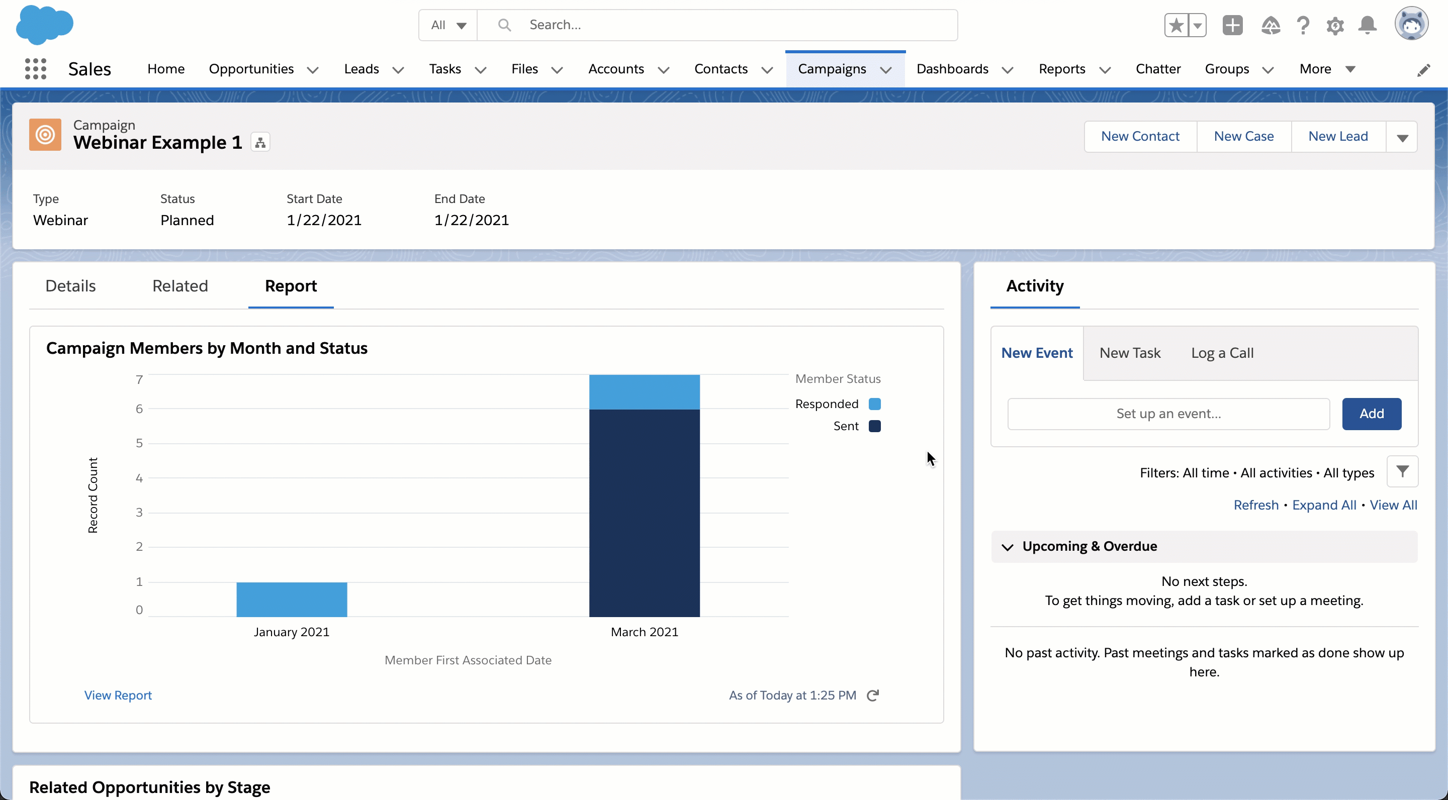
Adding report charts will give you insight into a particular campaign’s performance without creating a separate report or leaving the campaign page. These reports can show you how many campaign members were added, by month or by status, how many opportunities are influenced by the campaign by opportunity stage, etc.
To learn how to add reports to your campaign page in Salesforce, check out this blog post.
4. Add Tabs
Any of these components can be added as a tab within the campaign page instead.
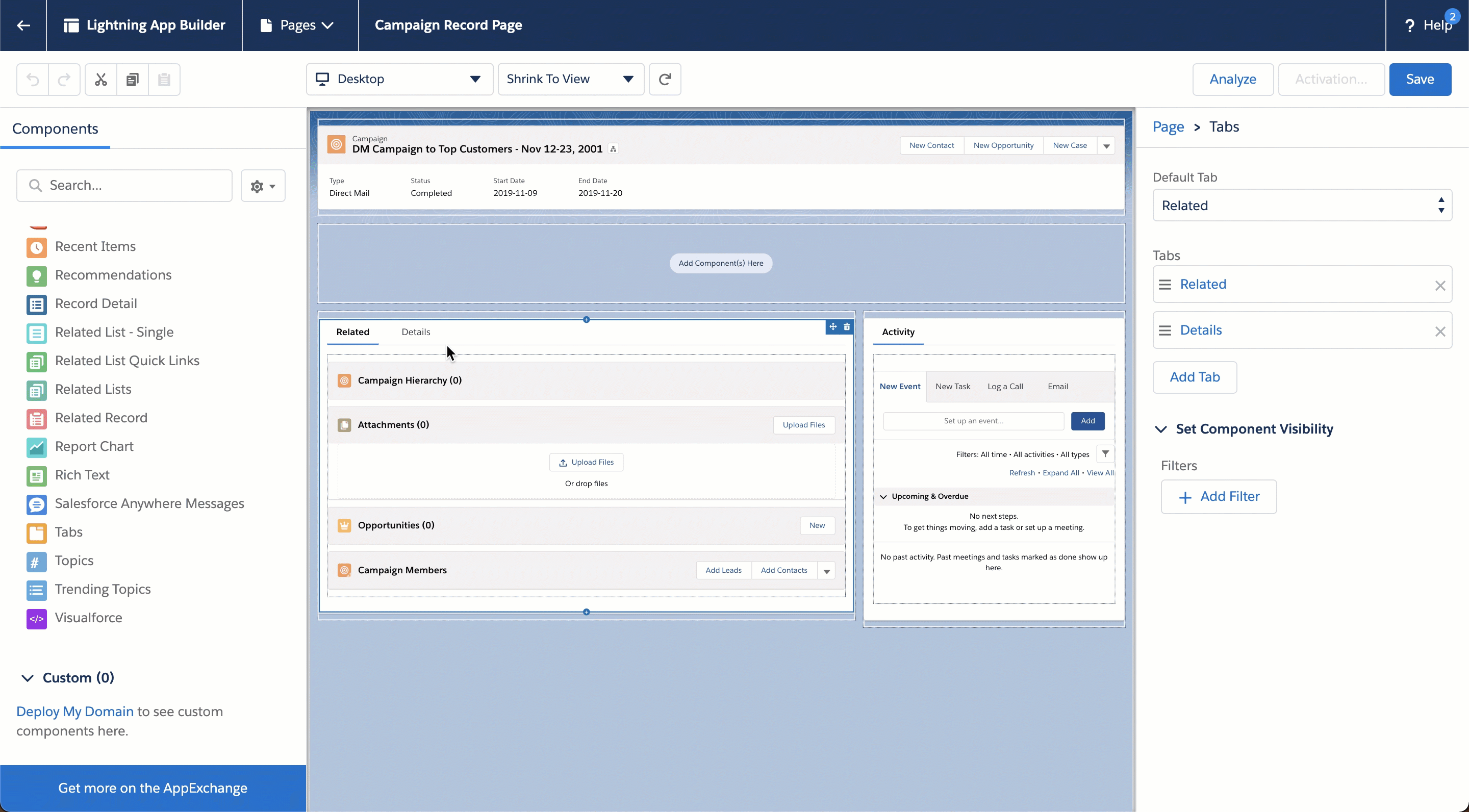
To add a tab, click on one of the tabbed sections to bring up the tab sidebar. Click the add tab button and select which component you want to add to the section.
You have your lead lifecycle set up, your scoring set up, and the marketing qualified leads (MQLs) are flowing in. Now it’s time to pull reports in Salesforce to see how you are doing against your targets. Maybe you don’t know where to start, what reports to pull or what extra data points you need. In this post, I’ll share some example MQL reports and some tips and tricks for creating reports in Salesforce.
Getting your MQL data ready
To pull the reports outlined in this post, you will need to ensure you are collecting appropriate data points. Here are some data points that are used to create the MQL reports.
MQL Date: The date the lead became an MQL.
Recycle/Nurture Date: The date the lead went from MQL to recycle/nurture or whatever the equivalent status you have set up.
Rejected Date: The date the lead was rejected because it’s not the right fit.
Age New Lead > MQL: The number of days between when the lead was created and when the lead became an MQL.
Age MQL > Recycle/Nurture: The number of days the lead was an MQL before moving to the next stage.
Recycle/Nurture Reason: The reason the lead was marked as recycle/nurture.
Rejected Reason: The reason the lead was marked as rejected.
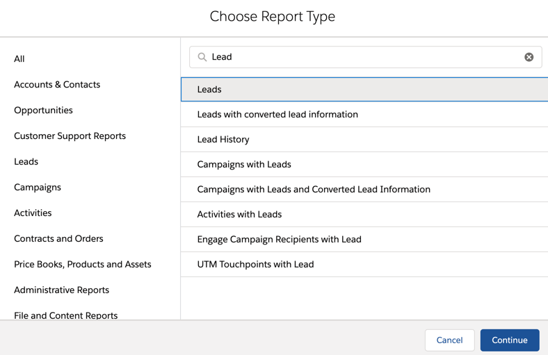
Most MQL reports will use the default “Leads” report type.
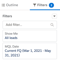
For the report filters, you almost always want to use the show me all leads option. You also can update the date filter from created date to MQL date.
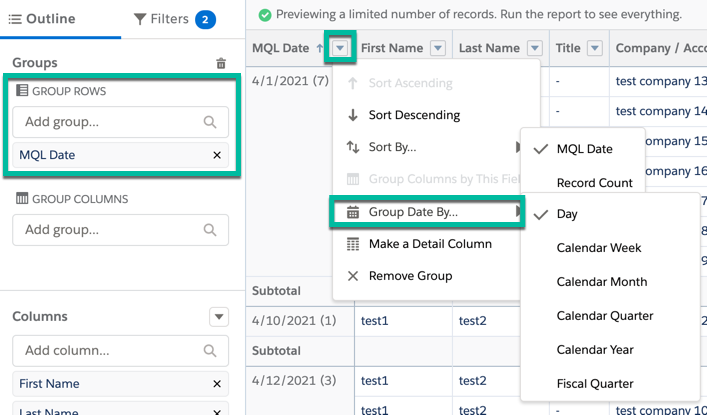
Group rows by searching for the field name in the group rows section. When grouping by a date range, click on the arrow next to the field to group the date by day, week, month, etc.
Tip: Don’t forget you can group by more than one row!
You can also group columns by searching for the field name in the group columns section.
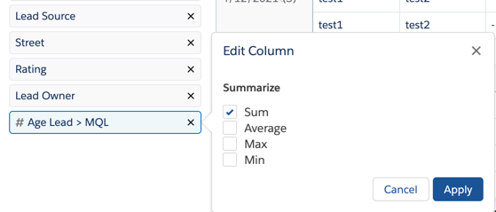
When adding a number field to your report, you have the option to summarize the field using sum, average, max and min. To change the summary option, click on the field name to bring up the edit column options.
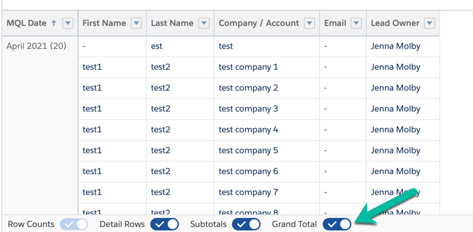
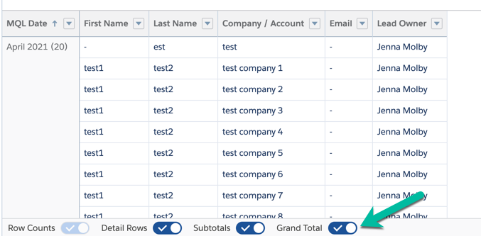
Use the toggles along the bottom of the report to show/hide information for your report. For most reports, you will probably want to hide the detail rows.
Example Reports
Here are some example reports and what filters to use to create them.
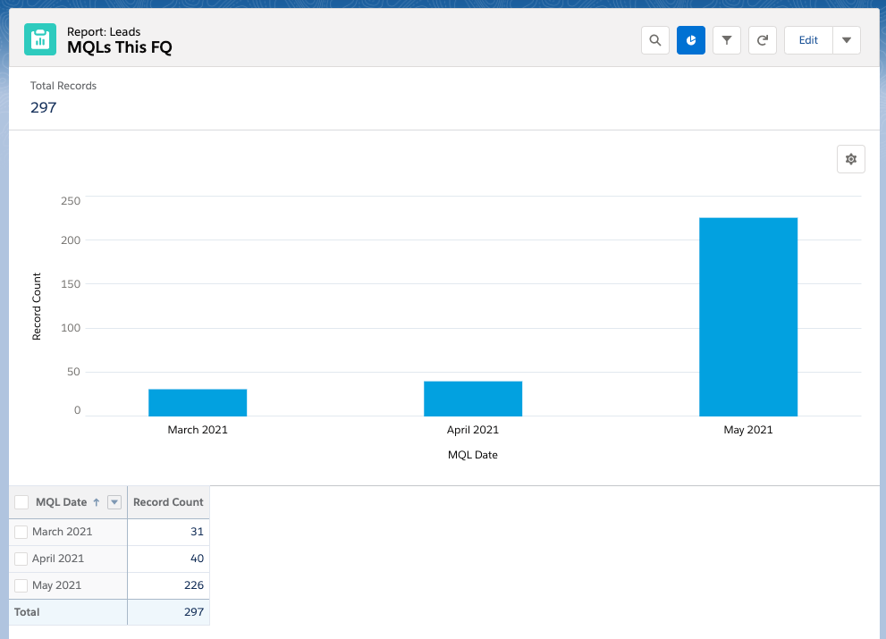
MQLs this quarter
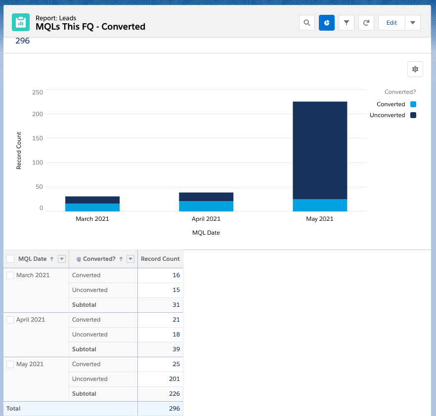
How many MQLs did we have this quarter? Filters: All leads, MQL Date is current FQ. Grouped by MQL date (by month).
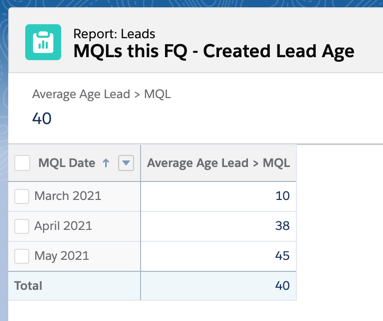
Average number of days between lead created date and MQL date
How long does it take for a new lead to become an MQL? Filters: All leads, MQL date is current FQ. Grouped by MQL date and with the average filter turned on for the field “Age New Lead > MQL.
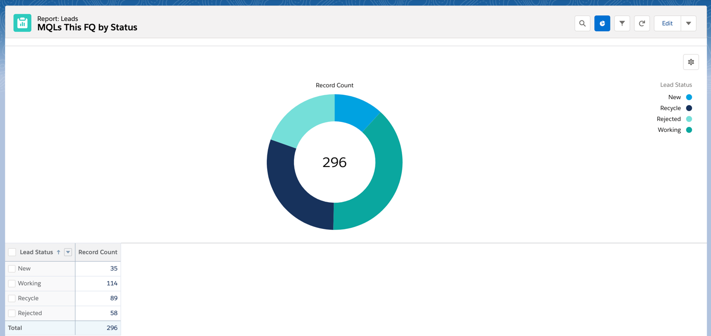
MQLs by Status
What status are the MQLs in? Filters: All leads, MQL date is current FQ. Grouped by Lead Status.
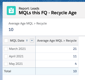
Aveage number of days between when an MQL is created and when the status is changed to recycle
How long is a lead in the MQL stage before being recycled? Filters: All leads, MQL date is current FQ, recycle date is equal to “”. Grouped by MQL date with the average filter turned on for the field “Age MQL > Recycle”.
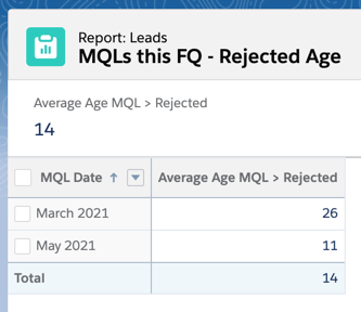
Aveage number of days between when an MQL is created and when the status is changed to rejected
How long is a lead in the MQL stage before being rejected? Filters: All leads, MQL date is current FQ, rejected date is equal to “”. Grouped by MQL date with the average filter turned on for the field “Age MQL > Rejected”.
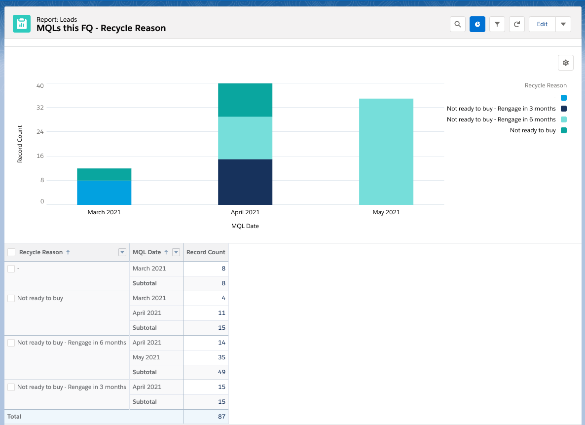
Leads by recycle reason
What are the main reasons for an MQL being recycled? Filters: All leads, MQL date is current FQ, recycle date is equal to “”. Grouped by recycle reason and MQL date.
Same report can be pulled for rejected reason or any other related field.
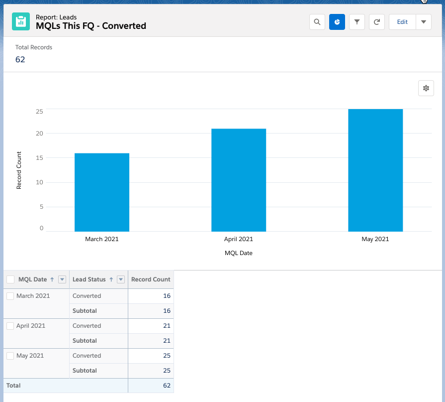
MQLs that have been converted
How many MQL leads have been converted this quarter? Filters: All leads, MQL date is current FQ and lead status equals converted. Grouped by MQL date and Lead Status.
Tips & tricks
Add targets to your reports
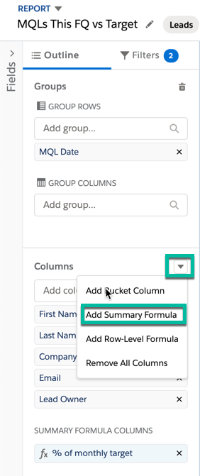
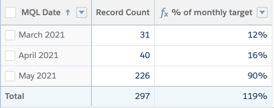
How far away are you from your MQL target? You can add a formula field to your report to calculate the percentage of how close you are to any number. To do this, click on the arrow next to the columns section and click on add summary formula.
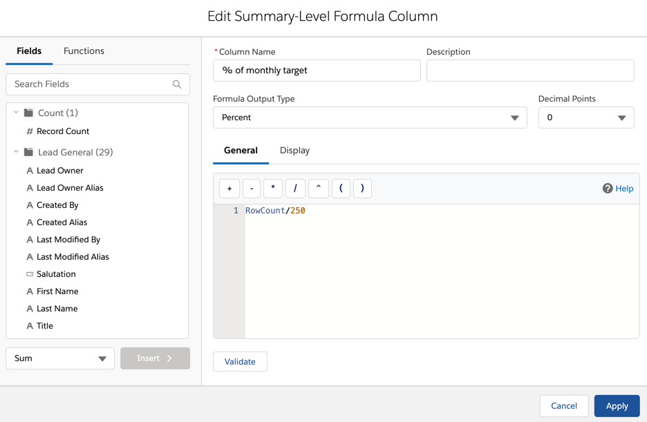
Give your column a name, select percent as the formula output type and use this formula RowCount/250. Replace 250 with whatever your target MQL number is.
Run your report to see the calculation in action!
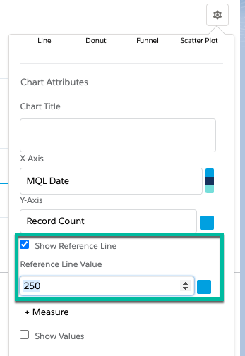
You can also add a target to your chart by going to chart settings. Check the box for show reference line and enter your MQL target in the text box.
Add bucket fields
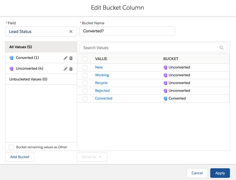
Bucket fields are a great way to clean up your report by grouping field values. One way I like to use them is to show converted vs unconverted leads. In this example, lead status is updated to “converted” when a lead is converted, so I can use that field to bucket my fields to determine converted vs unconverted.
Note: There is also a field called “converted” on the lead which is a checkbox. You can also use this in your reports, but I it will only be a “true” or “empty” which can be confusing.
Don’t start from scratch every time
As long as you are using the same report type for your reports, there is no need to create a new report every time. Use one report and build off of it. Adding different filters and columns. Just make sure you use the save as button!
Dashboards
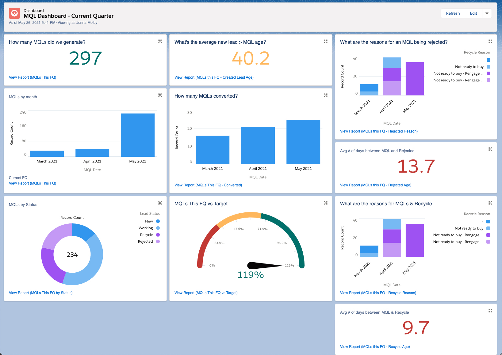
Once all your MQL reports are created, the reports can be used in dashboards like this MQL dashboard.
I’m so excited to finally launch version 2.0 of the Pardot Form Style Generator. With the new version comes a new UI and some cool new features, including customized checkboxes and radio buttons, embedded Google Fonts, new submit button options and more.
What is the Pardot Form Style Generator?
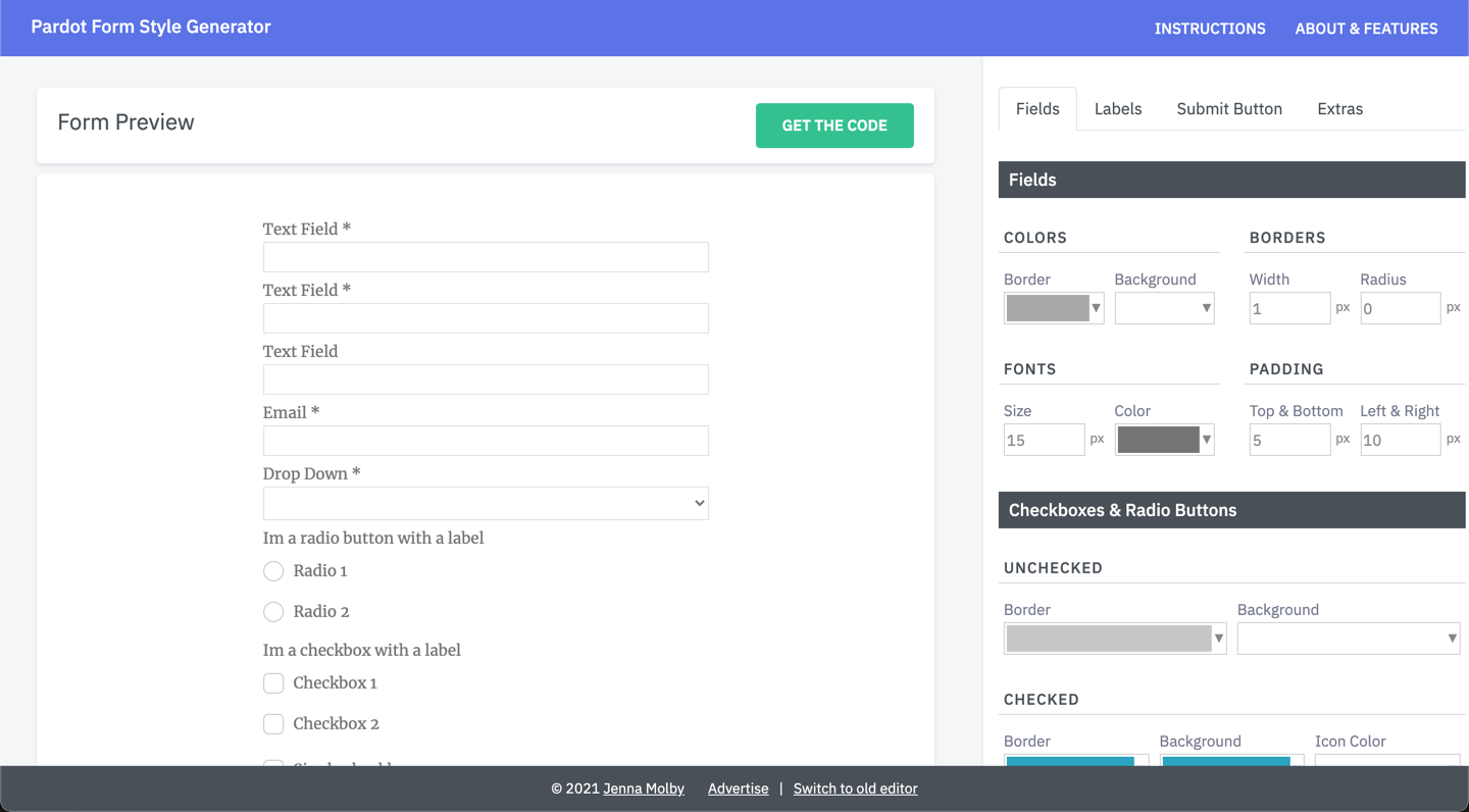
The Pardot Form Style Generator is a free tool you can use to easily customize your Pardot forms with no coding required. With a couple of clicks, you can customize almost every form element, including fields, checkboxes, buttons, labels and more. When you’re done customizing your form, the generator will compile custom CSS that you can copy and paste into your Layout Template within Pardot.
The generator has a complete new look, making it easier to customize your form.
Starts from a template
The old version started with the default Pardot form CSS. This new version starts with a template I use frequently within projects, meaning there are less tweaks needed to create a beautiful form.
Customized checkboxes & radio buttons
Change the border color, background color for radio buttons and checkboxes.
Embedded Google Fonts
The most popular Google Fonts are loaded directly within the editor, including Roboto, Lato, Open Sans and more.
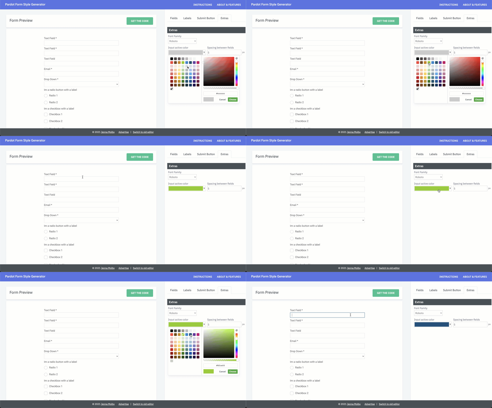
Set a border color for fields on focus
Select a border color that will be displayed when a prospect clicks into a form field.
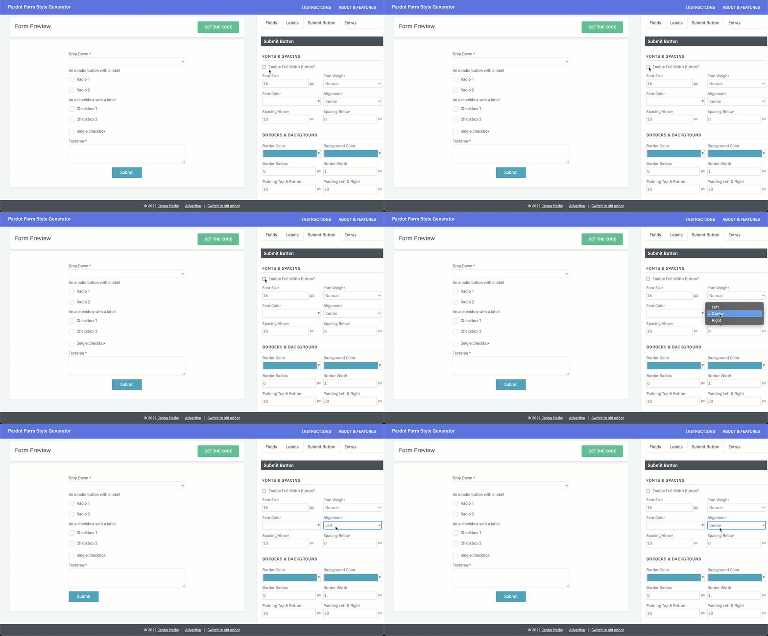
Create a full-width submit button
Check the box to enable a full-width submit button or select one of the alignment options from the dropdown.
Select hover colors for the submit button
Change the border colour, font color, and background color for the submit button.
Try it yourself
Check out all the new features and send me any questions via Twitter (@jennamolby), or leave a comment below.
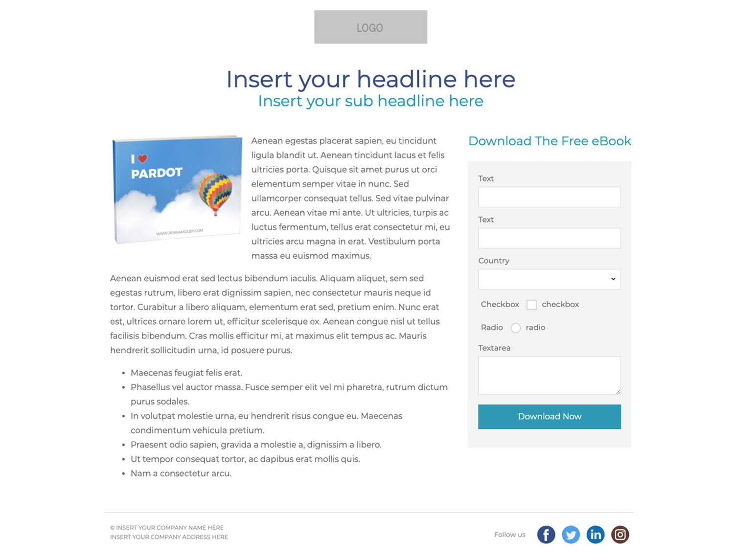
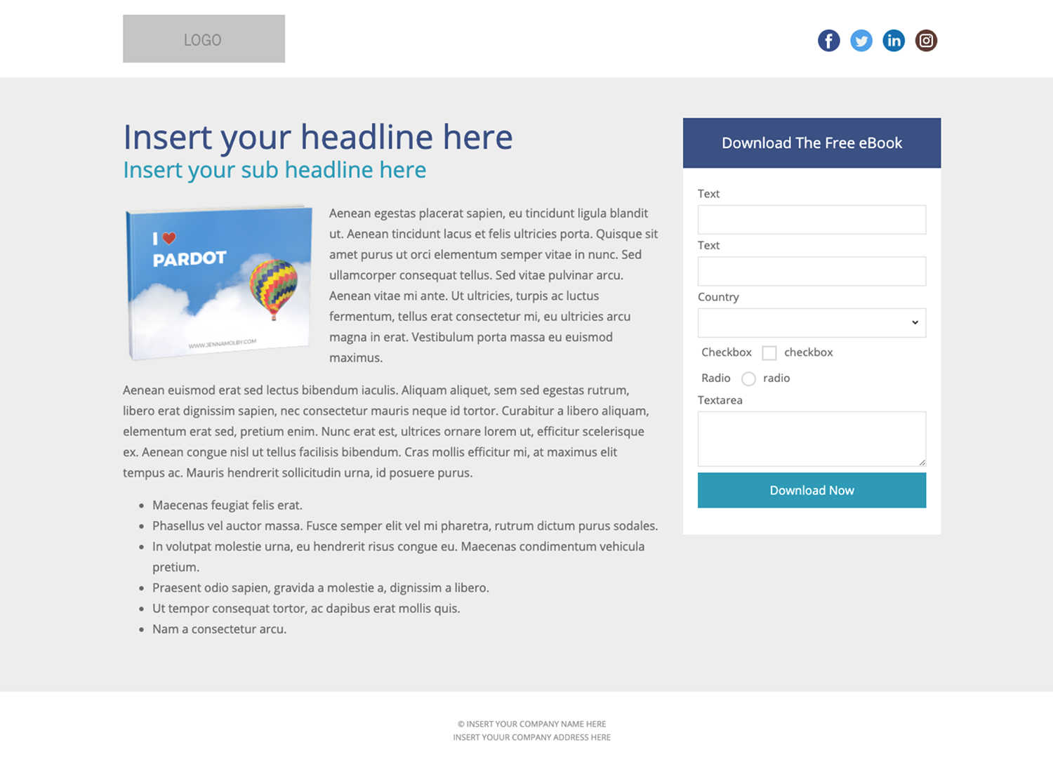
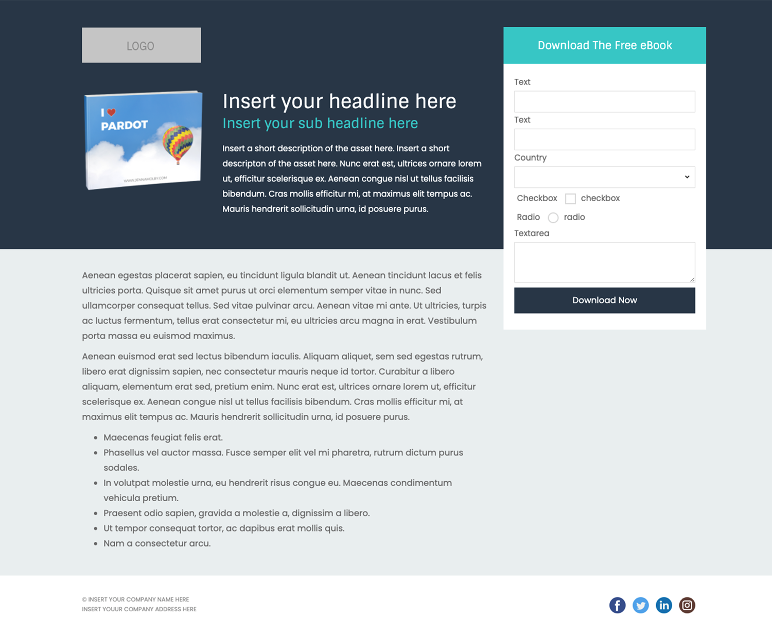
Create beautiful, responsive landing pages in Pardot by using one of these 3 free Pardot layout templates. These landing page templates are designed specifically for gated assets such as white papers and eBooks, but they will work well with any landing page that contains a form.
Terms
These templates are free for both commercial and personal projects. No attribution is required, however, if you use them I would love to see how you customize them. Share your templates with me through Twitter, email, or in the comments below.
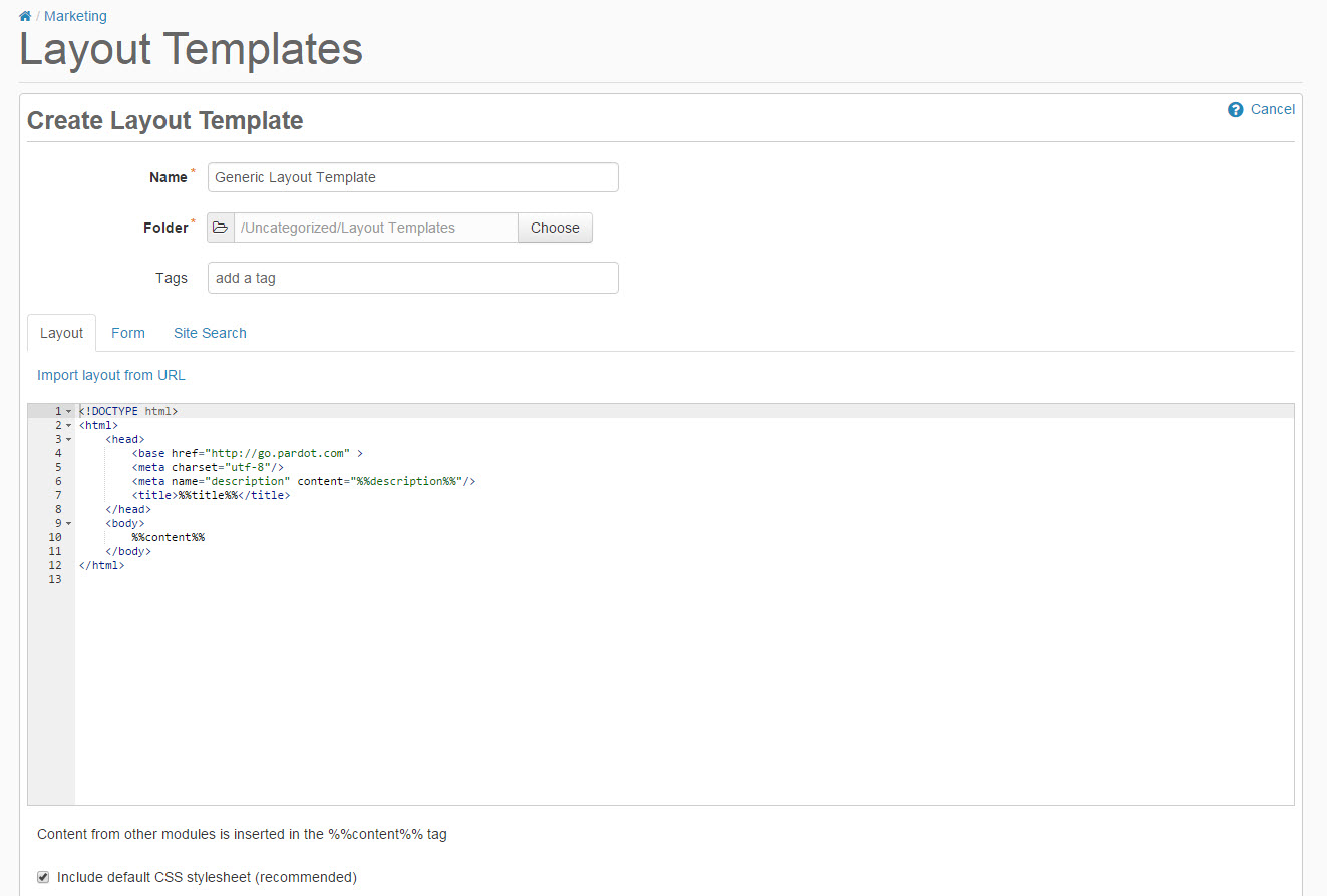
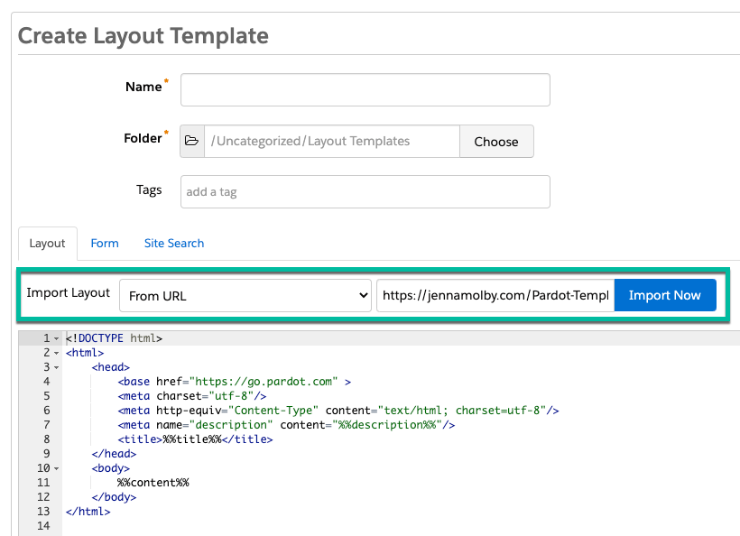
1. Create a new layout template in Pardot (Marketing > Landing Pages > Layout Template > Add Layout Template). Give your layout template a descriptive name and add your desired tags.
2. Copy the link to the template by clicking on one of the ‘copy link’ buttons below. This will copy the URL to your clipboard.
3. Navigate to the import layout drop down and select from URL. Paste the URL to the template into the text field and click import now.
Customizing Basics
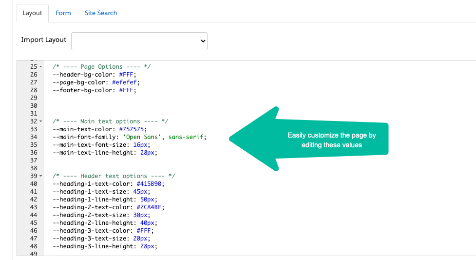
All templates use the Bootstrap Framework and use SVGs from Flat Icon for the social media icons. The CSS is directly in the template (no external CSS files are referenced other than the Bootstrap library). You can easily modify the template to meet your branding requirements by modifying the hex codes directly in the template which are commented clearly within the template file.
Your Pardot forms don’t have to be boring. With a little extra CSS you can create beautiful Pardot forms with customized checkboxes and radio buttons. In this tutorial, I’ll show you how you can style checkboxes and radio buttons within Pardot forms with minimal coding.
Before we begin…
Let’s refresh on how to add custom CSS to your Pardot forms.
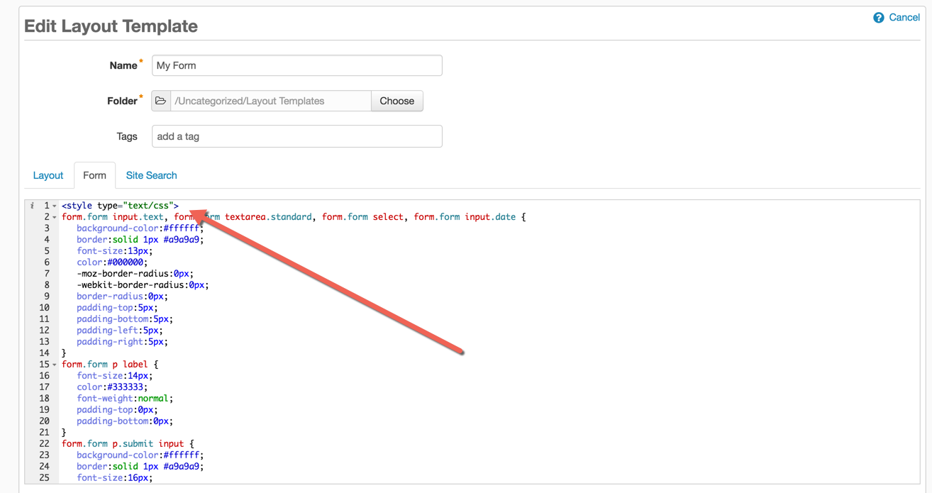
Navigate to Marketing > Forms > Layout Templates and select the layout to add the form styles to. Paste the CSS right above the existing code of the Form tab and save.
Styling Checkboxes
One of the downsides of using Pardot forms is the inability to modify the HTML structure of the form, so I will be leveraging the standard Pardot HTML to style the checkboxes.
The HTML
The standard HTML for a checkbox in a Pardot form looks like this:
Notice how the all the checkboxes are wrapped in a paragraph tag with the class pd-checkbox? This is how we will target the checkbox input and the checkbox label within the CSS.
The CSS
For the CSS, the default checkbox will be hidden and the ::before selector will be used to style the new checkbox.
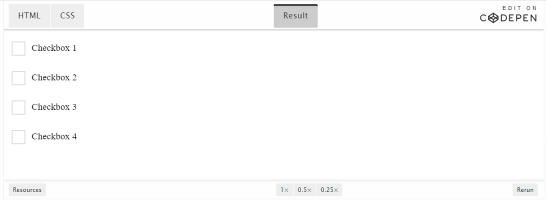
The styled checkboxes will look like this once the CSS has been added to the Pardot form.
Styling Radio Buttons
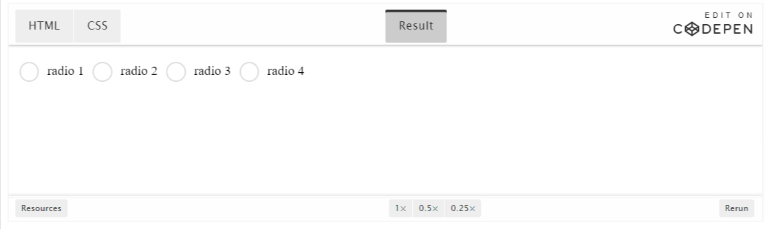
Styling radio buttons are pretty similar to the checkboxes, but with a bit of extra CSS to make them look like a radio button. Just like the checkboxes, we will leverage the HTML that Pardot provides, so all you have to do is add some CSS.
The HTML
All radio buttons in the Pardot form are wrapped in a paragraph tag with the class pd-radio. This is how we will target the radio input and the radio label within the CSS.
Did you know you can add report charts to your campaign page layout in Salesforce? Adding report charts will give you insight into a particular campaign’s performance without creating a separate report or leaving the campaign page.
These reports can show you how many campaign members were added, by month or by status, how many opportunities are influenced by the campaign by opportunity stage, etc. All this is made easy by customizing your campaign lightning record page.
Example
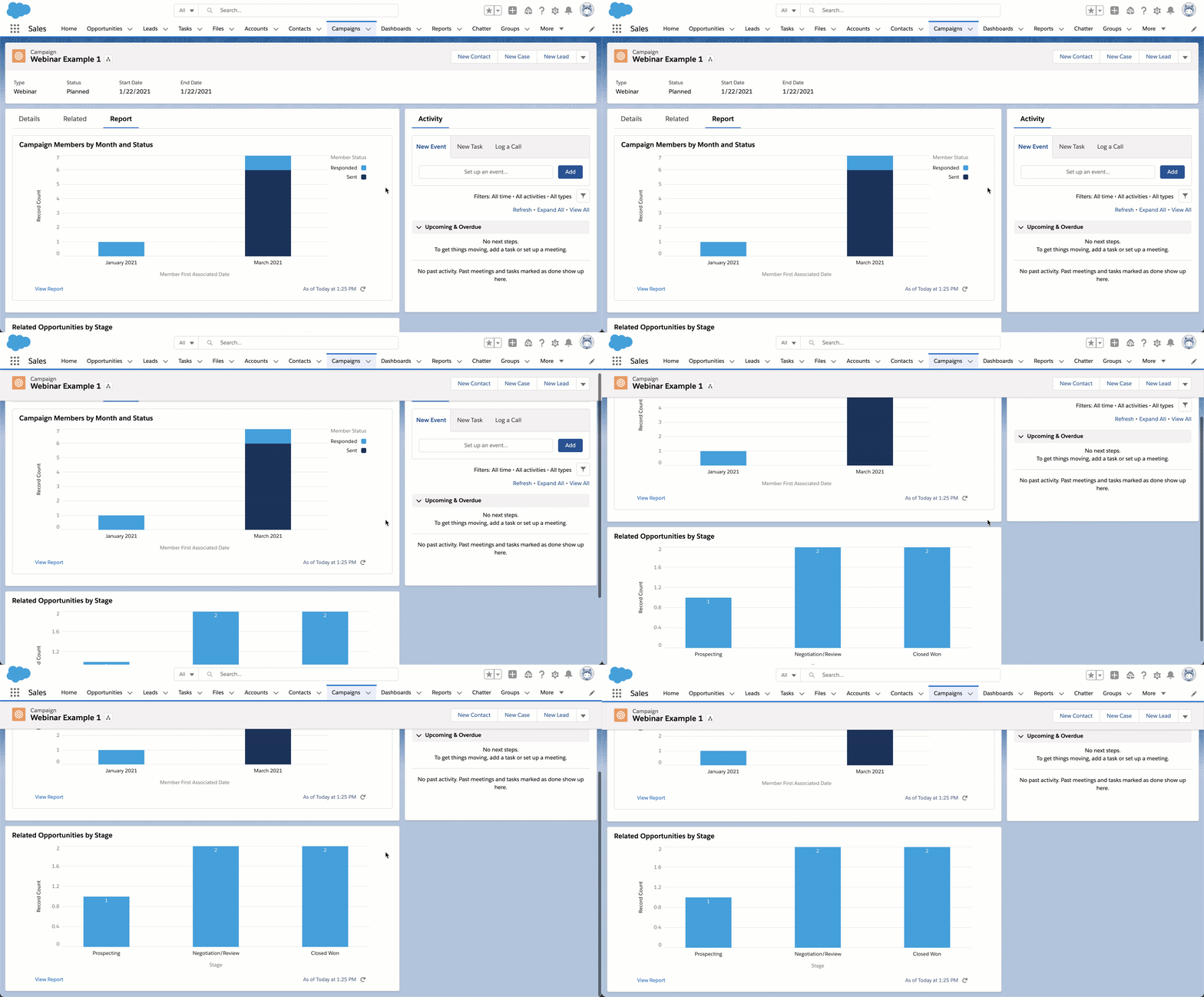
Here’s an example of a campaign that has a separate reports tab containing report charts.
This example has the report charts directly on the page instead of a new tab.
Step 1: Create the reports
The first step is to create the reports you want to add. There are two things to keep in mind when creating your reports:
Only reports with charts are available to add to campaign page layouts.
The reports must be saved within a public folder in order to add them to the page layout.
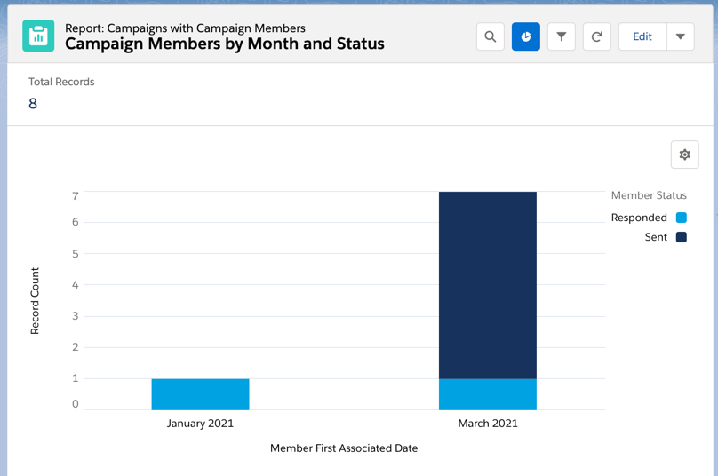
Example: Campaign members by month and status
When added to the page layout, this report will show a chart of all the campaign members (leads & contacts) by status and by month.
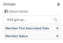
The report type is campaigns with campaign members, and the report is grouped by member first associated date and member status.
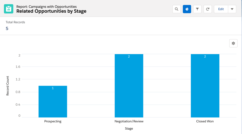
Example: Related opportunities by stage
When added to the page layout, this report will show a chart of all associated opportunities by opportunity stage.
The report type is campaigns with opportunties and the report is grouped by stage.
Step 2: Add the reports to the campaign page layout
Now that your reports are created, you can add them to the campaign page layout. Navigate to one of your Salesforce campaigns, click on the gear icon, and click on edit page. This will take you to the Lightning Page Builder.
Note: Editing the page will overwrite the existing page. You might want to create a new custom record page instead of overwriting an existing page.
Drag & drop the report chart component anywhere on the page.
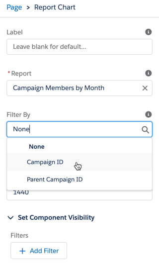
Select your report from the panel on the right. Add a filter for either campaign ID or parent campaign ID.
You can also add reports to a new tab within the page layout. To do this, click on the tab group, and click the add tab button. Click on the name of the new tab and select report from the menu.
Drag & drop the report chart element to the report tab to add your reports.
Save the Lightning Page and navigate to a campaign to see your reports in action!