Want to be able to restrict the date range of a date picker within your Pardot forms? The default date picker with Pardot does not provide this option, but with a couple of lines of JavaScript, you can enhance the functionality of the date picker. In this tutorial, I’ll show you how to use the jQuery UI date picker within your Pardot form.
Step 1: Add the field to your form
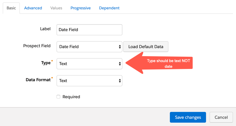
Add the field to your form. Since we won’t be using the default date picker leave the type as TEXT.
Step 2: Add the JavaScipt to your form
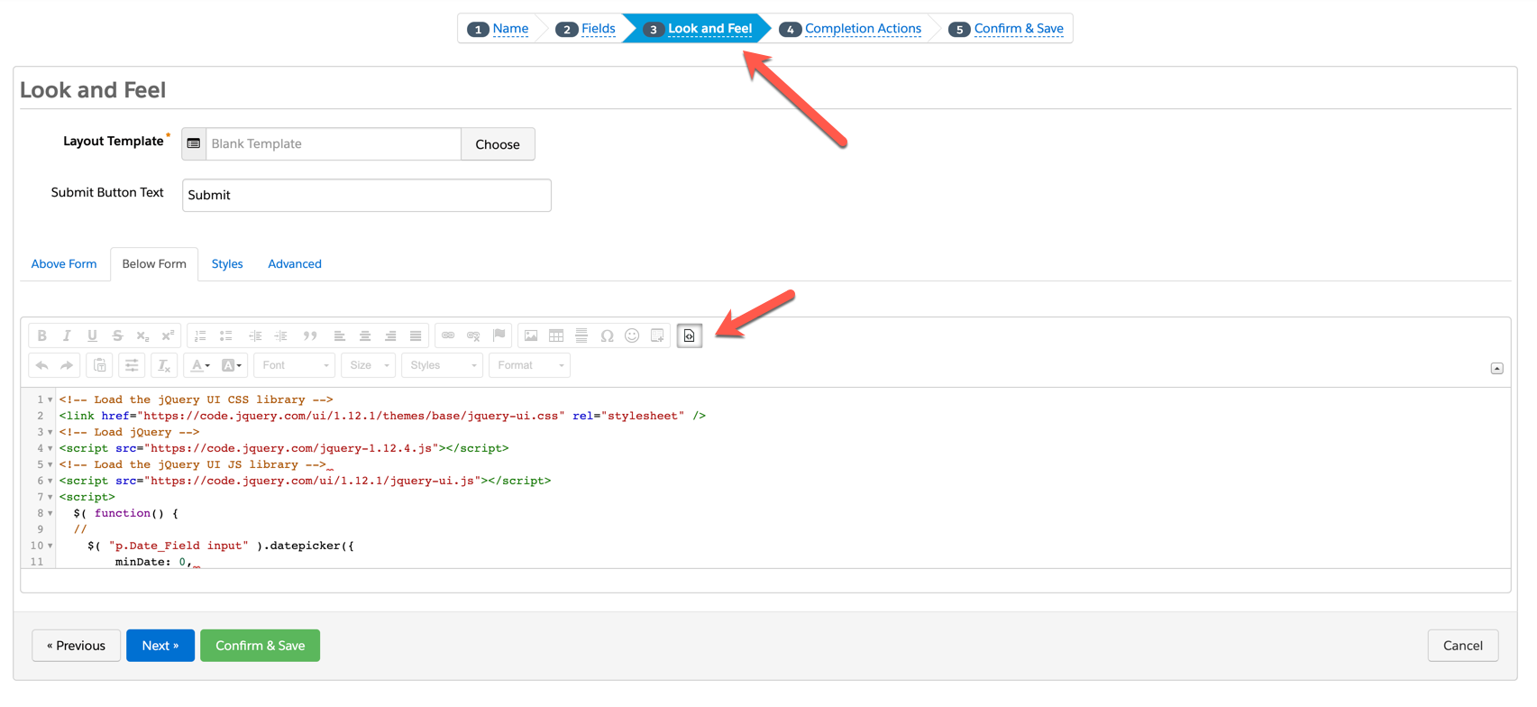
In the form editor, go to step #3 – look & feel and click on the below form section. Copy & paste this JavaScript in the HTML editor.
<!-- Load the jQuery UI CSS library -->
<link href="https://code.jquery.com/ui/1.12.1/themes/base/jquery-ui.css" rel="stylesheet" />
<!-- Load jQuery -->
<script src="https://code.jquery.com/jquery-1.12.4.js"></script>
<!-- Load the jQuery UI JS library -->
<script src="https://code.jquery.com/ui/1.12.1/jquery-ui.js"></script>
<script>
  $( function() {
  // update YOURDATEFIELDNAME with the name of your date field
    $( "p.YOURDATEFIELDNAME input" ).datepicker({
     // Update minDate with how far back the date picker should go
     minDate: 0,
     // Update maxDate with how far in the future the date picker should go
     maxDate: "+1M",
     // This formats the date so it's valid within Salesforce/Pardot
     dateFormat: "yy-mm-dd"
    });
});
</script>
Step 3: Edit the script
There are a couple of changes you need to make to the script in order for it to work with your form:
Update YOURDATEFIELDNAME with the name of your Pardot field that should launch the date picker.
Update minDate with the number of days in the past the user should be able to see and select. For example “0” would not show any dates in the past. “-20” would allow the user to select up to 20 days in the past.
Update maxDate with the number of days in the future the user should be able to select. For example, “+1M” would allow the user to select a date that is 1 month in the future.
Step 4:
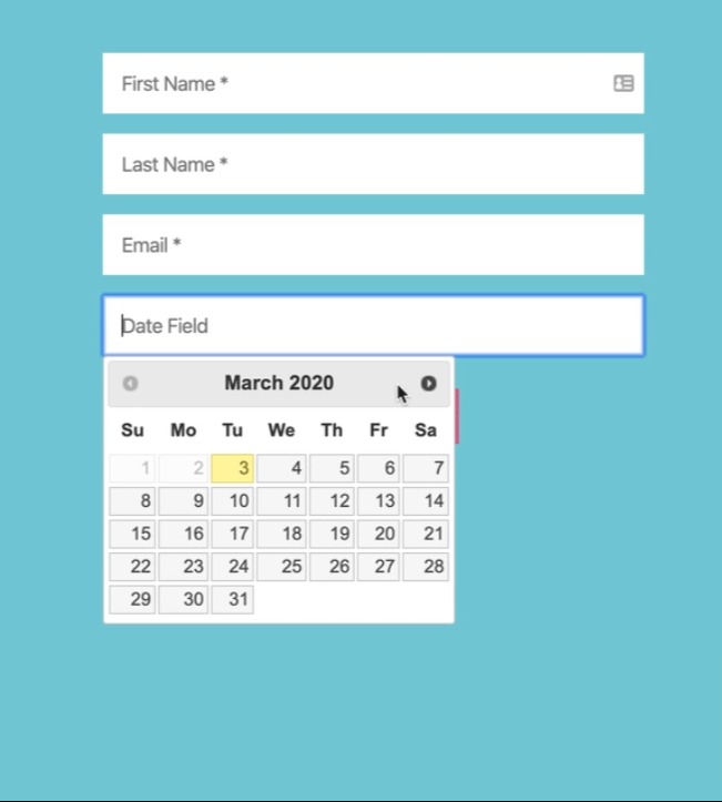
Save and test! Your date picker should look like the one below and if you fill out the form the date should populate within Pardot in the yyyy-mm-dd format.
The 2nd part of the form customization series is finally here! In part 1, I showed you how to implement the popular floating label technique and how to create searchable, user-friendly dropdowns. In this post, I will show you how to create a conversational, paragraph-style form and how to create a form on a single line.
This is part 2 of the 3 part series. Have you come accross a form recently and didn’t know to replicate the functionality in Pardot? Share it with me in a tweet @jennamolby, or in the comments.
Create a paragraph-style form
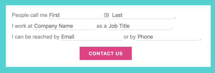
This “conversational”, paragraph-style form is a unique way to display your Pardot form. It requires editing your layout template and adding some custom javascript and CSS. Here’s a preview of what it looks like.
Edit your layout template
In order for this method to work, you need to make some updates to your layout template. Navigate to your layout template and click on the FORM tab. Replace the code with the code below.
What has changed? The paragraph tags surrounding the inputs have been replaced with DIVs and the description code has been moved from after the input to before the input.
Edit your form
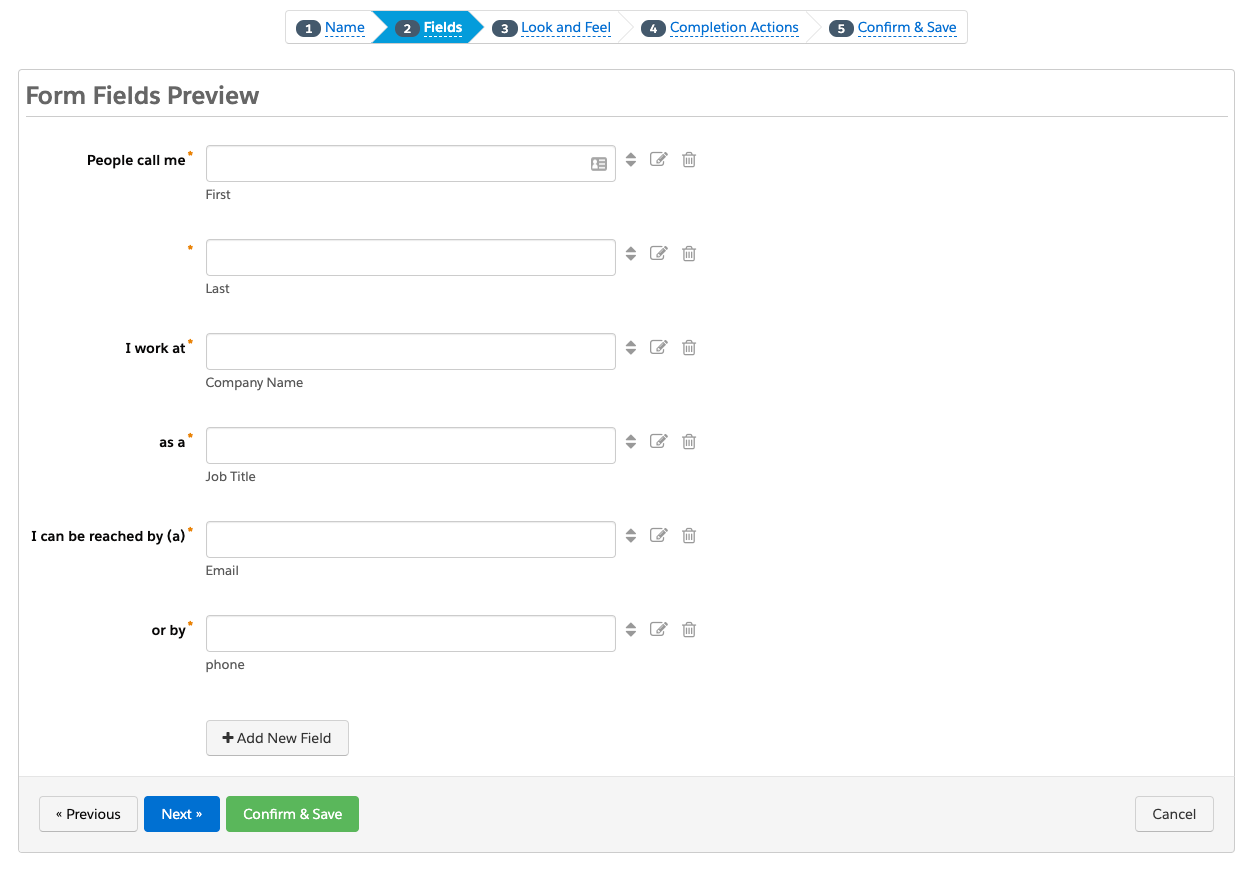
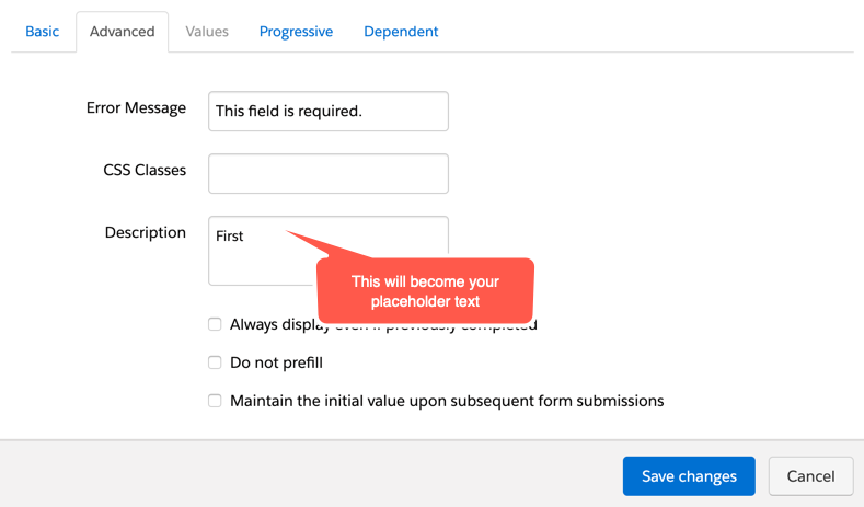
Since this is an advanced technique, the form setup is a bit unique. The labels within the form will act as the “paragraph text” and the description option will be used as the placeholders within the fields.
Here’s what the set up of my form looks like once the labels are updated and the description text is added.
Add the Javascript
This JavaScript will take the description text from the form and turn them into placeholder text.
<script type="text/javascript">
var labels = document.querySelectorAll("span.description");
var i = labels.length;
while (i--) {
    var label = labels.item(i);
    var text = label.textContent;
    label.parentNode.classList.contains("required") && (text += "");
    var nextElement = label.nextElementSibling;
    if (nextElement) {
        if (nextElement.tagName == 'SELECT') {
            nextElement.options[0].text = text;
        } else {
            nextElement.setAttribute("placeholder", text);
        }
        label.parentNode.removeChild(label);
    }
}
</script>
Add the CSS
The CSS is pretty straightforward. Float all the labels and inputs to the left, style the placeholder text and error messages.
<style type="text/css">

/* put the input fields on the same line */
form.form .form-field {
    float:left;
    clear:none;
    margin-right:5px;
    padding-bottom:10px;
}
form.form .field-label {
    font-size:18px;
    color:#888;
    font-family:Arial,Verdana,Sans-serif;
}
/* style the text inputs */
form.form input.text {
    border-bottom:solid 1px #ccc;
    border-top:none;
    border-left:none;
    border-right:none;
    font-size:18px;
    color:#888;
    outline:none;
}
/* style the select inputs */
form.form select {
    border-bottom:solid 1px #ccc;
    border-top:none;
    border-left:none;
    border-right:none;
    font-size:18px;
    color:#888;
    outline:none;
    -webkit-appearance: none;
   -moz-appearance: none;
   appearance: none;
   background:none;
   border-radius:0;
   width:200px;

}
/* insert line breaks */
form.form .form-field.line-break {
    clear:left;
}
/* insert periods at the end of sentences */
form.form .end:after {
    content:".";
    color:#888;
    font-size:15px;
    display:inline-block;
    top:5px;
    position:relative;
}
/* change the color of the placeholder text */
::-webkit-input-placeholder { /* Chrome/Opera/Safari */
  color: #888;
}
::-moz-placeholder { /* Firefox 19+ */
  color:  #888;
}
:-ms-input-placeholder { /* IE 10+ */
  color:  #888;
}
:-moz-placeholder { /* Firefox 18- */
  color:  #888;
}
/* center the submit button */
.form.form p.submit {
  margin-left:0;
  text-align:center;
}
/* give the form a width */
.form.form {
  width:100%;
  max-width:640px;
  margin:0 auto;
}
/* style the error messages */
form.form div.error {
    margin-left:0 !important;
    padding-left:0 !important;
}
form.form p.no-label,
form.form p.email-pref {
    margin:0 !important;
    text-align:right;
    font-size:11px;
}
form.form .error input.text {
    border-bottom:solid 1px #8b0000;
}
form.form .error input.text::-webkit-input-placeholder { /* Chrome/Opera/Safari */
  color: #8b0000;
}
form.form .error input.text::-moz-placeholder { /* Firefox 19+ */
  color:  #8b0000;
}
form.form .error input.text:-ms-input-placeholder { /* IE 10+ */
  color:  #8b0000;
}
form.form .error input.text:-moz-placeholder { /* Firefox 18- */
  color:  #8b0000;
}
</style>
Extra customizations
Bump the text to a different line
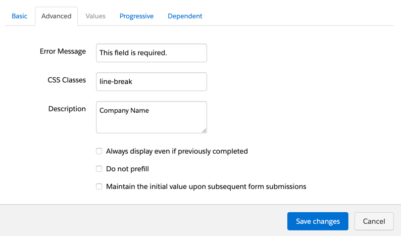
By default, the form fields will appear on a different line and wrap based on the width of your form. If you want to force a new line, navigate the form field that should start on a new line within the editor. Click on the advanced tab and add the class line-break as shown below.
Add a period to the end of a sentence
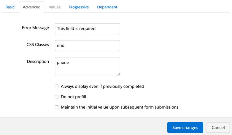
You can also add a period at the end of a sentence. Simply, add the class end where you want the period to appear.
The result
Minimal styling
Styled version
Create a form on a single line
I get a lot of inquiries on how to put form fields and the submit button on a single line. Now I have finally found the time to document it. Here’s an example of what the form will look like.
Edit your layout template
For this method to work, you need to make some updates to your layout template. Navigate to your layout template and click on the FORM tab. Replace the code with the code below.
What has changed? The paragraph tags surrounding the inputs have been replaced with DIVs.
Add the CSS
<style type="text/css">
/* put the input fields and the submit button on the same line */
form.form .form-field {
    float:left;
    clear:none;
    margin-right:10px; /* add some spacing between the fields */
}
form.form p.submit {
    float:left;
    clear:none;
    margin-left:2px !important;
    margin-top:0 !important;
}
</style>
Gravity Forms is one of the easiest tools to create advanced forms for your WordPress website and with some customization they can be integrated with Pardot. In this post, I will show you how to integrate Gravity Forms using Pardot Form Handlers.
Step 1: Create your Gravity form
The first step is to create your Gravity form. I won’t be diving into how to set up the Gravity form, but if you’re new to this WordPress plugin take a look at their product documentation to get started.
Step 2: Create your Pardot form handler
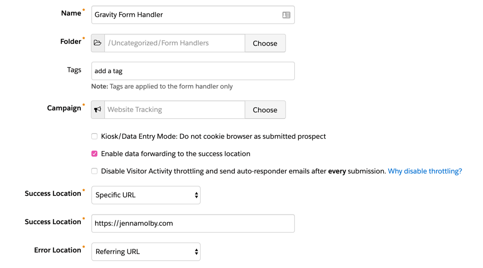
In Pardot, navigate to Marketing > Forms > Form Handlers and create a new form handler. Enter a name for the form handler, select your campaign and set your the rest of the settings to the following:
Kiosk/Data Entry Mode: Do not cookie browser as submitted prospect should be UNCHECKED
Enable data forwarding to the success location should be CHECKED
Enable data forwarding to the success location should be CHECKED
Disable Visitor Activity throttling and send auto-responder emails after every submission. Why disable throttling? should be UNCHECKED
SUCCESS LOCATION should be the URL of your thank you page.
ERROR LOCATION should be the referring URL.
Here’s a screenshot of the settings within my form handler.
Step 3: Add your fields
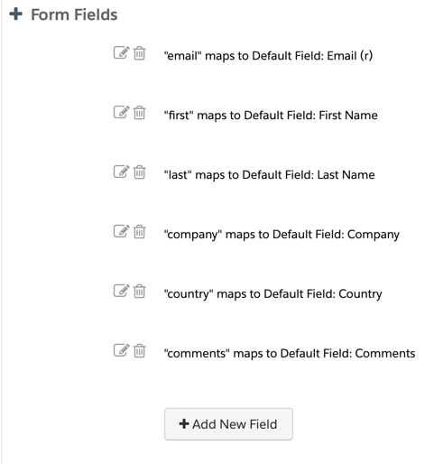
Next step is to add your form fields to your form handler. I recommend only making email address required. The validation for the other required fields will be handled via Gravity Forms.
Here’s what the fields in my form handler look like.
Step 4: Update the settings in your Gravity Form
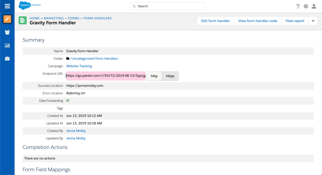
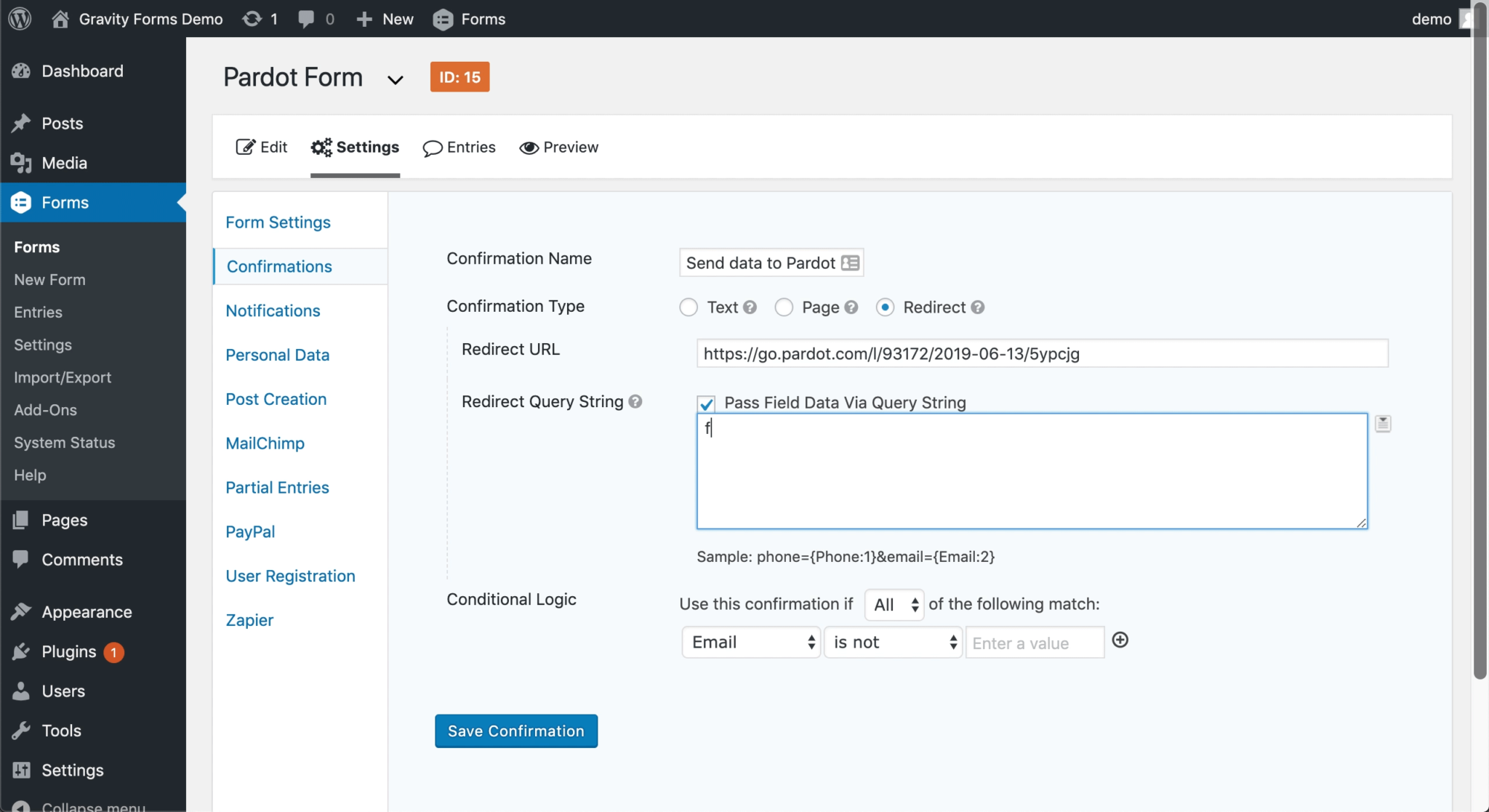
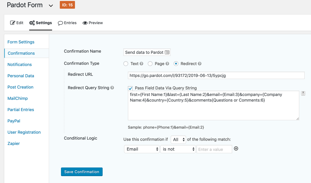
Navigate to your form within the Gravity Forms plugin and click on Settings > Confirmations > Add New. Give it a name and select the confirmation type as redirect. Copy & paste your form handler URL into the redirect URL box.
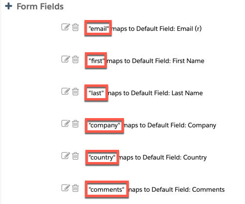
Now here comes the tricky part, in order for the data from the Gravity form to sync to Pardot, the fields need to be mapped. Select Pass Field Data Via Query String and a textarea will appear. This is where you will input the field names in your Pardot Form Handler and select the corresponding Gravity form field.
The syntax for this query string looks like this:
You can find the field names for your Pardot Form Handler, by editing your form handler and scrolling down to Form Fields.
You can find the field names for your Gravity form, by selecting the arrow that appears next to text box within your Gravity form settings.
The last setting you need to update is the conditional logic. I’m not sure why the Gravity form doesn’t give the option to remove the conditional logic completely, but for this part, you can select email is not empty.
Here’s what my settings look like all together.
Step 5: Test, Test, Test
Last but not least, test your Gravity form and make sure the data is going into Pardot.
For the past year, my marketing team has had the joy of testing half LinkedIn lead gen forms and half Pardot Landing Pages with LinkedIn’s Sponsored Posts.
Let’s revisit our old friend the A/B test. Because the results surprised us…
LinkedIn Lead Gen 101
If you’ve clicked on a sponsored ad on LinkedIn recently, you may have noticed that the click took you to a form where your information had already been pre-populated prior to form submit. That’s most likely a Linkedin Lead Gen Form at work.
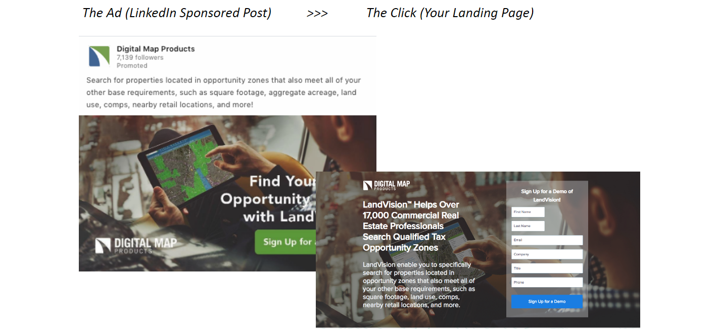
Or, if the click took you to a much fancier and dynamic landing page, it was more than likely not a LinkedIn lead gen form, but instead a landing page created outside of LinkedIn by a hip & cool marketer.
Where LinkedIn Lead Gen Forms win: Quantity
Here’s a sample of the Linkedin Lead Gen forms we tested:
From a prospect’s user experience perspective, the pre-populated lead gen form can go a few different ways:
Wow that’s creepy, how does it already know my email address, and my phone number, oh crazy — and my title!
Awesome, great, wonderful — I only had to click twice and not fill out any information to download this handy dandy checklist on how to train my new sales team.
Oops, I clicked once to look at the checklist, tried to exit, and fat fingered it to submit the form. I actually have zero interest in the content — and now a BDR won’t stop calling me, perfect.
In my team’s experience, we saw all of the above happening regularly at a pretty consistent pace, no matter how long we ran our campaign.
The lead gen forms converted at a significantly higher rate compared to other landing pages used in the campaign, with a lower cost per lead. Another key advantage is the ease of creating the form – it’s quick and easy, simple to duplicate, and all managed with the LinkedIn interface.
Where Pardot Landing Pages Win: Quality
So, we should all switch our landing pages to LinkedIn Lead Ads?
Not so fast. Let’s look at the other half of the experiment.
Within a couple of months of testing, we noticed the volume of prospects created was significantly less on Pardot landing pages. The dip in conversions was especially true when a brand-new prospect was viewing your Landing Page (with no pre-population from Pardot).
But from our initial testing, these prospects have been higher quality and progressed further down the funnel.
LinkedIn Lead Gen Forms vs. Pardot Landing Pages: Our conclusion, so far
LinkedIn Lead Gen forms seems to be the obvious answer when promoting content through sponsored posts for the high volume of top of funnel leads they will create.
Pardot Landing Pages seem to be the right answer for LinkedIn retargeting campaigns. For example, if you’re promoting a brand-new campaign for a promotional discount and want them to learn more – this is a great fit for a Pardot landing page. This allows you to use progressive Pardot forms on the landing pages to collect even more data on your already targeted prospect, or know they are ready for bottom of funnel content like a demo or free trial.
(ProTip: retarget audiences from your CRM data and enable lookalike audience within LinkedIn’s Campaign Manager, this will lower your CPL as opposed to Landing Pages typically having a higher CPL.)
Another bonus of Pardot Landing Pages is the ability for your UTM parameter tracking to carry through on your form submit on the Pardot Landing Page. With these hidden fields you can track off the click if they then convert on the website – very helpful for proving LinkedIn ROI.
At the end of the day, many variables come into play in digital marketing, and there are always tradeoffs. Advertising and LinkedIn Sponsored Posts are no different. I highly suggest you try both approaches, A/B test, track everything — and keep an open line of communication with your sales team on which campaigns are producing the higher quality leads or are re-engaging existing prospects.
Looking for some creative ways to spice up your Pardot forms? In this post, I will show you how to implement the popular floating label technique in three easy steps. I will also show you how to turn your long drop down menus into user-friendly, searchable dropdowns.
This is part 1 of the 3 part series. Check out part 2 here.
1. Floating labels
You have probably seen this technique before. The label appears as placeholder text and when you click on the field the text moves out of the way and allows you to type. This technique can be applied to your Pardot forms in three steps.
Here’s an example of what it looks like. Click on the field to see the effect.
Adding this effect to your Pardot forms
Step 1: Edit your layout template
In order for this to work the labels within your forms must be placed below the fields. By default, the labels are above the form fields. To modify this, you will need to edit the layout template, click on the form tab and replace everything within the editor with the code below.
Add the CSS below to your layout template. This will create the effect of the floating labels for all form field other than radio buttons and checkboxes.
In addition to the CSS, this method uses some Javascript. Place the code below within your layout template as well.
<script src="https://cdnjs.cloudflare.com/ajax/libs/jquery/2.1.3/jquery.min.js"></script>
<script>
$('input[type=text], select, textarea').addClass('floatLabel');
(function($){
	function floatLabel(inputType){
		$(inputType).each(function(){
			var $this = $(this);
			// on focus add classs active to label
			$this.focus(function(){
				$this.next().addClass("active");
			});
			//on blur check field and remove class if needed
			$this.blur(function(){
				if($this.val() === '' || $this.val() === 'blank'){
					$this.next().removeClass();
				}
			});
			//manage the pre-populated values
			if($this.val() != '' ){
				$this.closest('.form-field').find('label').addClass('active');
			}
		});
	}
	floatLabel(".floatLabel");
})(jQuery);
</script>
The result
Here’s what the floating labels look like after implementing all the code within the layout template.
2. Searchable dropdowns
I came across this technique when I was registering for a webinar recently. When I went to select my Country from the drop-down, I was greeted with a search feature for the drop-down. I immediately started Googling what JavaScript plugin they were using to see if I could use it on Pardot forms. It turns out, you can and not only is it super easy to implement, but it also makes long drop-down in your Pardot forms more user-friendly.
Demo
Here is what a searchable drop down looks like in action.
Before
After
Adding this effect to your Pardot forms
Navigate to your form and click edit form. Go to step 3: Look and Feel, click on the below form tab, click on the HTML icon and paste this code:
<!-- load the chosen.js stylesheet -->
<link href="https://cdnjs.cloudflare.com/ajax/libs/chosen/1.7.0/chosen.min.css" rel="stylesheet" />
<!-- load the jquery library -->
<script src="https://ajax.googleapis.com/ajax/libs/jquery/1.12.4/jquery.min.js"></script>
<!-- load the chosen.js library -->
<script src="https://cdnjs.cloudflare.com/ajax/libs/chosen/1.7.0/chosen.jquery.min.js">
</script>
<!-- apply the chosen.js library to the country drop down -->
<script>
  $(".country select").chosen({no_results_text: "Oops, nothing found!"});
</script>
Update country with the name of your drop down field. Optionally, you can update the no_results_text to what ever you want to display when the no results are found for the searched term.
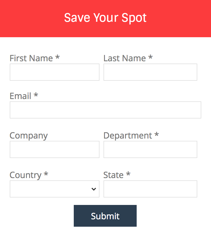
In this tutorial, I’ll show you the best way to create a two-column Pardot form. This is a follow up on my original post How to Create a 2 Column Pardot Form. By popular request, this new method includes a way to make certain form fields full width and is fully responsive. All you have to do is add CSS classes to your form fields and copy & paste the CSS provided into Pardot.
Add CSS classes to your form fields
The first step is to add CSS classes to your form fields. We will be using three different classes within the forms:
form-col-1: Add this to form fields that will be in the left column.
form-col-2: Add this to form fields that will be in the right column.
form-col-full: Add this to form fields that you want in a single, full-width column.
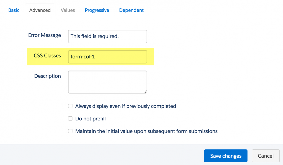
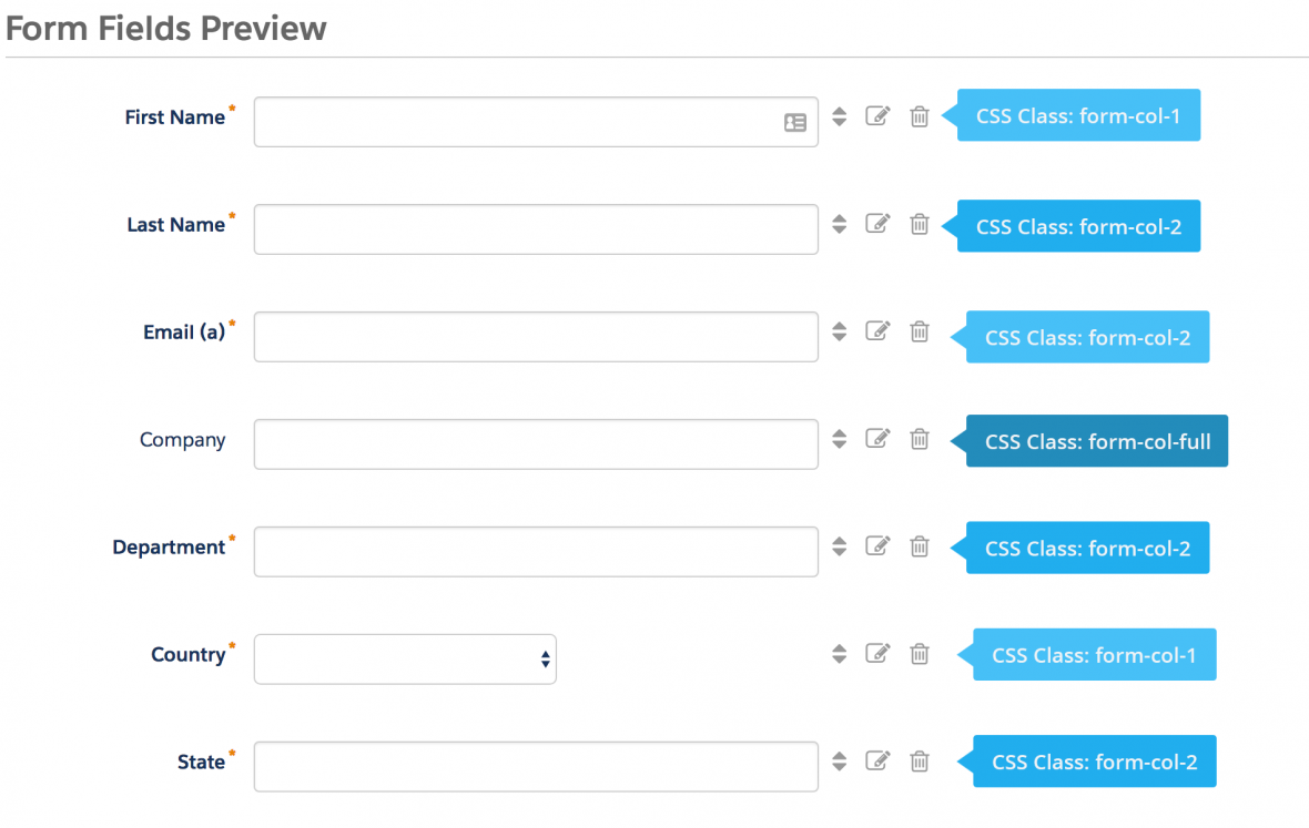
To add a class to a form field, navigate to the fields tab of your form, click on the pencil icon to edit the form field. Then, click on the advanced tab and enter the class name in the CSS classes field.
Repeat this process until all form fields have one of the three classes. Here’s an outline of what my sample form looks like, where all the fields are in two columns except for the email field which is full width.
Edit the Form HTML
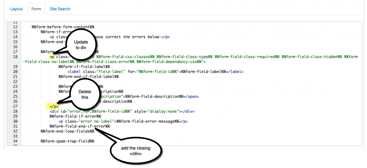
By default, every form field within your form will be wrapped in paragraph tags (<p></p>). This is not ideal when it comes to creating two-column forms, but it’s easy to update.
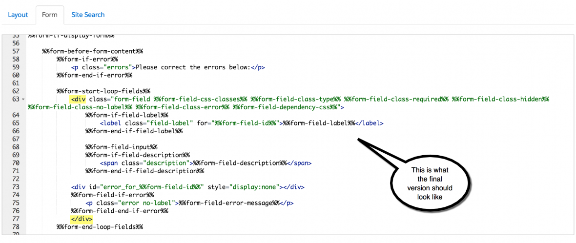
Navigate to your layout template and click on the Form tab. Change the paragraph tag to a DIV and close it right after the error message fields, as illustrated below.
Alternatively, replace the ENTIRE content within the form tab with the code below.