The Salesforce Winter ‘22 release introduced the ability to create a custom Lightning Web Component (LWC) for Lightning Email Content, and with Spring ‘22 we have the same ability for Pardot Lightning Email Templates.
With this new feature, you can create components for standard areas of emails, such as footers or headers. Or, use it for more complex items, such as displaying upcoming events or gathering prospect feedback.
In this post, we will present the code for 5 different LWCs, walking you through the most simple example and incrementing from there.
- Simple hard-coded HTML
- Hard-coded HTML, which includes a merge field
- Allow someone creating an email to provide text, which is placed into the HTML
- Present a picklist of values, with HTML being rendered based on choice
- Pull information from an Open API, and then place it into the email
It is important to note that these custom components behave differently than Pardot Snippets or Dynamic Content. Unlike those features, when you change the LWC, existing Pardot Email Content and Templates do not get automatically updated. You need to go into each one to refresh them.
Because we all like analogies, think of the LWC as a rubber stamp and the Pardot Email Content & Template as paper. We can craft the stamp however we like (from simple to very complex), and once it is ready it will stamp the ink (HTML) onto the Email Content or Template. Changing the stamp does not change the ink already on the paper — you need to use the new/adjusted stamp and do it again.
Feel free to check out the code project in our github repository. If you aren’t already familiar with Salesforce Lightning Web Components, check out this Trailhead Quick Start.
Simple hard-coded HTML
This example is a pretty good one for anyone to get started. It demonstrates what is needed to at least have something work at the most basic level. Consider it the Hello World of Custom Email Components. In our github repository, this is the fixedAddress component.
This type of custom component is great to use for standard sections of your emails that do not change with each send. For example, the copyright notice, legal disclaimer, unsubscribe language etc.
At a minimum, our LWC will need 3 files:
- .html -> The HTML which will become rendered and stamped into the Email Content/Template
- .js -> Any coding required to support the component
- .js-meta.xml -> Salesforce Metadata, enabling this component to be used in Email Content/Templates
First, we will explore the Salesforce Metadata.
<?xml version="1.0" encoding="UTF-8"?>
<LightningComponentBundle xmlns="http://soap.sforce.com/2006/04/metadata">
    <apiVersion>52.0</apiVersion>
    <isExposed>true</isExposed>
    <masterLabel>Fixed Company Address</masterLabel>
    <targets>
        <target>lightningStatic__Email</target>
    </targets>
</LightningComponentBundle>
Some key notes:
- isExposed (line 4) is needed to tell Salesforce that this component can be displayed in the Component Toolbox
- masterLabel (line 5) is the name to display in the Component Toolbox
- target = lightningStatic__Email is needed to tell Salesforce that this component can be used in the Lightning Email Builder. Other examples have a bunch of other targets, these are not needed and may result in your component showing up in unexpected places.
Next we will look at the JavaScript.
import { LightningElement } from 'lwc';

export default class FixedAddress extends LightningElement {}
Because our example is mostly hard-coded, there is nothing of value here. As we evolve, we’ll start seeing this get built out.
Finally, the HTML.
<template>
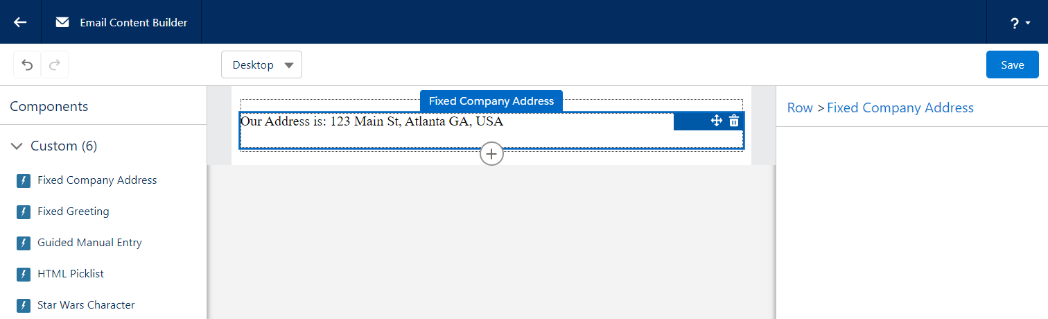
<p>Our Address is: 123 Main St, Atlanta GA, USA</p>
</template>
Again, very simple. When the email HTML is rendered, everything in between the <template> tags will be written.
Here’s what it looks like in the builder. Once the component is added to the email, it is just simple text that is rendered.
Hard-coded HTML, which includes a merge field
This example is nearly identical to the previous one, so we will skip showing the JavaScript and the Metadata. In our github repository, this is the fixedWithMergeFields component.
Straight to the HTML:
<template>
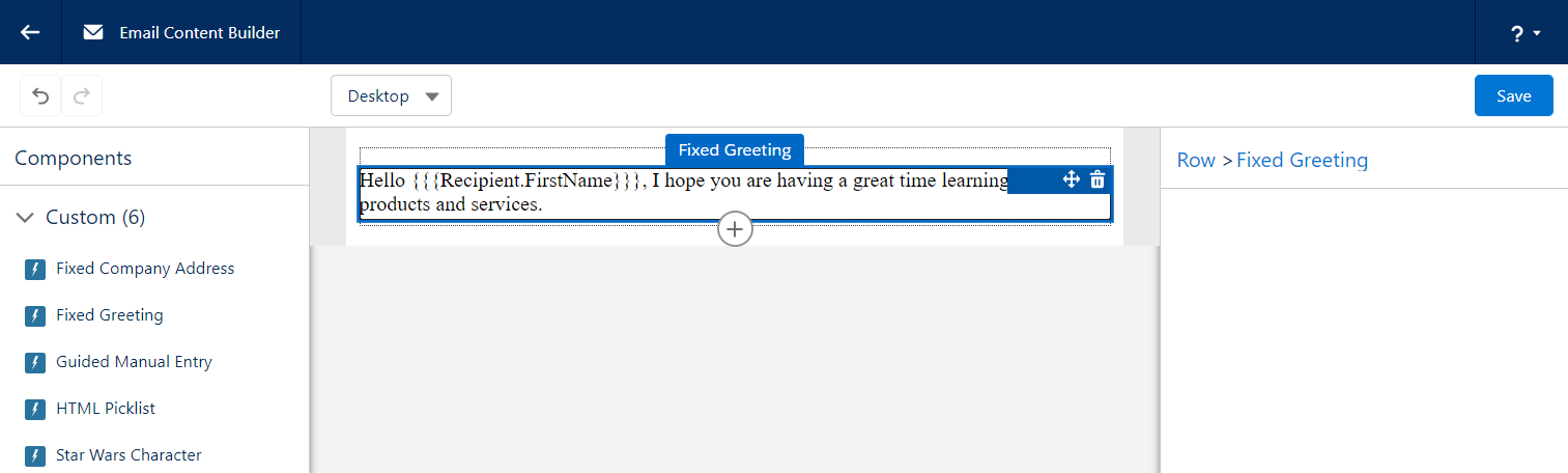
<p>Hello {{{Recipient.FirstName}}},
I hope you are having a great time learning
about our products and services.</p>
</template>
What you might notice is how the merge tag has been written. Due to some very technical reasons, we can’t just use the usual {{{FIELD}}} syntax, we have to instead “escape” the closing curly brackets to make the LWC gods happy. This appears to only be the case when the merge tags are placed into the HTML file, as normal syntax can be used when the merge tags appear in the JavaScript.
Here’s what it looks like in the builder. Similar to the previous example, you get text that cannot be adjusted.
Allow someone creating an email to provide text
Now we are going to start allowing the user of a custom component to provide their own values. In our example we are going to start off a bit slow, simply allowing them to provide some text. In our github repository, this is the guidedManualEntry component.
We need to decide which “attributes” (or values) we want a user to provide. For this example, we will ask for a Title, an Image URL, and a Description.
First, let’s take a look at our JavaScript. It needs to define these attributes.
import { LightningElement, api } from 'lwc';

export default class GuidedManualEntry extends LightningElement {
  @api
  title=""
  @api
  imageUrl=""
  @api
  description=""
}
You will note that each “attribute” has a variable name and the @api annotation. This annotation tells the LWC system that these can be referenced by the HTML file as well as our metadata file.
Next, we will tell our Metadata file to prompt the user to fill in these values.
<?xml version="1.0" encoding="UTF-8"?>
<LightningComponentBundle xmlns="http://soap.sforce.com/2006/04/metadata">
  ...
  <targetConfigs>
    <targetConfig targets="lightningStatic__Email">
      <property
        label="Title"
        name="title"
        type="String"
        default="Title of Entry"
        required="false" />
      <property
        label="Image URL"
        name="imageUrl"
        type="String"
        placeholder="https://"
        description="Enter Image URL for this image. Be sure that it is a secure URL starting with https://"
        default="https://via.placeholder.com/575x150"
        required="false" />
      <property
        label="Description"
        name="description"
        type="String"
        default="Description of Entry"
        required="false" />
    </targetConfig>
  </targetConfigs>
</LightningComponentBundle>
Ok, that’s a lot! What we are doing is giving our lightningStatic__Email target a list of properties to present on the right hand side of the Lightning Builder when someone wants to use our component.
Each property (to be presented) has a bunch of levers we can adjust to enable our user to give us what we need. Let’s break down the ones we use here:
- label > basically a form field’s label
- name > the name of the attribute in the LWC’s JS file
- type > the type of input to present. For an email builder our current choices are:
- Boolean > displays a checkbox
- Integer > displays a text input allowing digits
- String > displays a text input allowing any character
- Color > displays a color selector
- HorizontalAlignment > displays a horizontal alignment selector
- VerticalAlignment > displays a vertical alignment selector
- default > the default value to use when a new component is created
- required > whether or not a value is required to save the component
The Salesforce LWC Developer documentation is a great resource for getting more details on all the abilities of the LWC metadata file.
Now that we are getting values from a user, we need to display them in the HTML!
<template>
  <h3>{title}</h3>
  <img src={imageUrl} />
  <p>{description}</p>
</template>
Here we are using LWC variables to place the values provided by the user. The syntax for this is the variable name (that has the @api annotation in your JavaScript file) wrapped by a single set of curly brackets.
Now we can kind of understand why our HML syntax which includes 3 sets of curly brackets doesn’t really work, we can’t mix the two.
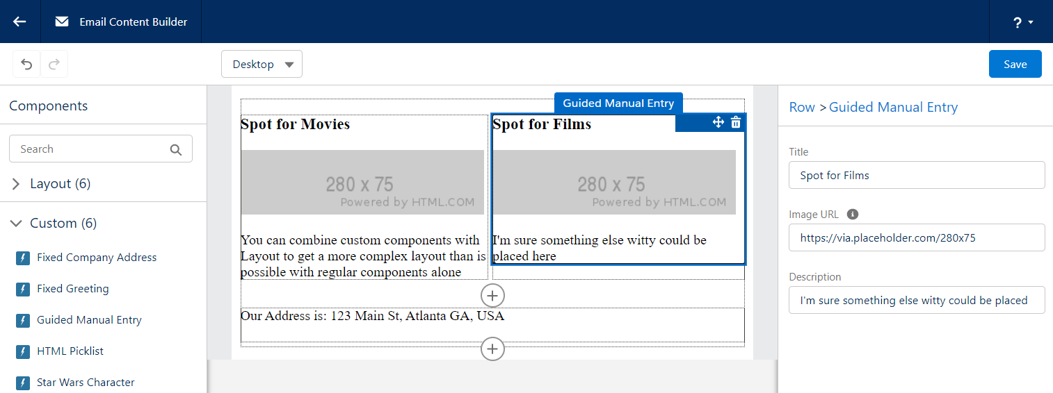
Here’s what this looks like in the builder. We are asking for the user to provide values within the section on the right hand side.

You can combine your Custom Components with Layout components to build a nice consistent email.
Present a picklist of values, coming from APEX
Now things start to get interesting. We will tie our LWC to some APEX code, opening our world of options. Before we get started, it is important to know that you don’t have to use APEX to present a picklist of options, it can entirely be done in the Metadata. Sadly we can’t show every variation of example. In our github repository, this is the htmlPicklist component.
Before we get started, we want to give credit to the original author of this example to jrattanpal on github. We simply made some minor changes to enable it to be used as a learning example.
First, we need an APEX class which will provide the options that are available.
global class HTMLSources extends VisualEditor.DynamicPickList{

  global override VisualEditor.DataRow getDefaultValue(){
      VisualEditor.DataRow defaultValue =
          new VisualEditor.DataRow('--Select--', '');
      return defaultValue;
  }

  global override VisualEditor.DynamicPickListRows getValues() {
      VisualEditor.DynamicPickListRows options = new VisualEditor.DynamicPickListRows();
      options.addRow(new VisualEditor.DataRow('HTML Option 1', '<h1>Sample 1, simple header</h1>'));
      options.addRow(new VisualEditor.DataRow('HTML Option 2', '<h3>Sample 2, smaller heading</h3>'));
      options.addRow(new VisualEditor.DataRow('HTML Option 3', '<h4>Sample 3, multiple blocks of HTML</h4><div>hello<p>testing html picklist</p></div>'));
      options.addRow(new VisualEditor.DataRow('HTML Option 4', '<h2>Hello Trailblazer</h2>'));
      options.addRow(new VisualEditor.DataRow('HTML Option 5', '<h2>This was swell</h2>'));
      return options;
  }
}
Note that the class extends VisualEditor.DynamicPickList, which requires us to provide 2 method overrides.
- getDefaultValue -> provides the value selected when the component is first added to an Email. In our example above we simply prompt for a choice.
- getValues -> provides all of the options that a user can pick from. To our knowledge you can’t retrieve a list of values dynamically based on another input from the user, though if this changes in the future be sure to let us know!
Now that we have APEX which can provide our values, let’s set up our LWC. We will start with our JS.
import { LightningElement, api } from 'lwc';

export default class HtmlPicklist extends LightningElement {
  @api
  set htmlValue(value) {
    if (this.attachmentPoint) {
      this.attachmentPoint.innerHTML = value;
    }
    this._htmlValue = value;
  }
  get htmlValue() {
    return this._htmlValue;
  }
  renderedCallback() {
    this.attachmentPoint = this.template.querySelector('div[ishtmlcontainer=true]');
    this.attachmentPoint.innerHTML = this.htmlValue;;
  }
}
The approach here is a little bit different than all the other examples. The goal is to take the “htmlValue” (which comes from APEX) and have that HTML be the entire HTML that gets stamped onto the Content/Template. This keeps our LWC HTML very lightweight and gives full control over the HTML to APEX (or wherever the APEX is getting the value).
Next, we will tell our Metadata file to prompt the user to choose one of the options.
<?xml version="1.0" encoding="UTF-8"?>
<LightningComponentBundle xmlns="http://soap.sforce.com/2006/04/metadata" fqn="banner">
  ...
  <targetConfigs>
    <targetConfig targets="lightningStatic__Email">
      <property
        name="htmlValue"
        label="Pick an HTML Sample"
        type="String"
        required="true"
        datasource="apex://HTMLSources"/>
    </targetConfig>
  </targetConfigs>
</LightningComponentBundle>
Some of our properties are similar to the previous example, however we introduce a new one.
- datasource >
As for the HTML file, it simply has a DIV that the JS can grab onto and fill.
<template>
  <div ishtmlcontainer="true" lwc:dom="manual"></div>
</template>
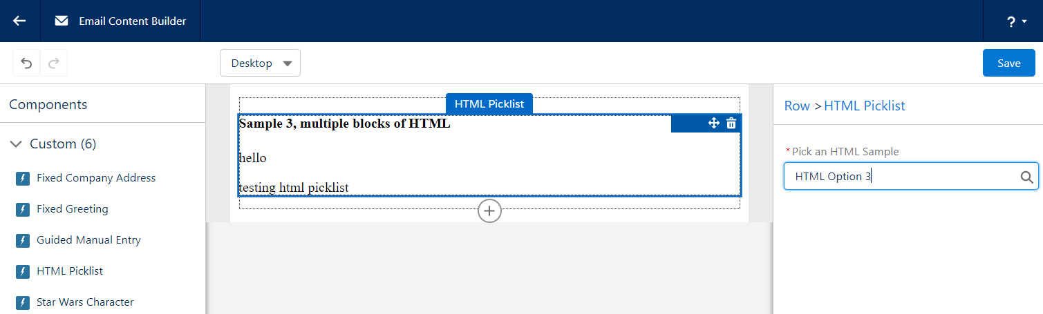
Here’s what it looks like in the builder. Similar to the previous example, the right hand side allows us to make a choice, and once made the content of our component is rendered.
Pull information from an Open API
This is the last of our examples, and it goes all out. By using an Open API, we don’t need to worry about authentication and all the additional steps to set it up in Salesforce. In our github repository, this is the starWarsCharacter component.
Similar to the previous example, we will start with some APEX. While there can be a lot going on here, the end result of the APEX is to provide a JSON String representing the attributes of each Object, or dropdown choice.
global with sharing class StarWarsCharacterPicklist extends VisualEditor.DynamicPickList {

  global override Boolean isValid(Object attributeValue){
      return true;
  }

  global override VisualEditor.DataRow getDefaultValue(){
      return new VisualEditor.DataRow('--Select a Character--', 'no-character-selected');
  }

  global override VisualEditor.DynamicPickListRows getValues() {
      System.debug('Providing Star Wars Character values now!');
      return getApiOptions();
  }

  private VisualEditor.DynamicPickListRows getApiOptions() {
    VisualEditor.DynamicPickListRows pickListRows = new VisualEditor.DynamicPickListRows();

    //Make API call to StarWarsAPI and get a list of characters
    List<StarWarsCharacterServices.StarWarsCharacter> characters = StarWarsCharacterServices.getCharacterList();


    // When a choice is made from the VisualEditor, the DataRow value will be provided to the LWC
    // We are choosing to have that "value" be a JSON string, so that the LWC can parse it and
    // render the properties as it sees fit
    for(StarWarsCharacterServices.StarWarsCharacter character: characters){
      String characterInfoAsJson = System.JSON.serialize(character);
      pickListRows.addRow(new VisualEditor.DataRow(character.name, characterInfoAsJson));
    }
    return pickListRows;
  }
}
Note that the class extends VisualEditor.DynamicPickList, which requires us to provide 2 method overrides.
- getDefaultValue -> here we explicitly set a value that the JavaScript can look for, allowing it to determine if a character has been chosen or not
- getValues -> the for loop iterates over a list of options that we’ve retrieved from some other source (just so happens to be a Star Wars API with a list of characters). For each option/star wars character, we build a JSON string of all the attributes we might care about in the LWC, and then return them.
Now, let’s take a look at the JavaScript.
import { LightningElement, api } from 'lwc';

export default class StarWarsCharacter extends LightningElement {
  @api
  character = {}
  @api
  characterChosen = false
  @api
  hasFilms = false
  @api
  hasStarships = false

  @api
  set characterJson(value) {
    // the "value" is the DataRow value that came from APEX
    // in our example, this is the JSON encoded string which contains details about our character
    console.log('setting characterJson::', value);
    this._characterJson = value;
    if(value==='no-character-selected') {
      console.log('There has been no character selected yet');
      this.characterChosen = false;
    }
    else {
      try {
        console.log('A StarWars character has been selected, parsing the JSON returned from APEX');
        this.character = JSON.parse(value);
        this.characterChosen = true;
        if(this.character.hasOwnProperty('films') && this.character.films.length > 0) this.hasFilms=true;
        if(this.character.hasOwnProperty('starships') && this.character.starships.length > 0) this.hasStarships=true;
        console.log('ok done');
      }
      catch(ex) {
        console.log('got an exception trying to parse json', ex.message);
        console.log(ex);
      }
    }
  }
  get characterJson() {
    return this._characterJson;
  }
}
Some things to note with this code:
- @api character -> the JS Object which will contain all the attributes of a chosen Star Wars character.
- characterChosen -> a flag that lets the HTML know which block to render
- hasFilms -> a flag that lets the HTML know if the chosen character was in any films
- hasStarships -> another flag
- @api set characterJson -> a setter method, this is how the Email Builder will provide the JSON encoded string to the LWC once a choice has been made. The LWC then parses it and sets some of the flags.
Next, we will tell our Metadata file to prompt the user to choose one of the Characters.
<?xml version="1.0" encoding="UTF-8"?>
<LightningComponentBundle xmlns="http://soap.sforce.com/2006/04/metadata">
  ...
  <targetConfigs>
    <targetConfig targets="lightningStatic__Email">
      <property
        label="Star Wars Character"
        name="characterJson"
        type="String"
        datasource="apex://StarWarsCharacterPicklist"
        required="true" />
    </targetConfig>
  </targetConfigs>
</LightningComponentBundle>
It looks fairly similar to the previous example. A minor difference is that the “name” attribute specifies the setter method in the JavaScript as opposed to a property. Not a big difference, but worth calling out that you have a couple of options as you build your own.
Now, let’s look at our HTML.
<template>
  <template if:false={characterChosen}>
    <h3>Please select a Star Wars character from the picklist to the left</h3>
    <p>It may take a moment for Salesforce to retrieve the list of Characters and make them ready to display</p>
    <p>To my knowledge, it isn't possible to bind a search criteria to the API request, so all options need to be fetched first, however I'd love to know if someone figures this out!</p>
  </template>
  <template if:true={characterChosen}>
    <div class="card">
      <h2>{character.name}</h2>
      <p>
        Height: {character.height}<br />
        BirthYear: {character.birth_year}<br />
        HairColor: {character.hair_color}<br />
        HomeWorld: {character.homeworld}
        <template if:true={hasFilms}><br />Featured in {character.films.length} films</template>
        <template if:true={hasStarships}><br />Found in {character.starships.length} starships</template>
      </p>
    </div>
  </template>
</template>
We have 2 templates, the first displays some instructions when a choice has not yet been made, and the other displays information about the choice nicely. You can see we are using simple dot-notation to merge the character attributes into the HTML of the Email Content / Template.
The web developer inside of me really does prefer this approach for rendering HTML into an email, though it does prefer a consistent structured payload for each option.
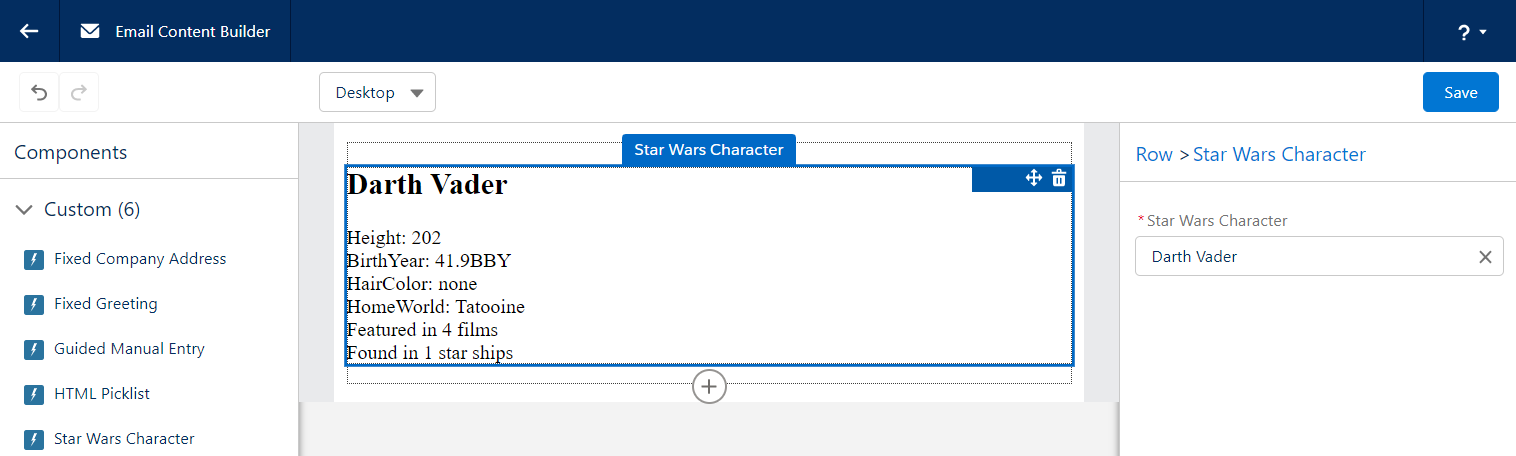
Here’s what it looks like in the builder. Similar to the previous examples, the right hand side container is where the user makes their selection and, once made, the details are rendered in the email.
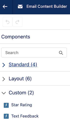
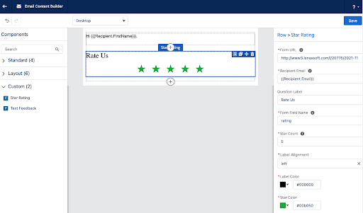
Custom components are platform assets, meaning they do not belong to a specific Pardot Business unit and can easily be shared across all of your Business Units. These components will enable your users to easily drag in standard areas of emails (copyright notice, unsubscribe language, etc.) as well as more technical components, making email building faster and easier. With no backend HTML access to Lightning Builder Email Content and Email Templates, custom components are vital to building advanced emails.
What custom components do you plan on building? Let us know in the comments!