
If I hear someone complain that they don’t like the email and landing page editor in Pardot, my first thought is: “your implementation partner didn’t set your templates up well for your needs.”
Don’t get me wrong, there are absolutely things in the editor experience that could be improved. But there are also a lot of things that can be built into the template to simplify the process for making updates, customizing, and minimizing the potential for error when the templates are being used.
Here are a few best practices to consider as you build out Pardot email templates:
1. Create flexible sections that can be moved around
There are some types of emails that you may want a purpose built template for — something with a standard format, that’s tried and true. There may be other times where your content strategy is evolving and flexibility is key.
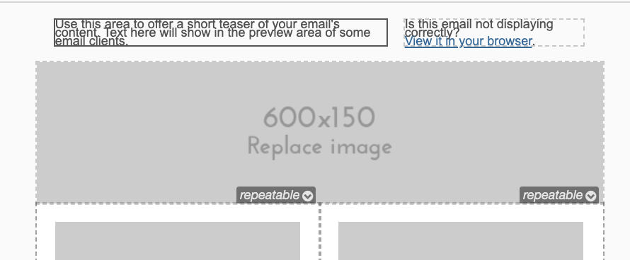
That’s where Pardot’s custom HTML elements come in handy. You can add attributes to the different sections of your emails to make them editable, repeatable, or removable.
When these are applied to a section in your template, you’ll see this when you click in the upper right hand corner:
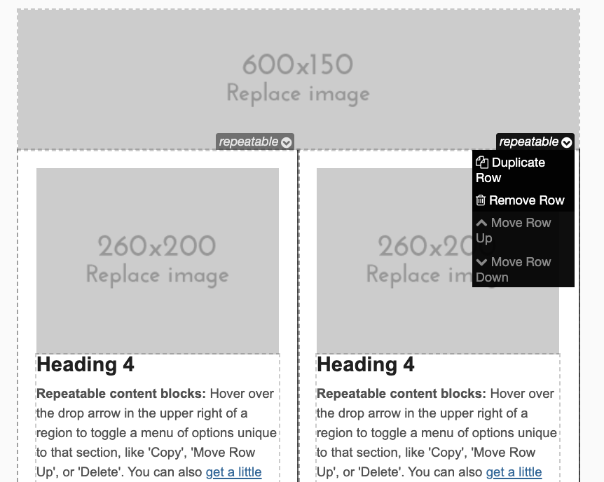
Might need a green button? How about a hot pink one? One column, two, three? Add them all and move/mix/match later!
2. Lock down sections you don’t want changed
On the flipside, there may be sections of your email templates that you NEVER want changed, and may want to prevent marketing users from inadvertently deleting — things like a disclaimer in a footer, GDPR compliant subscription management verbiage, etc.
By excluding the editable content element from your code, your users won’t be able to accidentally delete this using the WYSIWIG editor.
3. Use a simplified editing experience for images and things that are prone to breaking
In addition to the HTML elements that dictate how sections can be moved, removed, and edited, there are also Pardot HTML elements that create different types of editing experiences — full WYSIWG, text only, image only, and more.
The short answer: the more chance for changing up a particular section in a template, the more opportunities there are for it to inadvertently break on some browser or some device somewhere. By introducing the ability to edit only what the user needs to be able to edit, we can protect the formatting of the overall template and minimize potential for error.
4. Set up easy to edit, visually hidden preview text
Pardot’s default templates include pre-header text that looks like this:
This is a useful piece of real estate, because it shows up in the user’s inbox right after the subject line. You can use this space to add content that will woo users to open your email and read further.
But it’s also…. Ugly. There, I said it.
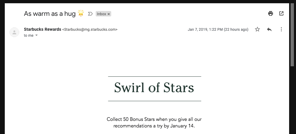
It has become a common practice to hide preview text that is not visible in the email body to only serve as preview text.
Here’s a great example from Starbucks. Their preview text is “The cheery glow of 50 Bonus Stars”

Here’s the open email. As you can see, the preview text is not visible within the body of the email. This is a better experience for users.
5. Make emails mobile responsive
It’s 2019. If your templates don’t play nice on mobile, go home.
Okay well, don’t go home. Just fix your templates though.
We can help 🙂
6. Design emails with your users in mind
There are all kinds of edgy things email marketers are doing right now like embedding GIFs, animations, sound effects and more.
But these new innovations only work in some browsers, devices, and mail clients — so before going too far down this road, take a look at what % of your users are using what. Pardot generates a report on this for every sent email that breaks this down:
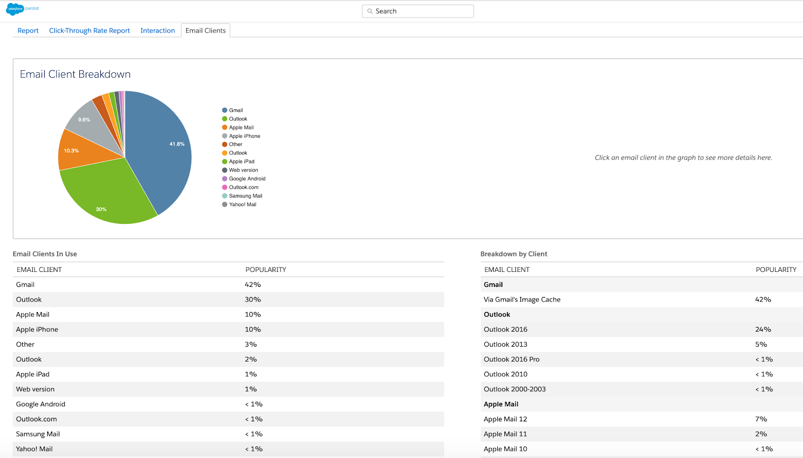
Outlook is notorious for taking the coolest things we can do with email, chewing them up, and spitting them out. For many of our B2B customers though, it’s the mail client that continues to reign supreme, so we generally design with an eye for this user experience.
7. Don’t expect emails to look identical on every device
Your emails will likely look slightly different on various devices/email clients — and this is okay and expected behavior.
There’s a number of reasons emails may render differently across different email devices and applications. In short, there’s a combination of things that happen when an email is sent, and depending on how it’s being viewed, the rendering will vary.
Support for HTML and CSS can vary across email clients, browsers, and devices, in addition to the way the message is sent and received that will impact rendering.
A few examples of differences you might notice across different instances may include:
- Slight variations in how spacing renders around different elements
- Rounded corners displaying as square corners
- Fallback fonts displaying instead of your brand fonts
- GIFs and interactive elements falling back to static images or elements
In general, we recommend using simple, streamlined designs to minimize variability and setting fallback behavior if a user is unable to access particular content (like backup fonts, or a clean first image in GIFs if a user can’t load it in their email client, etc.).
As long as you’re following basic best practices your prospects should get your message loud and clear. If you find that something looks slightly different in one type of viewing experience, ask yourself:
“Is the message here still coming through?”
If the answer is no, back to the drawing board. If yes, move on to designing your next winning campaign.
8. Remember that everyone’s needs are different
There’s not necessarily a “wrong” way to create templates… but what’s right for your team depends on how you plan to use your templates. Things to consider include:
- How technical is the team that is going to be using the template?
- Does the team have access to email rendering preview in Pardot (a Plus and above feature), Litmus, or Email on Acid?
- How quickly does the team turn around email sends? Is it realistic for them to run tests on every email?
- How consistent is the look and feel of emails? Is a standard format feasible, or is each a custom design?
- What devices and browsers do their audience most commonly use?
Depending on the answers to these questions, you may want to design the templates differently.
9. Always make a copy
If you have a master template to use across many emails and/or landing pages, be sure to clone it every time so you don’t modify the master for future use.
Seriously, clone it.
Every.
Time.
Even if you’re just tweaking “one leeeettle thing.” This will help guard against those inevitable “whoops did really I just delete that” moments.
And consider saving a notepad file with the raw HTML somewhere else as a backup.
10. Always test!
If you’re on Plus or Advanced edition, take advantage of Pardot’s email rendering tests through Litmus to make sure your emails are rendering across email clients and devices and passing through spam filters.
It takes a little extra time, but it’s really worth doing for every email.
If you don’t have access to this, talk to your Account Executive about adding it, or consider purchasing an Email on Acid or Litmus subscription to use for internal testing.
What are your email template best practices?
What are some creative ways you’ve customized templates to fit your team’s needs? Any design pros/cons or tradeoffs you had to make along the way?
Let us know in the comments!