
The 3rd and final part of the form customization series is finally here! In part 1, I showed you how to implement the popular floating label technique and how to create searchable, user-friendly dropdowns. In part 2, I showed you how to create a conversational, paragraph-style form and how to create a form on a single line. In this post, I will show you how to add images to your checkbox and radio buttons.
Checkboxes with images
The concept is to hide the default checkboxes and replace them with images. When one of the images is selected, the border and background color of the box will change to let the prospect know the option was selected.
Step 1: Add the images and text to your form
The first step is to add the text and images to the checkboxes within your form. To do this, go to the fields tab of your form and edit or add the checkboxes field. Click on the values tab and add the values. The text in the first box is the text that will be stored in Pardot. The second box is the display text aka the text the prospect will see when completing the form. This is where you would add the images for each option.
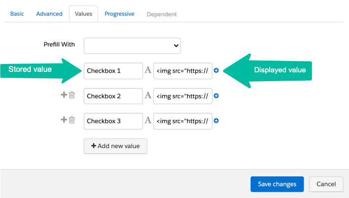
The value should look like this:
<img src="YOUR-IMAGE-URL" width="70" /> <span>Checkbox 1</span>Add your image URL, set the image width (optional) and add your text (wrapped in a SPAN tag).
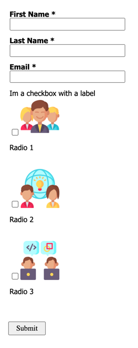
Here’s what my form looks like once I added the images to the checkboxes.
Now, let’s add some CSS to make it look better…
Step 2: Add the CSS
Add this CSS to style the checkboxes.
/* --- customize the checkboxes --- */
/* Put the checkbox text on one line */
#pardot-form .pd-checkbox label span  {
    display:block;
    float:none;
    padding-top:10px;
}
/* align the new checkboxes */
#pardot-form .pd-checkbox span.value {
  display:flex;
  width:100%;
  gap: 10px;
}
#pardot-form .pd-checkbox span.value span {
  flex-grow: 1;
  flex-basis: 0;
}
/* style the new checkboxes */
#pardot-form .pd-checkbox label.inline  {
    margin-top:5px;
    background-color:#FFF;
    display:flex;
    flex-direction:column;
    border:solid 1px #e8e8e8;
    padding:20px;
    text-align:center;
    -moz-border-radius:10px;
    -webkit-border-radius:10px;
    border-radius:10px;
    align-items:center;
    cursor:pointer;
}
/* hide the default checkbox */
#pardot-form .pd-checkbox input {
    display:none;
}
/* style the checkboxes when selected */
#pardot-form .pd-checkbox input:checked+label {
	background-color:#e8e8e8;
	border:solid 1px #539c18;
}
Note: I only have ONE checkbox in my form, but if you have MULTIPLE checkboxes in your form this will style all of them. To style only ONE checkbox, replace .pd-checkbox within the CSS to .YOURFIELDNAME
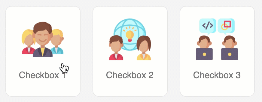
See it in action
Here’s what my example looks like in action.
Radio buttons with images
The concept is the same as the checkboxes example. We’re going to hide the default radio buttons and replace them with images. When one of the images is selected, the border and background color of the box will change to let the prospect know the option was selected.
Step 1: Add the images and text to your form
The first step is to add the text and images to the radio buttons within your form. To do this, go to the fields tab of your form and edit or add the radio field. Click on the values tab and add the values. The text in the first box is the text that will be stored in Pardot. The second box is the display text aka the text the prospect will see when completing the form. This is where you would add the images for each option. The value should look like this:
The value should look like this:
<img src="YOUR-IMAGE-URL" width="70" /> <span>Radio 1</span>Add your image URL, set the image width (optional) and add your text (wrapped in a SPAN tag).
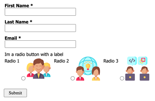
Here’s what my form looks like once I added the images to the radio buttons.
Step 2: Add the CSS
Add this CSS to style the radio buttons.
/* --- customize the radio buttons --- */
/* Put the radio button text on one line */
#pardot-form .pd-radio label span  {
    display:block;
    float:none;
    padding-top:10px;
}
/* align the new radio buttons */
#pardot-form .pd-radio span.value {
  display:flex;
  width:100%;
  gap: 10px;
}
#pardot-form .pd-radio span.value span {
  flex-grow: 1;
  flex-basis: 0;
}
/* style the new radio button */
#pardot-form .pd-radio label.inline  {
    margin-top:5px;
    background-color:#FFF;
    display:flex;
    flex-direction:column;
    border:solid 1px #e8e8e8;
    padding:20px;
    text-align:center;
    -moz-border-radius:10px;
    -webkit-border-radius:10px;
    border-radius:10px;
    align-items:center;
    cursor:pointer;
}
/* hide the default radio button */
#pardot-form .pd-radio input {
    display:none;
}
/* style the radio button when selected */
#pardot-form .pd-radio input:checked+label {
	background-color:#e8e8e8;
	border:solid 1px #539c18;
}
Note: I only have ONE radio field in my form, but if you have MULTIPLE radio fields in your form this will style all of them. To style only ONE radio field, replace .pd-radio within the CSS to .YOURFIELDNAME
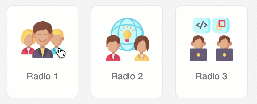
See it in action
Here’s what my example looks like in action.
Questions?
Send me a tweet @jennamolby, or contact the Sercante team for help.


